We’ve all heard “Don’t judge a book by its cover,” but I suspect we’ve all been guilty of it at some point.
A quality book cover design is your chance to make a positive first impression. Although first impressions aren’t everything, a bad one is hard to overcome. You could string together some of the most impactful and moving words ever combined in history only to see them fade away because the book cover looks like amateur hour.
Related: Why brand quality counts — Judging a book by its cover
The book industry is growing more competitive and more digital. Ebooks now make up 30% of all book sales.
Instead of taking several minutes to find a good book by casually strolling through the library perusing book titles, readers now scroll through the internet’s webpages in seconds. With vats of information competing for everyone’s attention, visual clues can help viewers identify superior content.
As we go over these 10 ideas to design the best book cover, feel free to jot down a few of your own observations to inspire your own design.
1. Set the tone with your design

Source: TIME
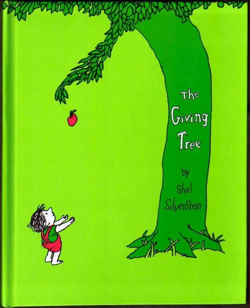
The verdant design of The Giving Tree by Shel Silverstein reflects the simplicity of a children’s book and depicts the dependent nature of a child. Instantly, you understand the themes explored in the book and feel an emotional connection with both characters.

Source: Behance
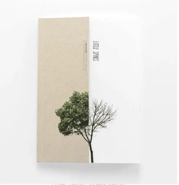
“Little Spines,” an anthology of creative writing by students at RMIT University, uses the image of a single tree in two different seasons to depict a story of change — revealing the poetic theme of the book.
2. Speak to your audience’s emotions

Source: WTTW
The Shack by William Paul Young is a good example of using design to appeal to one’s emotions. The conflicts of sorrow and hope, fear and faith are illustrated in the sunshine cutting through the snow and darkness.
3. Create a focal point

Source: Amazon
On the cover of The End of Food by Paul Roberts, the use of white space helps the reader focus. The white tag on the product packaging draws attention to the title which, after reading, the image effectively illustrates.
4. Use custom photography

Source: Barnes & Noble
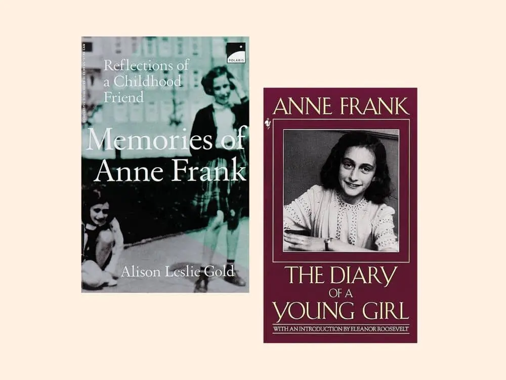
In The Diary of Anne Frank, photographs of the young author help the reader relate and empathize with her on a more intimate level. This is why custom photography is highly effective for biographies and documentaries. It is also helpful if you are trying to build personal recognition.
5. Your design should function as a thumbnail, too

Source: Brandon Hill Design
Given the digital nature of book shopping these days, it pays to create a book design that makes a great thumbnail. On Making the Climb by John C. Bowling, a brown shoe print is easy to identify and will be recognizable even as a small image.
6. Include reviews & awards in the design

Source: Books & Books
Working awards and reviews into the design of your book cover helps establish credibility to the reader. As humans, readers are social creatures, and testimonials from literary authorities provide enticing and trustworthy social proof. You can see this principle demonstrated elegantly on the cover of The Girl on the Train by Paula Hawkins.
7. Use imagery to spark imagination

Source: Paul J. Bartlett Art
On this modernized cover of The Wonderful Wizard of Oz by L. Frank Baum, images of a tin pipe hat, feline eyes, a girl’s face and a burlap necktie allude to the main characters in the book. The green tint hints to the Emerald City. This is a good way to weave your narrative into the cover design without giving too much away.
8. Let typography take center-stage

Source: Barnes & Noble
Here, on the cover of The Shallows by Nicholas Carr, the words are the imagery and help expand on what the author wants to communicate. By utilizing typography, the design is kept simple, not distracting the flow of the reader’s eye from one design element to the next.
9. Figure/ground Gestalt principle

Source: Pinterest
Things get interesting when the foreground and background contain two distinct images, as shown on this cover of Peter and the Wolf. Impressively, this creative use of negative space doesn’t distract from the main focal point.
10. Keep colors simple

Source: Pinterest
On this cover of JAWS, blue and black are the only colors used. The dark shading of the blue makes it identifiable as the ocean against a white background. The darker tip of the letter A reveals a shark fin breaching the surface of the water.
Key takeaways
An effective book cover is both planned out and meaningful. It’s a billboard on the highway directing readers to your pages. Your book cover’s role as a marketer is important and shouldn’t be treated like an afterthought. Use these tips to design a book cover you’ll be proud to share. You can start by customizing a book cover template in our gallery.


