Are you sitting at your desk waiting for that sweet, sweet logo inspiration to strike?
No matter whether you’re a consultant looking to brand your business or a designer looking for new ideas, this article will get you unstuck.
Related: 9 excellent logo redesigns for famous brands
Below, you’ll discover different types of consulting logo ideas from some of the biggest consulting brands in the world.
Whether you’re looking for designs with hidden meanings or something more traditional, the examples below are bound to stir up some creative juices.
Before diving into our pool of inspiration, though, let’s see what makes a good consulting logo and what mistakes you should avoid.
3 golden rules to create a modern consulting logo that stands out
Make sure your logo doesn’t misrepresent your business
The color, the weight of your fonts, the spacing between the letters—everything stirs an emotion.
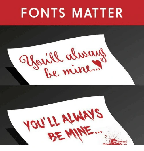
You have to make sure your logo conveys the right story, the right emotion and the right voice for your brand.
For instance, if you want to be perceived as an expert, you wouldn’t want an overly playful design.
Make sure your logo is clear and not too complicated
Yes, it’s true, your logo should tell a story. But, this doesn’t mean a person should figure it out in the blink of an eye.
Here’s what I mean. If you look carefully at Amazon’s logo, you’ll see an arrow pointing from A to Z. This is because they want to show people that they can find almost any product on their platform.
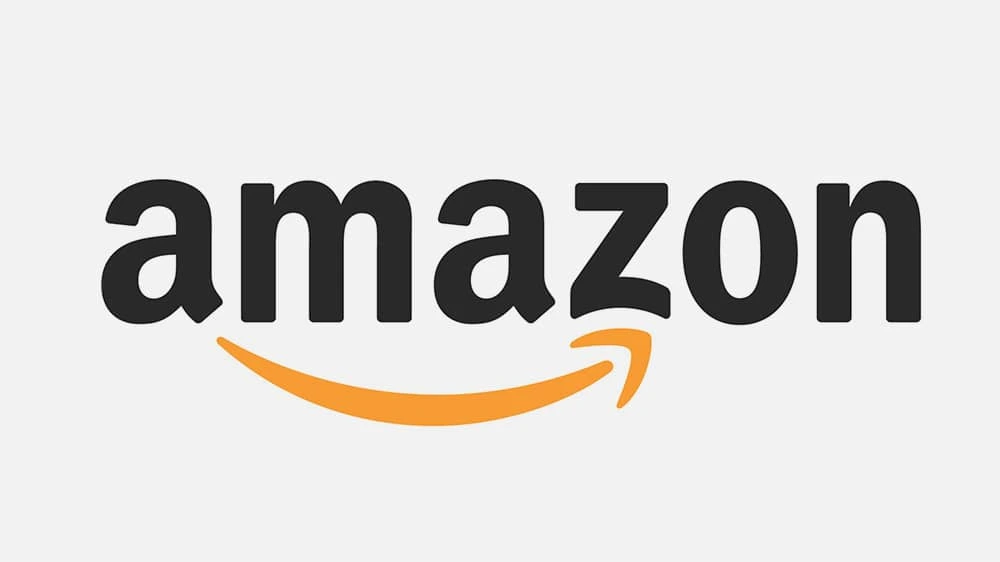
This story now makes sense because I’ve just told it to you. It only took a few seconds, and a logo which was already effective before now seems even more so. It goes to show that you don’t need to overcomplicate your logo to tell a story.
Make sure your logo doesn’t look old or outdated
What would be your first impression if you saw a consulting logo like this? (Yes, we know Hot Wheels is not particularly known for its consulting prowess, but please bear with us for the sake of example.)

A vintage font combined with a childish design… If this actually were a consulting company, you’d probably think they don’t care about how they look—and maybe they don’t care about their customers either, right? Not great.
Of course, this doesn’t mean you have to update your logo every year just to keep up with the trends. You just have to make sure you’re not hanging on to outdated design elements that were only trendy 20 years ago.
And with that, let’s move on to our round-up of consulting logo ideas.
Consulting logo idea #1: Accenture
Accenture is one of the biggest management consulting firms. The company offers strategy, consulting, digital, technology and operations services. Their revenue was around $40 billion in 2018, so we could definitely learn some design lessons from them.

The sign for “greater than” is placed above the letter t to represent the future—a future where you’ve ascended and grown to be greater (>) than (t) you (u) are (re).
As you can see, your next consulting logo can be clean & simple and still have a deeper message to communicate.
Consulting logo idea #2: Capgemini
Capgemini is another consulting giant that can teach us a valuable design lesson.

The key lesson here is that you can build a financial empire… even if your logo isn’t closely related to the services you’re selling.
The Ace of Spades has been present in their logo since its inception, but it has little to do with their business. In fact, it refers to bridge—a card game that the founder of the company, Serge Kampf, enjoys. In bridge, the Ace of Spades is the highest-value card.
It’s simple, it’s sweet, and it works. The lesson? You don’t necessarily need to hire an expensive designer to create a custom logo that’s meaningful to your brand. There are plenty of free logo makers out there that can help you get started.
Consulting logo idea #3: DLA Piper
If you’re offering legal consulting services, here’s what you can learn from one of the biggest global law firms. (How big? DLA Piper has lawyers in more than 40 countries and over $2 billion in revenue—that’s how big.)
The open-ended shapes represent out-of-the-box thinking. Something you might actually want from a lawyer, right?
If you look at it from a different angle, the logo seems like a talking bubble, which shows they value the art of communication… or that they’re friendly. You decide.
Do you see how the story starts to make sense after you receive more information? And how quickly this story can change, depending on the interpretation?
The point is this: If you’re just starting out and you’re not a giant corporation, don’t fret too much on pinpointing the right story behind your logo. You can refresh the design and infuse more meaning as your brand grows and develops.
Consulting logo idea #4: Deloitte
Deloitte’s revenue was over $40 billion in 2018, and they use one of the most basic design elements in their logo: a dot.

What could we possibly learn from this? Actually, it makes a great point. (Ha!)
Timeless shapes (like the point) and simplicity will never go out of style. You don’t need an overwhelming design that distracts people from getting your message.
Plus, a simple logo will be much easier to integrate in almost any sales collateral or marketing material you develop later.
If you need further proof, just study the logos of some of the biggest brands out there: Nike, Apple, Adidas, Dell, Intel, etc. Enough said.
Consulting logo idea #5: McKinsey & Company
McKinsey & Company is undoubtedly one of the biggest consulting firms you can study and look to for inspiration.

And it can teach you two important lessons.
The first is that you don’t need a fancy or even a creative logo to express professionalism or extensive experience within a field.
In fact, quite the opposite is true. If you study successful companies, you’ll see that most of them refined their logos into simpler, cleaner versions as they matured.
The second lesson here is that even your choice of font can tell a story.
At its core, McKinsey & Company uses a classic custom font because experience, heritage and legacy are what represent them best.
Consulting logo idea #6: L.E.K. Consulting
Want to make your consulting logo stand out while still maintaining a professional, bold look?
Here’s a key takeaway from L.E.K. Consulting, a global company established in 1983.
Their logo stands out because of some basic design elements and principles like composition, contrast and negative space.
For instance, they draw attention to their logo by using the contrast between the negative space in the top-left corner and the logo in the bottom-right corner.
They also give a bold look to the whole design by leveraging one of the most basic elements—the rectangle—all in combination with a deep-colored background.
Consulting logo idea #7: KPMG
If you’re afraid that your consulting logo won’t be perfect right away, don’t fret.
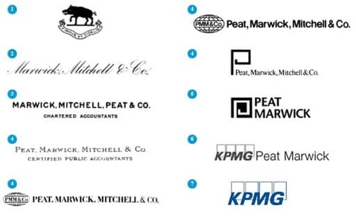
KPMG proves that no design should be set in stone, even if it’s a logo. You can always change it, and there’s no tragedy in doing that. It doesn’t mean you have to lose sales or credibility.
For instance, here’s how many iterations their logo’s had throughout the years:
Source: KPMG
As you can see, these weren’t minor changes—in fact, many were radical redesigns. Even its name changed each time the company got a new partner or the shares were redistributed.
Still, the company is one of the largest professional services companies in the world with over $28 billion in revenue for 2018.
Consulting logo idea #8: FedEx
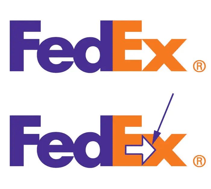
FedEx isn’t a consulting company, but if you want your consulting logo to be more creative and have a hidden meaning, it’s a good example to follow.
If you look carefully, there’s a hidden arrow that communicates speed and accuracy to those in-the-know.
Of course, now the question is, how do you come up with such clever ideas?
It’s simple. It all starts with your unique value proposition, the core message you want to communicate.
Find out that one thing, that most important thing that makes people want to do business with you. Then, incorporate it in your design.
Consulting logo idea #9: Sony Vaio
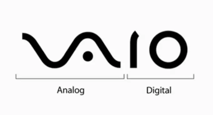
Sometimes, the hidden meaning in a logo can come from the product itself.
Here’s a clever logo idea from Sony Vaio. Even though it’s not a consulting company, it’s worth mentioning because they managed to create such a simple logo with a hidden meaning behind it. Take a look:
Consulting logo idea #10: Eighty20
If you’re looking for creative consulting logo ideas, Eighty20 is probably one of the best examples you can use for inspiration.
Eighty20 is a business consulting company that uses big data to inform its market research, then they use these insights to help marketers and companies better sell their services.
Their brand is a combination of geeky and creative, and they express that well in their logo. How? Each of the horizontal lines represents a binary sequence. The blue squares represent 1s, and the grey squares represent 0s.
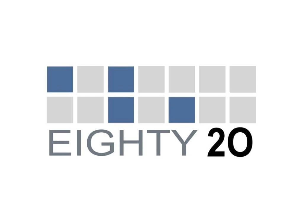
In binary sequence, the top row is 1010000, while the bottom one is 0010100. If you transform these numbers from binary to decimal, it reads… you guessed it: 80 and 20. Pretty clever, right?
Before designing your next consulting logo, do this
There are thousands of logo design ideas out there. The problem is, the more you see, the harder it is to choose one.
Here’s a method professional designers use to come up with great ideas quickly (and easily decide on the right one).
First, stop looking for ideas. Then, define the core message you want to communicate.
Are you fast and precise? Do you offer a complete range of services? Do you have the most innovative solutions or the most comprehensive research? Are you affordable for SMBs, or do you only serve large enterprises?
Only after you define your core message should you start looking for inspiration. Don’t worry—we’ll be right here when you come back.
