8 Examples of Great Brand Guidelines – And How They Can Inspire Your Own

The world’s most memorable brands didn’t build themselves overnight. What today’s juggernauts like Uber and Walmert did do, however, is spend time cultivating their brand identity through consistent messaging, design, customer service, and more. Together, all of these elements form your brand. And as such, it’s important that you control all of these touchpoints. Everything you do sends a message, and as a brand manager or creative lead, it’s up to you to guide and direct what messaging gets the green light. This is where your brand guidelines come in.
At Marq, we’re obsessed with branding, and we like to keep a close eye on what the most recognizeable companies are doing to maintain — and to change — their brands. Lucky for us, a lot of these businesses post their brand guidelines online, giving us an inside look into how they do what they do.
Every brand guideline is unique, but they all share the goal of teaching people how to properly and consistently use the building blocks of a brand’s look, feel, and language, in other words, the fundamentals of brand identity design. Some stick to these basics, while others give a comprehensive look into a brand’s story, philosophy, inspiration, and positioning statement. Sounds pretty useful, right? It is — and if you want to see how brand guidelines work in the real world, read on to check out some of the best brand books we’ve encountered yet.
Sounds pretty useful, right? It is — and if you want to see how brand guidelines work in the real world, read on to check out some of the best brand books we’ve encountered yet.
What are brand guidelines?
We like to think of brand guidelines as a instruction manual of sorts for keeping your brand’s positioning, communications, and experience consistent. With it, anyone should be able to craft on-brand content and self-serve any creative requests they might find thrown their way all while maintaining brand consistency.
If we were to whip up a brand book example on the spot, it’d likely include things like:
- Logos – full and secondary logos, along with any icons
- Color palette – primary, secondary, and any tertiary colors
- Typography – primary and secondary fonts, sizes, and spacing
- Imagery – graphics, artwork, photography, etc
- Brand voice – your brand’s POV, how it relates to your audience, what kind of language you use/avoid
A frequently updated and easily accessible brand standards guide – often delivered through a centralized brand portal – will go a long way in making sure no one at your company is making off-brand collateral. If everyone knows how and where to find your brand guidelines, they can just quickly pop in and check the rules without needing to ask a designer or risk publishing something that doesn’t look or feel like your brand.
And with that being said, below are some of our favorite brand guideline examples.
Great brand guidelines to inspire your team
Skype

We love that Skype’s brilliant brand book reads more like a cheeky comic than a stodgy brand style guide. Illustrations and speech bubbles are used throughout to convey exactly what vibe the brand is going for, and it’s a testament to what good creative can do for your branding. It’s fun to read, it’s colorful, it’s got jokes — what more could you want? When you need inspiration for adding fun into your brand, consider spending some time with Skype’s branding guidelines. View the full brand guidelines here.

Mailchimp
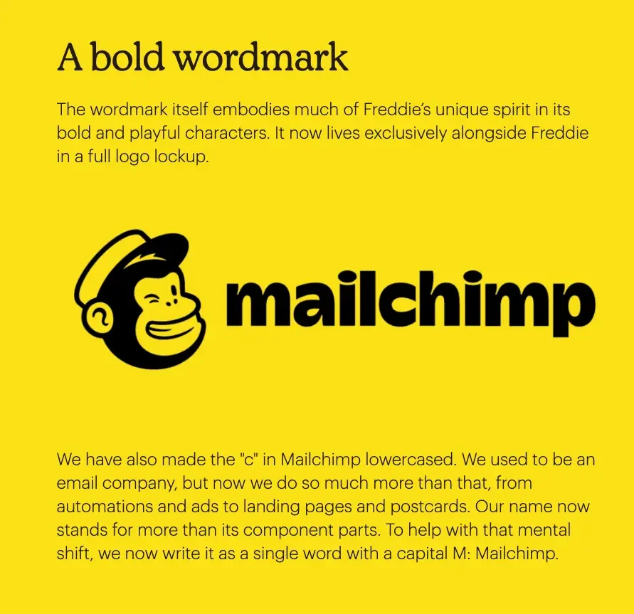
Our favorite small-business-focused marketing platform got a new look in 2018 that’s still serving the brand well today. The brand offers both a peek at the visual style guide as well as an in-depth content style guide. Everything from the brand’s colors to tone to animation style relies on vibrancy and simplicity, and we couldn’t be bigger fans.
Scrolling through the style guide, you’ll see that the thought behind Mailchimp’s brand is well articulated and laid out. You’ll always find a “why” here. It’s a simple thing, but this really helps people understand the vision for the company, which in addition to laying out ground rules, is one of the most important things brand guidelines can do.
“Think of your brand style guide as a living document,” Mailchimp Art Director Jane Song says. “You want to give your brand expression room to keep expanding over time.” View the full brand guidelines here.

Why they work: Mailchimp and Skype’s brand guidelines manage to strike the perfect balance between fun and pragmatism. It’s easy to see exactly what makes these companies unique, but the cheeky designs and charisma never overshadow these guides’ true purpose: to educate and inspire.
Boy Scouts of America

The Boy Scouts of America have a huge branding challenge: The organization needs a brand guideline that not only conveys its message (“Prepared. For Life.”) but also allows for the customization of the brand in literally hundreds of thousands of troops. Just for perspective, there are over a million scouts in America plus more than 800,000 adult leaders, and any of those leaders might want to make a flyer or poster or brochure.
Most of these volunteers don’t have graphic design experience, and that means corporate needs a clear, easy to use, and accessible set of brand guidelines. That’s why BSA’s brand book offers a lot of hand-holding, as it might be the only brand manual these volunteers will ever see. There’s more to this manual than just guidelines about font size and color palette, though. The book carefully explains marketing terms that the average scoutmaster or den mother might not be familiar with. And for each logo and trademark asset, there are ample do’s and don’ts to advise the layman on how to move forward.

These brand guidelines, which are built upon a rich tradition of imagery, slogans, and trademarks, are a perfect example of how an organization with many products and variations can clearly and succinctly build a cohesive brand platform that integrates common design elements into disparate categories of symbolism. View the full brand guidelines here.
Girl Scouts of America
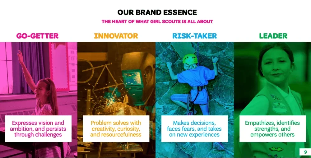
We got our hands on Girl Scouts of America’s brand playbook, which differs from a traditional brand guideline in that it’s focused on the high-level messaging of the brand rather than design details. It’s a stellar opportunity to see how a sprawling organization with thousands of chapters all over the country maintains a consistent brand identity.
The brand book’s specific purpose is to “help you understand how Girl Scouts functions as a brand and the key differences that set us apart from the rest of the saturated ‘girl power’ marketplace.” Look no further if you want to find out how a legacy brand tackles differentiation and keeping up with the times.

Inside you’ll find plenty of ideas on how to relay your mission, brand story, values, and voice and tone. View the full brand guide here.
Why they work: With a 100 year+ legacy and thousands of public members, the BSA and GSA face a unique challenge in upholding brand consistency at every level of their organizations. By prioritizing clear, concise, and down-to-earth instructions, they’ve made sure that anyone can take their brand and run with it.
Walmart

Walmart has a separate brand guideline just for internal comms and marketing. The guide pays special attention to voice and tone, encouraging human, but not chummy, language: “We have a specific approach that captures our fresh, always-Walmart spirit.” The brand’s Associate Spark logo is designed to represent the various people, cultures, and careers across the Walmart brand.

This brand guideline example is a smart look at how a huge company takes its company culture seriously and works to maintain a good employee experience. View the brand guide here.
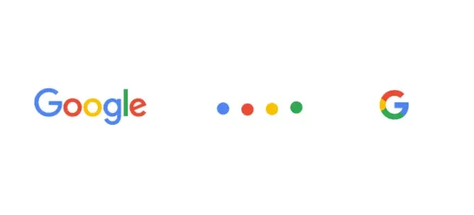
This tech giant has a hundred fingers in a hundred pies, which is exactly why we’re so interested in this case study of Google’s Logo, the Google G, and the Dots. The new logotype is imbued with “childlike simplicity” (a Google video shows the new logo being written as though it was on a grammar school’s middle-lined paper). It’s mathematical – an ode to geometry. What’s more, it was designed not only for a new brand aesthetic, but also to scale up and down while looking the same across many platforms — a problem Google’s previous logo struggled with.
Not to be outdone is the simple Google G: a circle with a small cut taken out and a reformed horizontal. It is designed for small applications where the full logotype wouldn’t have room to appear, but they’ve made it similar in many ways. The G is essentially the new G from “Google,” but with a thicker line weight, and it incorporates all the colors from the full word. It’s instantly recognizable as being the younger sibling of the full logotype.
Finally, Google introduced the dots, which are referred to as “a dynamic and perpetually moving state of the logo.” The dots are emotive: gently rolling when awaiting a command, expanding when being spoken to, forming a turning circle when thinking, and so on. The colors of the four dots are the same as the colors of the logotype and the Google G: blue, green, yellow, and red. View the full brand guidelines here.
Why they work: As giants of tech and commerce, Google and Walmart’s branding stretches far and wide. As such, they need a set of flexible brand guidelines that can not only adapt to different applications, but can still be instantly recognizeable at a glance.
Slack

You can check out Slack’s brand guidelines to see how this instant-messaging giant lays down the brand law. We appreciate how the brand book is designed to be as clear and user-friendly as the platform itself. It walks you through all the fine details of colors, icons, trademarks — the works.
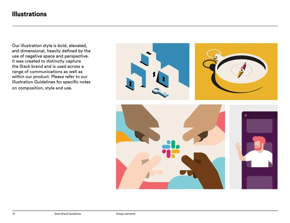
This particular brand book starts by taking you through its values (empathy, courtesy, craftsmanship, playfulness, solidarity, and thriving) before moving you through a thorough discussion of color, type usage, and logo lockups. This brand guideline example has it all, including type adjustments for its international markets and rules for photography and videos. View the full brand guidelines here.
Uber
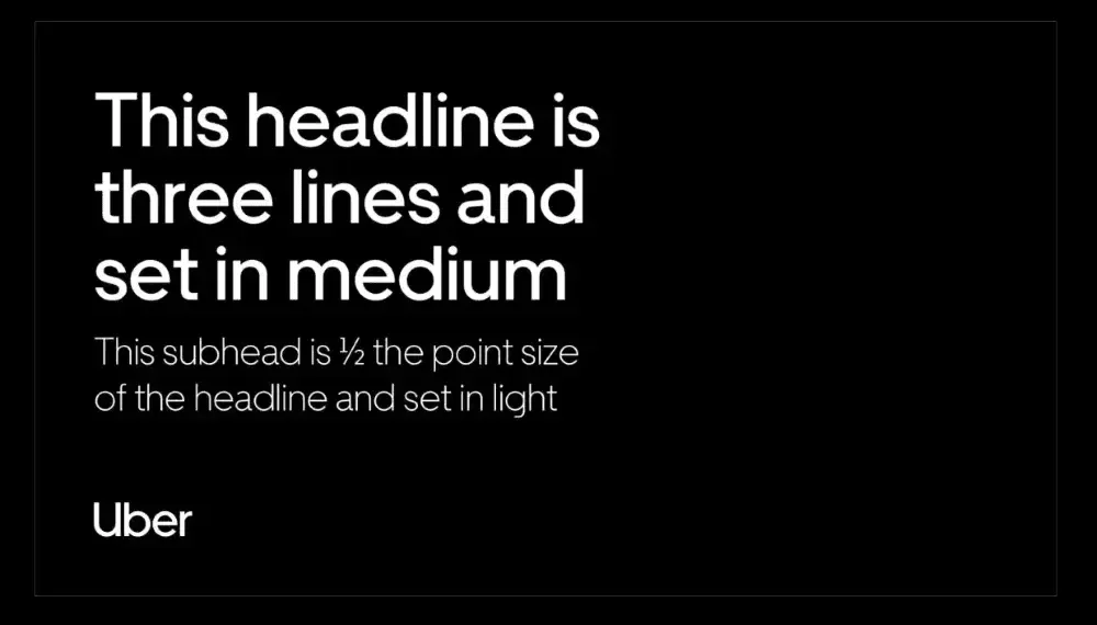
We love Uber’s very tidy brand guideline, divided into neat compartments like logo, color, composition, iconography, and illustration. It’s presented as an interactive webpage rather than a digital book, and this approach allows plenty of space to hash out details. You can even download templates and assets directly from each section, making the guide a functional DAM of sorts as well. View the brand guidelines here.

→ Strong brand stewardship starts with making these guidelines accessible, actionable, and easy to follow across your organization.
Why they work: Sometimes, simplicity is the best thing you can give your creative teams. We appreciate Slack and Uber’s no-fluff approach, and love how easy Uber’s brand book makes it to download templates and assets.
We hope these brand guideline examples inspire you to imagine all of the things your own brand guidelines can do for your company. While the idea of a brand book might seem restrictive at first, the reality is that a good set of brand guidelines will help you tell a compelling story and create a character for your company. They’ll help you remember exactly what you’re all about, and help your customers understand you better.


