A well-designed website is a valuable investment that will generate revenue for your business—but 38% of people say they won’t explore a site if they find it unattractive. If your website hasn’t been updated in a while, your web design could unintentionally be hurting your business by turning people away at the door.
If it’s time to refresh your website, we’ve put together a list of 10 website design best practices and coupled them with the do’s and don’ts of great web design. Follow these best practices as you update your site.
1. Target audience
- Don’t ignore the users
Always keep your target audience in mind. Your point-of-view, as a professional, might be very different from that of the user. Pretend you’re visiting your website with fresh eyes. Walk through the user’s journey as they explore different pages. Focusing on this experience will help you create a user-friendly website.
Good design addresses the target audience with a brand personality users want to engage with. Check out this website, Crypton. It’s designed ideally for a tech-savvy audience.

Source: Crypton
Parallax scrolling heightens the user engagement here, but you don’t have to include parallax functionality on every website. Research your buyer personas and use design elements, functions and colors that make your target audience feel right at home.
- Do optimize for search
Websites that don’t rank well on Google and other search engines have very little chance of breaking through the noise. As you update your website and add new pages, make sure you’re following the most recent SEO guidelines. Your page titles, meta descriptions, and content are all important players in driving better search signals.
2. Layout
- Don’t create a cluttered layout
Have you seen websites that look like rows of boxes—all different sizes and arranged haphazardly? Would you spend more than two seconds sorting through it? Probably not. That’s because cluttered websites are visually confusing; the viewer doesn’t know where to direct their attention. A well-organized layout, on the other hand, guides the viewer where you want them to go.
- Do create a focal point
So, where do you want your visitors to go? It depends on the purpose of your website. An e-commerce site will drive visitors to purchase, while a SaaS site might drive visitors towards a demo or a free trial. Whatever purpose your website serves, make it the focal point of your homepage.
- Do use catchy headlines and call-to-action
The first things that attract a visitor’s attention when she lands on your homepage are the headline and call-to-action. Not the contact info, articles or product specs, but these two elements. For this reason, the more action-oriented your headline and CTA are, the higher your chances of success rise.
CTAs are designed to incite an immediate response from a customer. That’s why clear, concise CTAs are more effective. One software company reported that their site’s conversion rate increased by 106% after it got a makeover that included a clear, direct call-to-action.
3. Color scheme
- Don’t use all the colors
Using too many colors will make your website design clash. Colors have strong psychological impact, and they will affect a viewer’s opinion of your brand. If you’re unsure how many colors to use, the rule of thumb says your design should not use more than three colors. If you’re working with a brand palette, you might be able to use more, as long as you balance them well.
- Do use color combos that enhance your content
Your website’s colors should reflect the brand, complement the content, and visually delight viewers. [] Avoid selecting random colors just based on what you like. Instead, think about the brand and its users. If you have a primary color but don’t know how to make color schemes, you can use an automatic color scheme generator to help fill out your palette.
4. Text placement
- Don’t fill the page with long paragraphs
Just like the layout, you don’t want the design to be cluttered with text. If you have long-form content on the website, create a clean, spacious design that divides the content into readable chunks. You can do that by adding ample white space, using images, and creating proper flow.
- Do make it easily scannable
If your pages are easy to scan, you have a better chance of luring readers to the bottom. Attention spans are short online, but if you can make your content easy to absorb, readers will get more value from it. In addition to high-quality writing, use headings, bullets, quotes and blocks to emphasize the essentials.
- Do establish trust & credibility
Potential customers are less likely to enter their contact information or make a purchase if they suspect that your website is not secure or trustworthy. Communicate your trustworthiness by featuring customer testimonials, case studies, reviews, security badges and your privacy policy. Make sure your contact information is easy to find so visitors know they can reach you. All of these signals will help you establish trust and credibility as a reputable brand.
- Do communicate your value proposition
Use compelling language to convince and show readers how your brand will add value to their lives or resolve their problems. What benefits can customers expect to enjoy by making a purchase or signing up for your service? What features make your products better than what your competitors offer? If you can excite your visitors with your value proposition, you will see your conversion rates improve.
5. Search & navigation
- Don’t make it hard for users to find what they need
Everything on your website should be easily searchable. Whether it’s the sign-up form, the “About Us” page, or your contact information, readers should not have to spend more than a few seconds finding it. To make things even easier, include a search box so people can find things that don’t align with the page’s primary focus.
- Do set up proper navigation
If your site requires users to sign up, use colors to make the navigation simple. For instance, if your navigation headers are blue, make your sign-up button green or some other color. Organize your content into categories that users can browse if they like. You can also organize content on various hub pages.
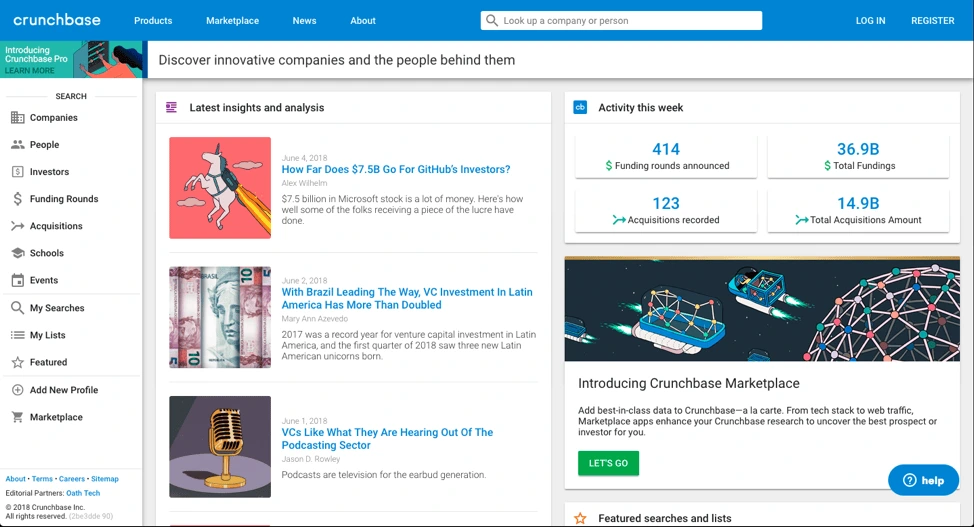
With good UX, your website tells the world that you think clearly about the end user. See Crunchbase’s website; its UI is done beautifully. There’s the search bar on top if you want to explore specific results, or you can click the menu on the left side to browse sections that interest you.

Source: Crunchbase
6. Fonts
- Don’t use too many fonts
A website that uses five different fonts loses users in seconds because it takes too much effort to read. Too many fonts on the screen can make a website look chaotic and unprofessional. The ideal number of fonts is three: one for main headings, another for sub-headings, and the third for the body text.
- Do select the right font sizes
Font size has a huge impact on legibility. It’s important that they’re neither too big (taking up half the page) nor too small (uncomfortable to read). The sizes of your fonts should reflect the importance of each element. For example, section titles and taglines are more significant than the body text, so they’re bigger. This helps readers scan the content, too.
7. Images
- Don’t use too many images
Too many images will crowd out your message, so use them sparingly and impactfully. Remember, search engines can’t read images very well, so don’t rely on them to convey text. If you’re using a background image, keep it under 1 MB. Large images slow down your site’s loading time.
- Do make it visually attractive
People think visually, which is why images are so effective. Feel free to use images in your web design, but find ones that are visually attractive, high resolution and not pixelated. Make sure the images you use reflect your brand’s personality. Don’t forget that you can also use textures and gradients to add visual appeal.
8. Mobile compatibility
- Don’t forget to optimize for mobile
57% of mobile users won’t recommend a website that’s not optimized for mobile. More people are browsing and shopping on mobile devices, and they expect websites to provide great mobile experiences. Invest in responsive or mobile-first design so you don’t miss customers during crucial moments.
- Do test for functionality
It’s not enough for your website to look good on mobile—it needs to be fully functional as well. Give your mobile users the tools to get things done, such as product search, store locators, service details, and more. If you can seize these opportunities, you won’t lose customers who are searching on the go.
- Don’t compromise on speed
People are not patient, and slow-loading webpages will almost certainly lead to a higher bounce rate. If your page takes longer than five seconds to load, it’ll frustrate your visitors and give them a reason to search elsewhere. To increase the loading speed of your webpages, consider removing any nonessentials, such as videos or large images that take extra time to load. Compressing images will also reduce loading time. Finally, utilize browser caching for storing cached versions of static resources to speed up your pages significantly.
9. Conventional vs. unique design
- Don’t ignore the power of convention
People are used to certain structures and formats on the web. This familiarity makes it easier for the brain to absorb content and make decisions. Your visitors shouldn’t have to be detectives to figure out who you are and what you offer. The power of traditional web design is that users will understand what your website is about with a single glance.
Your above-the-fold section should do the job
A Nielsen study says the majority of your website visitors will spend 80% of their time above the fold. That’s the section you see without scrolling—call it the opening screen.
The best websites explain what they do in this opening screen. A general practice is to use a headline (think your company’s tagline or mission statement), followed with a brief subtitle text describing your services or products. Top it off with a CTA button to direct visitors toward the next stage in your conversion funnel.
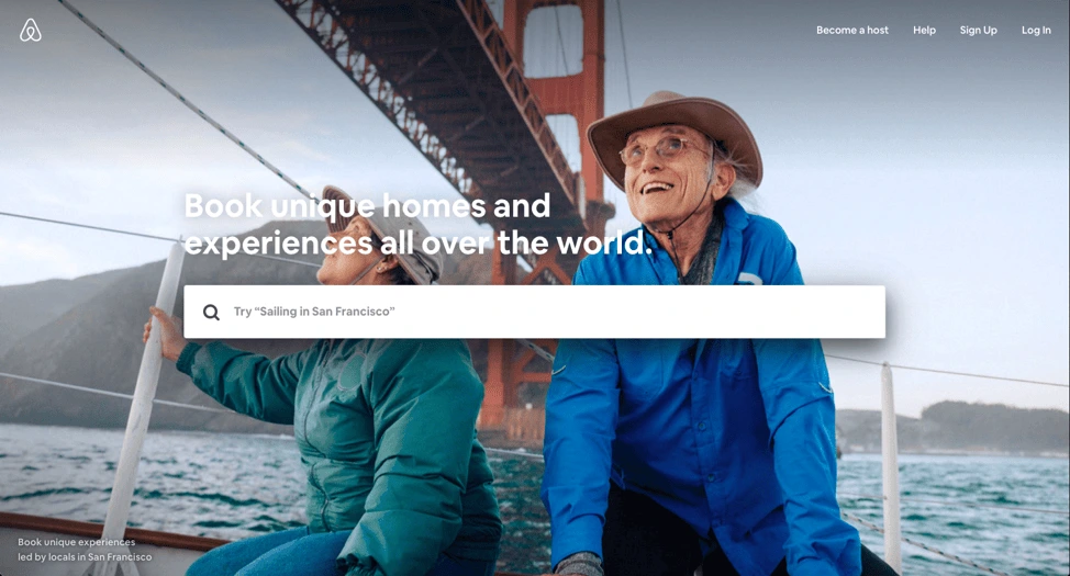
Airbnb does this brilliantly; the headline is the CTA. While there’s no subtitle text, their call-to-action is strengthened by a slideshow of awesome travel photos. Just beneath the headline, a search bar is intuitively placed. The example text in the search bar encourages interaction.

Source: Airbnb
- Do use floating menus
It’s very frustrating for users to have to move all the way to the top or bottom of a page to navigate the site. What many websites have now are floating menus: menus that move along the top or side of the screen as you scroll, making navigation a lot easier.
AMD, a giant in the computer hardware business, uses floating “share” buttons that visitors can use to share the content they find interesting across a variety of social sites like Twitter and Facebook. This helped AMD drive a whopping 3600% increase in social sharing, as more and more people found and shared their pages.
- Do be creative & unique
Still, you do want your brand to stand out from the crowd. Be creative, and use elements that make your site unique without disrupting the flow of information. Whether you experiment with moving images, video, or other design elements, try different things and monitor the results. You might be surprised what works.
10. Test it out
- Don’t forget to take it for a test drive
Once you’re done designing the site, test it to make sure everything is working correctly. Use multiple devices to navigate your website and see if it’s doing what it’s supposed to do. A user’s experience can vary depending on device type, internet browser, and location. Try to recreate different scenarios so you can catch any bugs or performance issues before they do.
- Do think like a CEO
A successful web designer needs to think like a CEO as well as an artist. This will help you view the website with business strategy in mind. Critical evaluation will give you a site that looks good, is user-friendly, and helps the business reach its goals.


