We all know the importance of branding.
Your brand experience, and thus your branding, is the sum of all impressions and interactions customers have with your brand.
Everything, from the moment a potential customer sees an unboxing video of your product on YouTube to how you communicate your return and refund policy, impacts the brand experience.
Many managers get preoccupied with equating brand management to aesthetically-pleasing pictures on social media, brand ambassadors and influencers, or the number of followers a brand has. These are relevant aspects of the brand experience, but ultimately, branding is so much more than these things.
For example, take a moment to consider the role that branding plays for the first physical touchpoint that an e-commerce brand has with its customer: i.e, packaging.
A critical component to ensuring your brand’s packaging is memorable lay within the impact of brand consistency. You want your brand’s content to be consistent across all touchpoints — so no matter where your customers encounter your brand, be it in-person,
But what does good, memorable and consistent packaging design look like? How do you imbue your unique brand experience onto physical packaging?
Well, take note from these inspiring brands!
11 brands with consistent brand experiences and packaging design
It’s easy to look at brands like Nike and Apple, or unicorns like Dollar Shave Club and Warby Parker and think to yourself, “that’s just what they do!”\
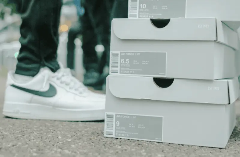
But it’s not just what companies, like the ones listed above, do. It’s because their teams know the importance behind consistent brand experiences and how packaging design is a direct reflection of that.
It’s worth noting that most of these large companies and organizations likely have an entire team dedicated to packaging design, or in the very least the work is outsourced. So, if you’re a small business owner, what are you supposed to do? How do you create consistent brand experiences through your packaging design…without running yourself ragged?
In this article, I’ll — your fearless writer Phil — showcase some smaller and medium-sized e-commerce brands, D2C brands and retail brands that have nailed their packaging design. Regardless of whether or not you’ve heard of any of these brands, it’s time to grab a pen and paper and dive into what makes these brands memorable.
Concrete Jungle
Concrete Jungle is a direct-to-consumer, German brand that sells women’s jewelry. As the name suggests, Concrete Jungle uses concrete as the main ingredient. Now, the thought of a rough, cold and lifeless material such as concrete being used in a product that’s delicate and subtle fine jewelry surely couldn’t work, could it?
Well, with the right branding, Concrete Jungle has managed to make it work perfectly.
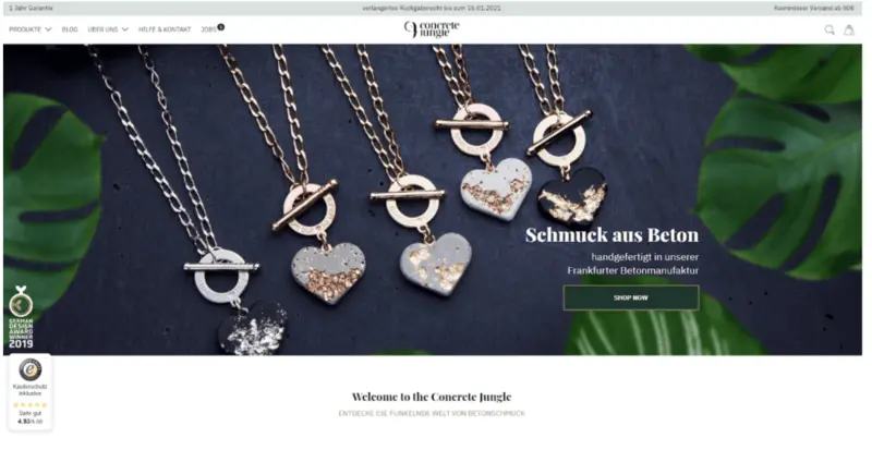
Design choices and brand consistencies worth noting:
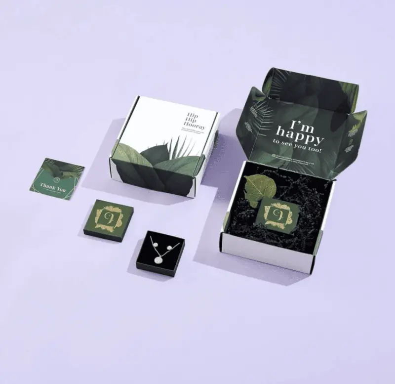
- The black background complements the grey color and cold texture of concrete.
- The leafy green plants provide a more natural “jungle” element for contrast.
- The result is a grey, black and dark green color palette that makes the rose gold, yellow gold and silver of the jewelry stand out.
What’s to love about the packaging?
Concrete Jungle’s brand experience is consistent across all packaging and digital touchpoints.
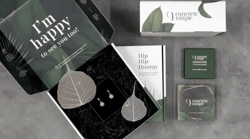
Much of the color palette remains the same but thoughtfully reimagined into new textures. For instance:
- Rough surface of the deep black wood shavings
- Smooth green on the box’s internal print
- Subtle indentations of the gold hot stamping on the product boxes
Concrete Jungle is a mix of textures — rough, cold concrete used in delicate women’s jewelry – and their custom box design complements that eclectic mix of textures.
Malimo
Malimo is a German brand that upcycles intricate and stunning fabrics, transforming them into clothing that looks and feels like a work of art.
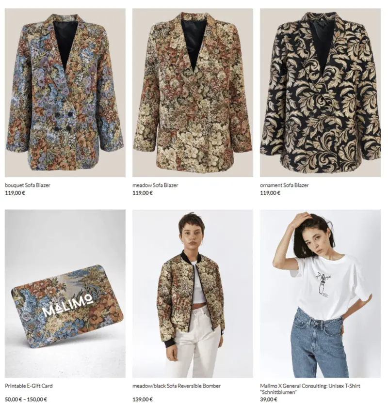
Malimo’s patterns are anything but subtle. They’re loud, eye-catching and maximalist in every sense of the world.
Conversely, their packaging is extremely simple.
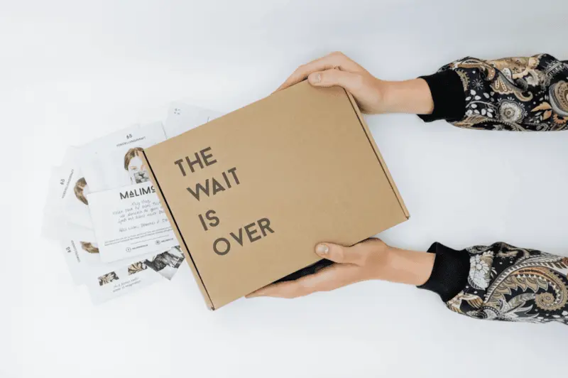
What’s to love about the packaging?
It’s this subtle and understated packaging that we love because upon opening the box, those loud and incredibly detailed patterns spill out of the box and into your eyeballs.
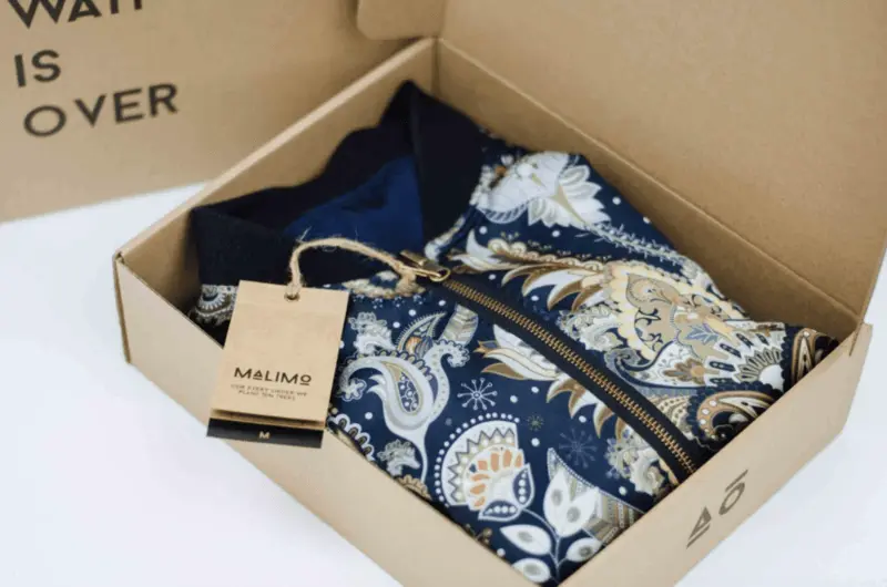
The hangtags feature the brand’s font, ensuring the content experience remains consistent and memorable. Furthermore, the copy itself echoes the brand’s tone of voice and vivacity — it’s somewhat human, honest, funky and down-to-earth.
Malimo’s product packaging fights traditional branding but still complements the overall brand experience.
Hemp Juice
This Polish manufacturer of CBD oil puts a bright, happy and positive spin on a product usually associated with cliche imagery and unfounded stereotypes.
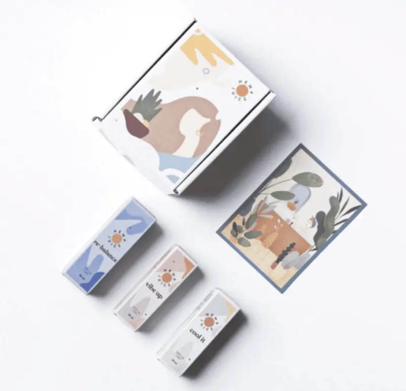
Hemp Juice leverages color to break up the product range, ensuring that customers can quickly identify which product is best for them — without going off-brand.
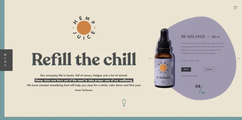
All collateral produced supports Hemp Juice’s core values: to educate consumers while giving them the product they need to live a happy, healthy life. So, whether customers are looking for educational information regarding CBD oil, best practices or shopping for a new product, they’re able to experience consistency across Hemp Juice’s branding.
And, as a result of the consistent and comprehensive branding experience, consumers invest more in the brand as they’re getting the support they need to get the most out of the product.
What’s to love about the packaging?
Hemp Juice’s CBD packaging is a fantastic example of packaging design that echoes the brand’s values.
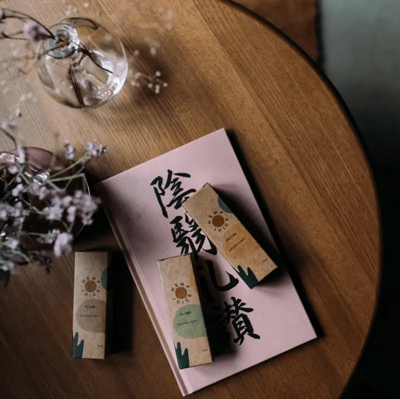
The visual experience is bright, cheery, and happy without being in your face about the product’s medicinal constitution. Say you were to look at Hemp Juice’s product amid a rough day, you don’t think about the rough day, but rather that moment you get home, unwind and take care of yourself.
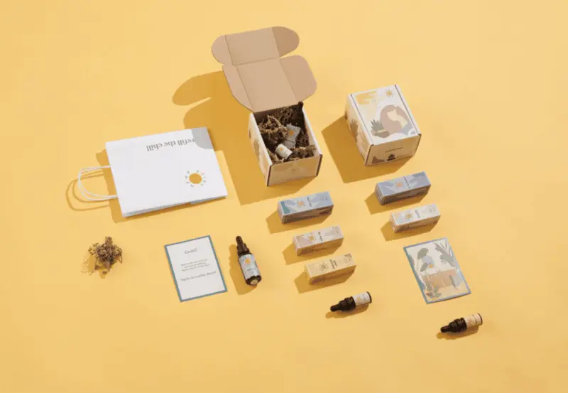
On the other hand, by not having the typical “green leaf” imagery as a staple of their branding, Hemp Juice winds up being more appealing to consumers on the fence about using CBD oil for the first time or those worried about the connotations of using CBD oil.
Monokel
Monokel is a boutique supplier of custom-made men’s clothing. Based in Berlin, the luxury brand prides itself on crafting high-quality garments tailor-fit to the individual.
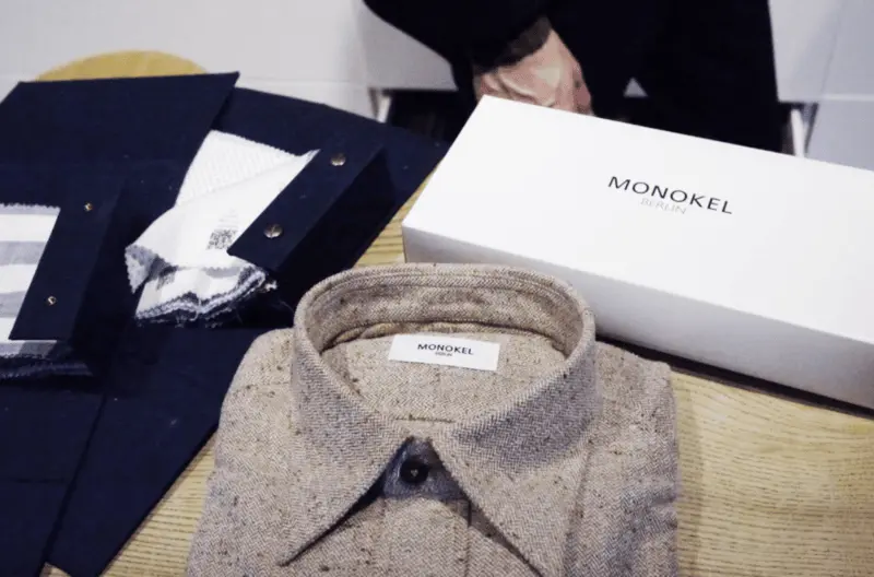
A luxury-inspired brand like Monokel doesn’t require loud branding or lengthy copy to explain or justify itself. Hence why Monokel’s logo leverages a simple typeface and elegant execution.
What’s to love about the packaging?
Monokel’s packaging reflects a sort of “take-home” elegance.
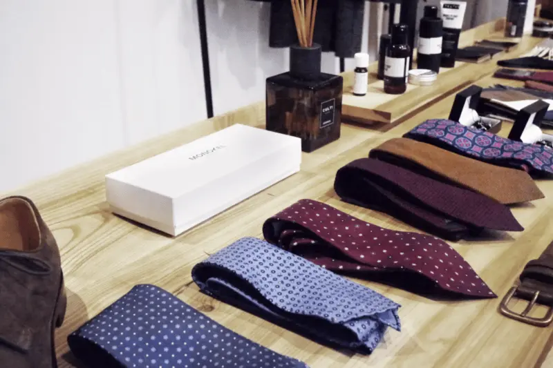
Monokel uses a classic, two-piece product box, with the logo printed smackdab in the middle. Not only does this consumer experience reflect the brand experience, but it ensures a consistent, memorable feel from store to home.
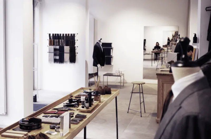
If you’ve had the chance to visit the Berlin store, you’ll see that the shop also reflects the packaging design’s clean minimalism.
Anthem
Anthem, an Italian-based brand, sells organic clothing inspired by casual, California “hippie” vibes. Anthem blends the quintessential surfer’s attitude (i.e., relaxed and laid-back) with the tactile nature and feels of organic, sustainable and eco-friendly apparel. Anthem’s key color is a sort of retro orange and the round logo is somewhat reminiscent of a VW van from the 1960s, both of which tie back to the “chill vibes” inspiration that grounds the company.
What’s to love about the packaging?
Anthem’s target consumers demand packaging that reflects the organization’s sustainable mission. Meaning, Anthem can’t just walk the walk; they need to talk the talk too.
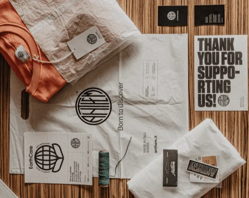
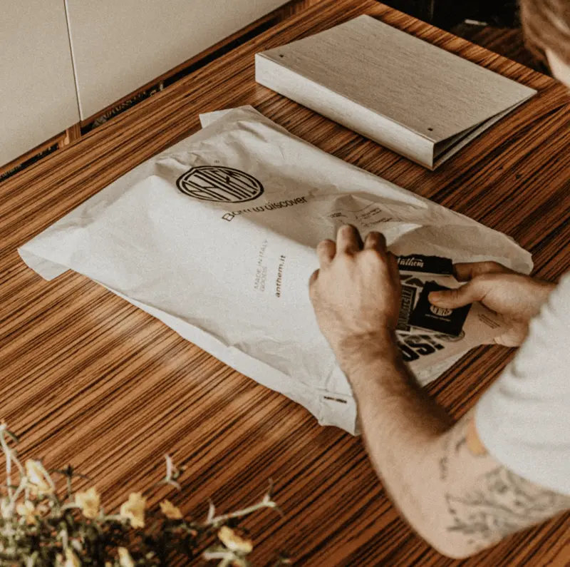
That’s why Anthem uses biodegradable and compostable mailing bags as their go-to packaging solution. These plant-based mailing bags are slightly off-white, lending a sort of natural look and feel while appealing to the environmental concerns their target consumer likely has.
Again, Anthem offers a unique take on the consistent brand experience, catering to customer expectations while staying on-brand.
Oase
Oase is a Dutch manufacturer of vegan hair supplements. The company’s branding is very minimalist and is done so deliberately to ensure the customer focuses on the ingredients and what the supplement can do for you — not the branding.
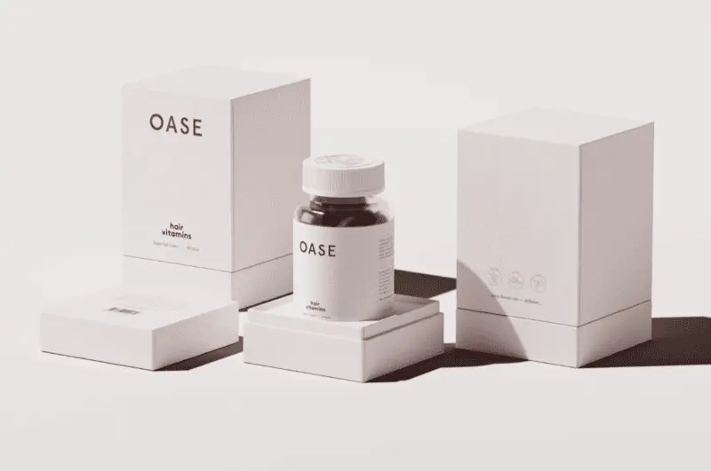
Minimalism is a trend echoed by many high-end companies, as it reflects confidence and elegance without being gaudy or ostentatious.
What’s to love about the packaging?
Oase based their design on the actual product — i.e., a red, strawberry-flavored gummy. The soft red and pink hues offer a sort of non-threatening look and feel and ultimately suggests that the product is gentle yet dependable.
Notice how the primary color of soft pink is a fainter hue of the product itself. The subtle hints of black text and the small gold logos (at the rear of the product) connect the supplement to the rest of the branding experience.
Polu
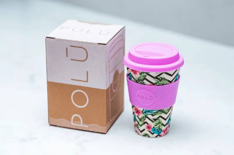
Polu is an Australian-based company that sells reusable coffee cups made out of bamboo. Australia’s coffee culture means it’s responsible for a lot of waste in the form of single-use paper cups — a problem that Polu wanted to solve.
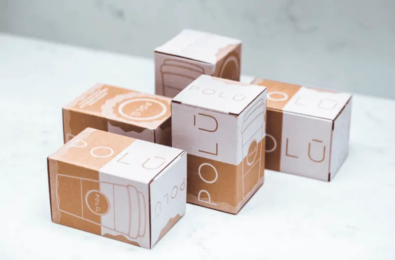
Polu developed a unique, durable and sustainably-sourced, bamboo-based product that allows consumers to reuse the coffee cup over and over. Plus, the coffee cups are available in a wide range of color options, thus creating a need for packaging that complemented all colors — without going off-brand.
What’s to love about the packaging?
The brand gleaned inspiration from the Hawaiian ‘Ū’ character and used that horizontal line to break the packaging’s design literally in half. The use of negative space and attractive blend of white ink on natural kraft makes the packaging pop without watering down from the cup’s unique look and feel. And again, the packaging and brand experience all tie back to the mission statement of the company.
Stay Cold
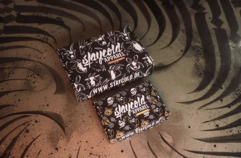
Stay Cold is a clothing brand that definitively knows its target market: i.e., tattoo culture. Stay Cold’s apparel and branding pays homage to the thick lines, bold colors and definitive look and feel of traditional flash, so subtle branding was never an option.
What’s to love about the packaging?
The striking use of the color black harkens back to tattoo culture and makes a bold statement on the packaging. And all imagery, from goats to skulls and roses, tie back to the various thematic range of clothing designs.
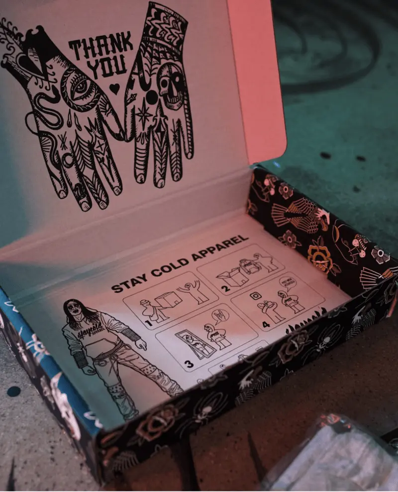
For Stay Cold, user-generated content plays a significant role in their organic marketing, hence why the inside of their box has an Ikea-like instruction manual for customers to create and share content around their new Stay Cold purchase.
Raylo
Raylo has a unique business model. Rather than telling folks to buy a brand new phone, users buy a SIM-free phone from Raylo for 12 or 24 months. At the end of the term, users send the phone back for a free upgrade, and the old phone is given to families or individuals in low-income communities so that they can still be digitally connected.
So, environmental good is done by keeping phones out of the landfill, and social good is done by helping out those that can’t always afford simple conveniences.
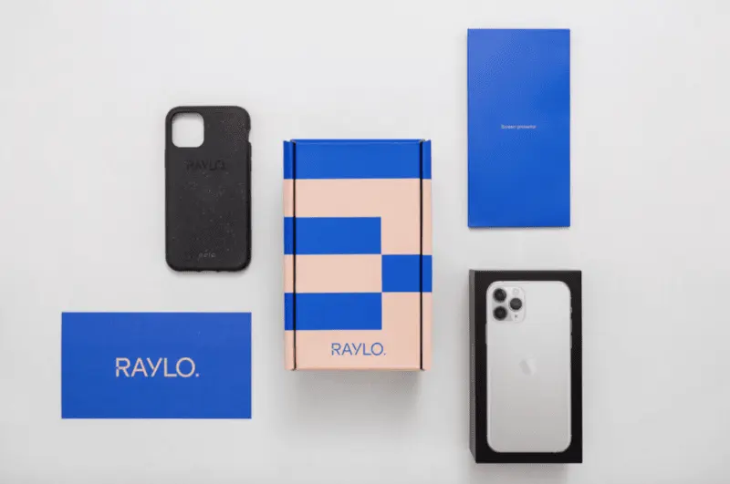
Due to the unique business model, Raylo also had a unique hurdle to overcome: the organization sells Apple and Samsung products, meaning customers are bound to associate Apple or Samsung’s branding with Raylo. To ensure customers would remember Raylo (as opposed to Apple or Samsung) and associate Raylo with the cause, they needed a unique and memorable brand experience.
What’s to love about the packaging?
- Raylo is founded on the notion of simplicity. For example:
- Raylo offers a simple way to get a new phone and all the necessary accessories.
- Simple branding — yes, Raylo features contrasting colors and sharp lines, but that’s complemented by simple packaging.
- Everything is sent in the same singular box.
Raylo initially used a standard-sized mailer box to deliver all products but soon found it used too many materials that contradicted its environmental mission. Raylo then worked with a packaging engineer and designed packaging from scratch, specifically for their set of items that are sent together.
So in turn, the packaging provides a unique brand experience and reflects the company mission.
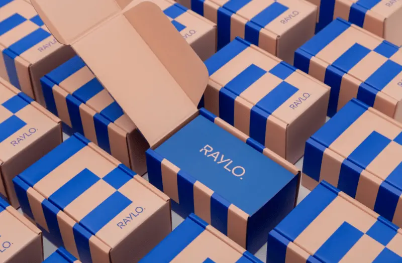
The result is stunning and visually very captivating. Furthermore, by using value-engineered packaging, Raylo decreased packaging costs by 11% and lowered packaging weight by an impressive 20%.
Monday’s Child
Monday’s Child is a London brand that specializes in creating beautiful, heirloom-quality pieces for young girls. Monday’s Child pride itself on crafting timeless dresses that feel special and are made to last.
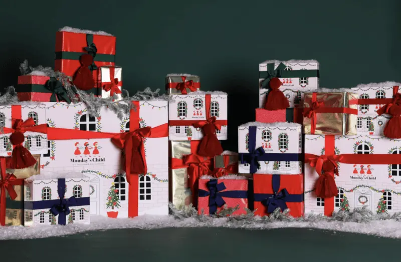
To that end, Monday’s Child wanted to connect the dress’s special memory with that of children’s playfulness through its packaging.
What’s to love about the packaging?
Monday’s Child has used innovative packaging design to turn their mailer boxes into a doll house for their customers — well, rather, the children of customers.
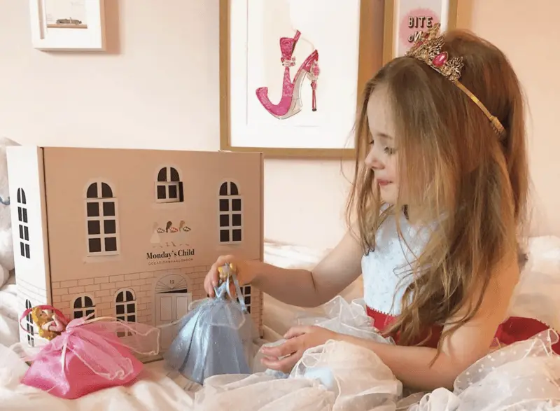
Monday’s Child brand knows the importance of imagination and bridges the gap between the feeling of wearing a “special dress” and creativity.
Brahmaki
Brahmaki is a Swedish brand that sells exclusive, handmade kaftans. A quick look at the homepage and you can get a feel of what the brand stands for: i.e., simplicity and serenity.
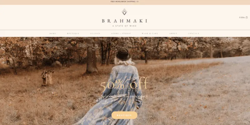
Looking at the brand’s lifestyle shots and it’s easy to extrapolate colors, moods and overall experiential brand goals.
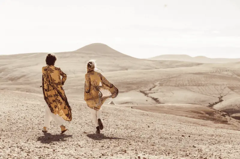
What’s to love about the packaging?
While the kaftans themselves are breezy and unique, yet ethereal and simple, the mailer box is equally as symbolic and carries the brand experience over onto the in-person experience.
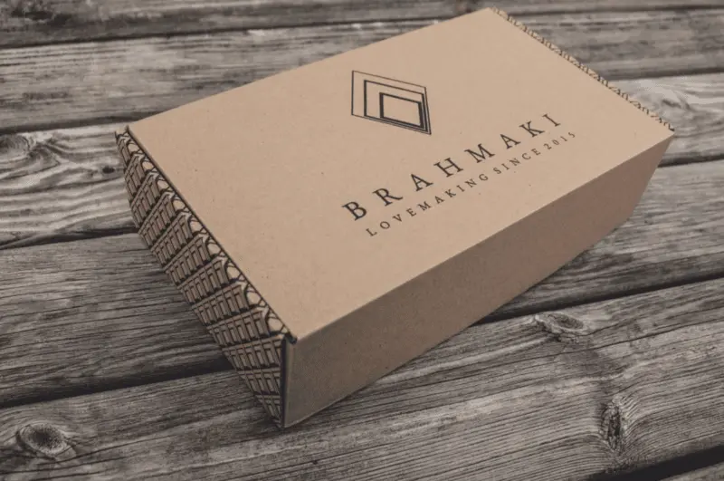
You’ll notice that at the front and center of the box is the logo, name and slogan of the company, whereas the side panels (with the vibrant and bold pattern) push your focus back to the logo and the kaftan presentation. Again, there’s no lack of continuity between the branding and the product itself, providing a consistent experience regardless of whether the customer is opening a box or shopping online.
The pinnacle of brand experience
Connecting the brand experience with the creative process and packaging design can be tough! The ideation process either flows like water or feels like getting blood from a stone. Regardless of which of those euphemisms you regularly experience, one thing is crucial — creating a consistent and unique packaging design experience empowers your brand to create more memorable customer experiences, therefore adding value to your brand overall.
