As the great Hannah Montana once said, “Everybody makes mistakes!”. Still, when it comes to your brand, some mistakes can’t be laughed off. Bad design choices can not only cause confusion among your customers, but can ultimately damage your brand’s legitimacy and cause you to lose business.
In this post, we’ll explore several of the most common design mistakes we see from brands, and explain how to avoid making them.
7 common design mistakes
Lack of white/negative space
Let’s say you’re designing a flyer for your business. You might think you need to cram in as much information as you can – you want people to know exactly what you’re all about, right? But good design is all about balance, and this line of thinking often creates designs that are way too busy.
Too much text, graphic design, or competing elements can be overwhelming and intimidating for your audience. Take old website designs like this for example:
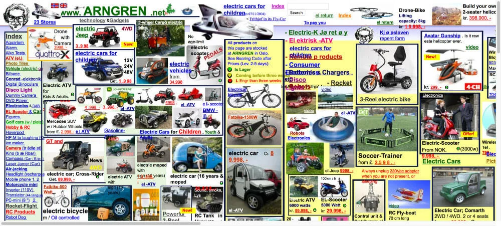
I don’t know about you, but thinking about having to navigate through all of that clutter is already making me tired.
How to avoid: Be intentional about incorporating enough negative or white space into your designs. Choose 1-2 key elements to highlight and give them plenty of space to breathe.
Inconsistency
Inconsistency in design can happen in a variety of ways, from using too many different fonts and colors, to simply not having a unified look and feel to your designs. And while it certainly doesn’t look good, the problem here goes deeper. Inconsistent design is at best annoying, and at worst confusing – and the last thing you want your customers to be is confused.
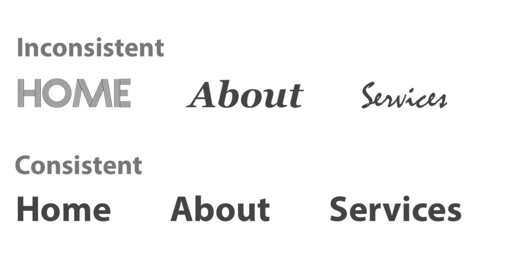
How to avoid: We’re big believers in brand consistency, and we recommend brands take the time to build out a comprehensive brand style guide before getting started on any marketing materials. Your style guide will outline exactly what fonts, color palettes, and types of imagery to use so you never have to worry about publishing something inconsistent with your brand.
Walls of text
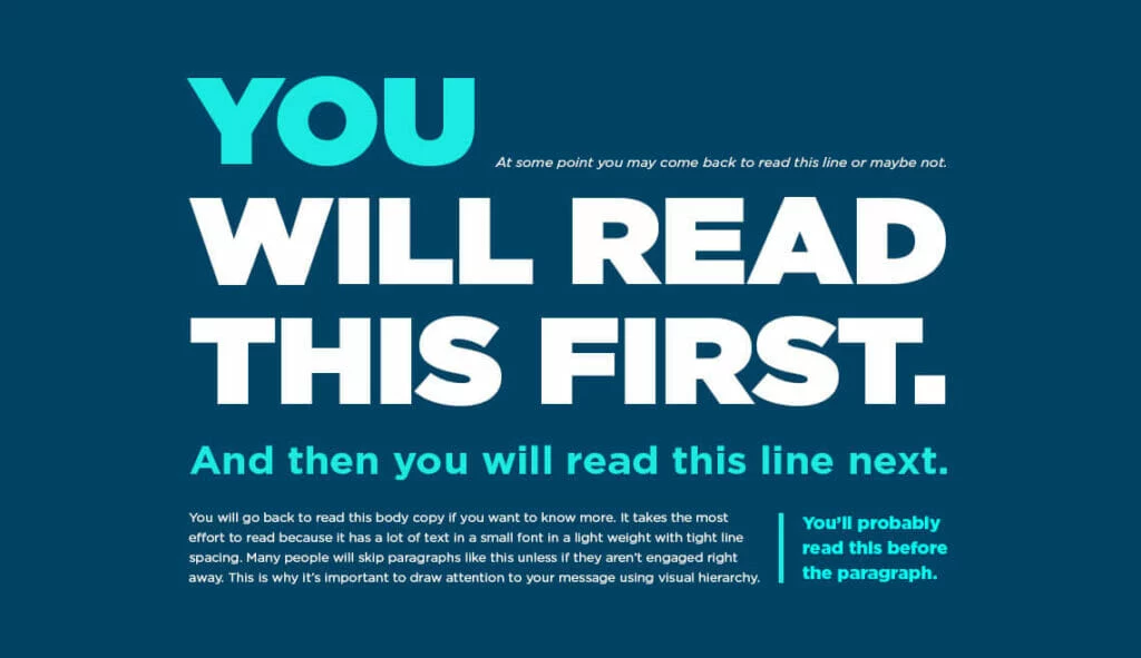
Unless you’re reading a gripping novel, no one likes having to muscle through walls of text. According to research, only 1 in 5 people actually read web content word for word. Most people skim or quickly scan to see if they want to continue looking at something in greater detail. You’ve only got a couple of seconds to hook someone – so don’t immediately turn them off with imposing blocks of text.
How to avoid: When designing with text in mind, follow the rules of visual hierarchy. This is the idea of placing your graphic or textual elements in order of importance. Let people know what to read first, second, third, and so on. Here’s a great example of visual hierarchy in action.
Low contrast
Have you ever had to squint to read something, even if you were holding it up close? That could possibly be because of low contrast. Check out the examples below:
Which is easiest to see? Definitely #1, right? That’s why whether you’re working with visual or textual elements, you want to be designing with high contrast in mind. High contrast means everyone will be able to read and understand your design.
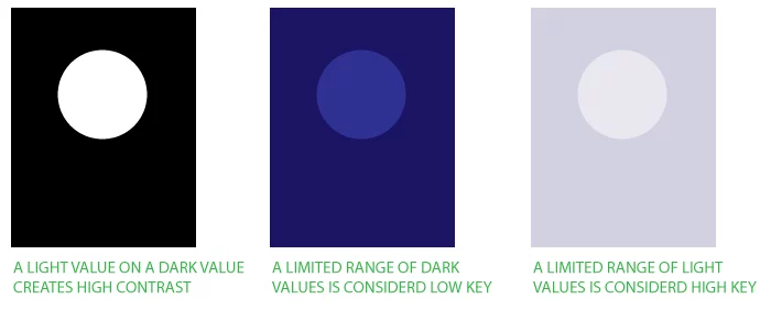
How to avoid: Double check your color palettes for contrast using this handy tool here. Anything above a 4:5:1 ratio for normal text is considered readable.
Lack of accessability
Speaking of low-contrast, let’s talk about some other common ways designs can inadvertently become inaccessible.
A few of the most common accessibility mistakes we see are:
- Forgetting about mobile design when designing for the web
- Using color alone to convey information or meaning
- Not providing stop/start controls for digital content that starts automatically, like videos, audio, carousels, etc.
How to avoid: Accessibility makes your content open and available for everyone. Familiarizing yourself with design accessibility standards can help give you a new perspective, and offer valuable tips on how to design for everyone.
Poor quality, irrelevant imagery
The pictures, images, and graphic art elements you choose to use says a lot about what you’re brand is all about, and nothing looks more unprofessional than blurry, pixelated, or irrelevant imagery.
When thinking about visual elements, make sure they make sense in the context of your overall brand or product goals. For (an extreme) example, you wouldn’t use imagery of tropical fruits and palm trees to advertise an Italian restaurant.

How to avoid: Always ensure your imagery is consistent with your brand. Then, don’t forget to use the right image format to ensure proper scalability and applicability. For example, since raster images are made up of pixels, they look pixelated when blown up. Vector images, on the other hand, can be sized however you need without becoming blurry or pixelated.
Not investing in quality software
If you want to create and publish professional-quality designs, then you need professional software. While there are many free design softwares available online today, many don’t offer the flexibility and usability that professional tools do. What’s more, many of them rely on stock images and raster graphics, which as we mentioned before, have limited utility.
How to avoid: Investing in a quality design software can drastically improve your design workflow, from allowing you to save and reuse templates, to opening up collaboration with anyone in your business. Take a look at our platform overview for more info on the kinds of features a great design platform should offer.
Key takeaway
Your designs can uplift your business – or take it downhill. Understanding the basics of good design will help you avoid the most common mistakes, and take your creativity to new heights. Want more resources on how to build a stunning brand? Check out our blog here.
