Not sure how your next fitness logo should look and want a few examples to get your imagination’s wheels in motion?
Maybe you want to see some design ideas from well-known brands in the fitness industry. Or, perhaps you’re looking for creative logo ideas that stand out from the crowd.
Related: Best logo design ideas for your inspiration
No matter whether you’re a fitness consultant, own a gym or have any other fitness business, by the end of this article, you’ll have plenty of ideas to get you started.
But, first, let’s see what makes a good fitness logo and what mistakes you should avoid.
3 fundamental rules to create a fitness logo people will remember
1. Make sure your logo doesn’t communicate the wrong message
Every aspect of your future fitness logo will evoke an emotion, from the colors to the fonts and shapes you choose.
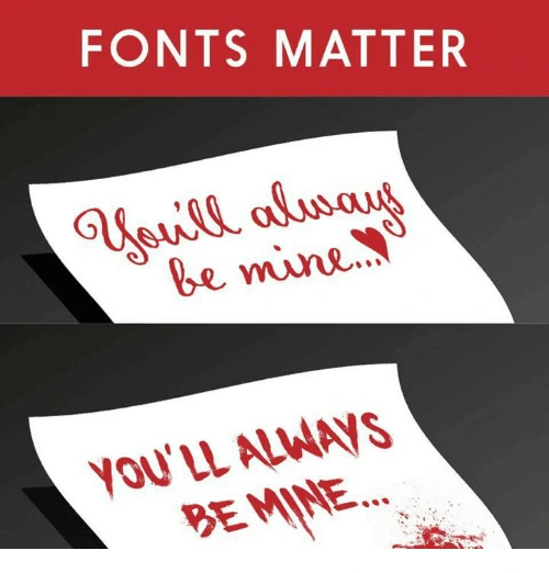
This is why you have to be careful about the first impression your visual identity makes.
For instance, a dark, sober color isn’t something you might want for a fitness logo if you’re also helping people keep a balanced, fresh and healthy diet.
2. Keep your logo simple and clean
Ideally, your logo should tell a story. Maybe the origins or the philosophy of your brand. Or, maybe just your unique selling proposition.
This doesn’t mean you have to overcrowd your logo with all kinds of elements in order for people to get your message. When you try to convey too much in a single logo, it comes overly complex and difficult to recognize and replicate.

3. Avoid using outdated design trends
Imagine someone hands you a business card with a logo that looks like this:

What’s your first impression? Other than nostalgia, probably not a good one, right?
Of course, you don’t have to update your logo every time a new design trend comes along. Just make sure your logo doesn’t look like it’s stuck in the ’90s.
These are three critical aspects you should take into account when creating a logo. Now, let’s dive into our pool of fitness logo ideas and see what you can learn from each one of them.
Fitness logo design ideas for your inspiration
When you have too many ideas, just stick to the basics, even if it’s cliché
Sometimes we spend too much time brainstorming and browsing through thousands of logo ideas just to find that “perfect one.”
And, too often, the result is a complicated design that few will remember.
When this is the case, it’s better to stick to something classic that anyone can recognize as a fitness business.
Plus, you have the advantage that most free logo makers have these elements in their gallery so you won’t have to customize your design too much.
Source: GLDesigns
If you want to be compelling, point out something your audience wants
What’s that number-one thing your audience wants? Point it out, and people will remember you as that gym or that fitness instructor or that nutritionist who can help them get it.
Notice how, in a second, you know this fitness business can help you just by looking at their logo. Then, note how it brings us nicely to our next point…

Source: 99designs
Make sure your fitness logo doesn’t drive away parts of your audience
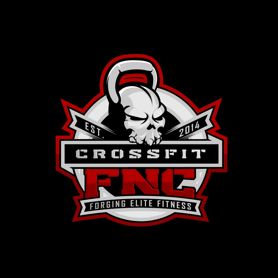
Let’s say you’re a fitness trainer, and you chose the logo below to represent your business.
Source: Design your way
It’s great for people who are looking for hardcore training. But, there are lots of people who just want to stay in shape. Your logo might tell them that you’re not a good fit for them.
Of course, if your ideal audience is into hardcore training, this could be a great strategic move. What’s important is for you to think through these considerations before you make your final decision. For example, take a look at our next point.
Make sure your logo isn’t limiting future expansion of your fitness business
Let’s say that you start out as a yoga fitness trainer, but you plan to grow your business beyond the yoga niche.

Unless you go through a complete rebranding, your logo will limit the growth of your business.
When you’re looking for design inspiration for your logo, make sure you also take into account any future plans. If you can spot them now, ahead of time, you’ll save yourself an expensive and time-consuming rebrand in the future.
Use a well-known symbol
Sometimes keeping a logo simple and clean can be most effective at showing what your brand is about.

Source: Lucidpress
Incorporate a top benefit into a classic fitness logo design
In logo design, it’s efficient to incorporate an element that people can easily recognize, such as a gear or muscles if you’re in the fitness business.
But, these elements are also a bit overused, and you might want something more creative for your logo.
Well, why not incorporate additional benefits that your brand has to offer—such as good music, for example. Now people have two reasons to choose you over the competition instead of one.

Source: Design your way
Your fitness logo doesn’t necessarily have to be related to fitness
Apple’s logo has nothing to do with phones. Nike’s logo doesn’t represent shoes, clothes or sports gear. Subway doesn’t have a sandwich in their logo.
Your fitness logo doesn’t have to be related to muscles, fit bodies or any kind of elements related to sports. It could be something as simple as two shapes that convey motion.

Source: Design your way
Use a color combination that stands out
Even if you don’t have a super creative logo layered with hidden meaning, you can still stand out from the crowd by using a powerful color combination.
Take Google, for example, or FedEx. Or, this fitness logo below.
Source: Logojoy
Think about all the different ways you’ll use your logo
A highly detailed concept might look great on a large banner.

Source: 99designs
But, how would this logo look on a small business card? Would it be as effective?
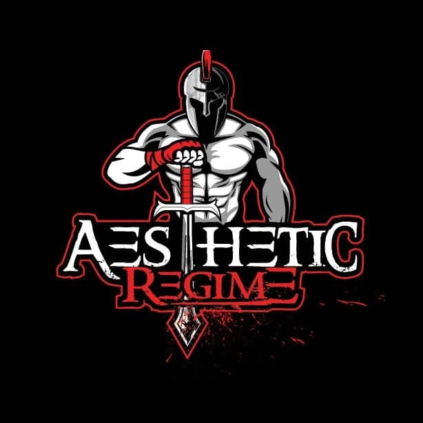
Suddenly, all those details become so small that people can’t recognize them.
Before you finalize your logo design, make sure you test it in all the different scenarios you know you’re going to use it.
Try to include a special meaning behind your logo
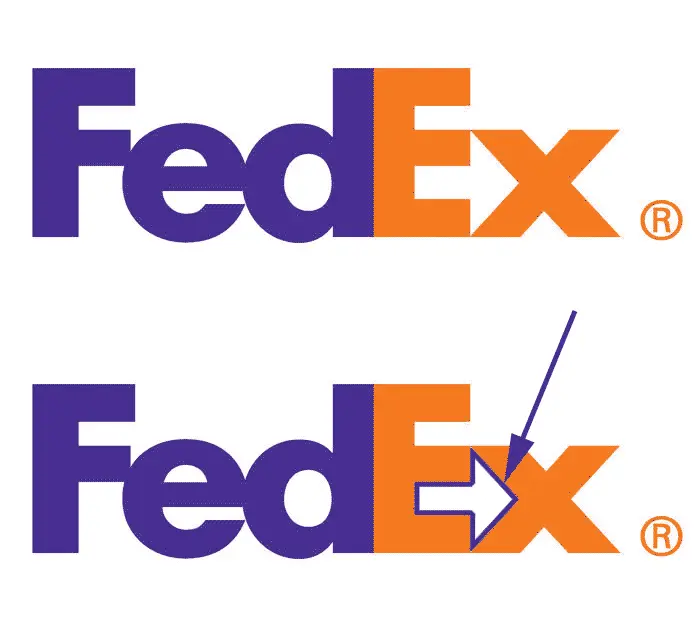
Let’s review a classic example for this one. FedEx uses negative space to hide an arrow that subliminally conveys speed and accuracy.
Source: Pixellogo
You, too, can use different elements in a clever way to give your logo a double meaning. For instance, here’s a clever way to incorporate the infinity symbol as a yoga fitness instructor.

Source: BrandCrowd
Incorporate a sense of motion
As a species, we seem wired to detect motion, thanks to our neural underpinnings.
And since motion is a key aspect of your business, why not include it in your fitness logo? A dynamic design attracts attention and motivates people to get more active.

Source: Design your way
Before you create your next fitness logo, do this
If you want your next logo to be something creative or to have a special meaning, you first have to understand your brand’s identity. What is the most important message you want your business to communicate?
Only after you answer this crucial question can you start looking for ideas for your next fitness logo. Otherwise, you might find some good inspiration, but it won’t represent your business. So, take your time and do your research—then try out a few ideas.
