Choosing the right newsletter design isn’t easy. There’s a seemingly infinite number of designs out there, each with their own strengths and weaknesses. (And in many cases, more weaknesses than strengths.) Finding the right colors, shapes, text formats and image placements can take up a huge amount of time.
But with these professionally designed newsletter templates, all you need to worry about is customizing. The designs are already in place, suggested color palettes chosen, and even some images added (though adding your own is recommended).
Related: How to make a newsletter in 9 steps
Newsletter design tips
There’s a few principles to keep in mind as you concoct your newsletter, even if you start with a pre-existing template. Though, in the end, you’ll have a fantastic-looking newsletter in less time than it will take to find a template from Microsoft Word or Publisher. Your readers will thank you. Also, it’s worth noting that we’ve organized this blog post based on newsletter type — i.e., newsletters for schools, businesses, holidays, digital and more.
Consider the layout type
As in — do you want your newsletter to be: fixed, fluid, responsive or adaptive? To avoid overwhelming you with information (and empowering you to learn on your own terms), we recommend checking out UX Alpaca’s article on layout types.
Grab attention with a header
Let your header do the talking for you. Your header should do one of two things (or both): First, it should draw the reader in. Copy can be witty and sharp, or directly address a pain point you know they have. Either way, you need to grab their attention and endeavor them to keep reading. Without telling them to keep reading. 2.) You need to say something. There’s an approach to copywriting that can be best summarized as “Say it straight, then say it great.” But whatever you do, it has to say something of substance.
Let your body copy do the ‘splainin
Remember: Your header doesn’t have to carry the weight of your newsletter — body copy can come in with the assist. The body copy is where important information should live. How you choose to present that is up to you, but keep in mind that big walls of words can be overwhelming for readers, so we recommend keeping the information as scannable as possible.
Add relevant links where it’s appropriate
The devil is in the details, right? Be sure to include links to webinars, listings, school flyers and more. If you want people to show up, you gotta give them a reason to show up! Or whatever.
Newsletters for schools
Skyline High classroom newsletter template
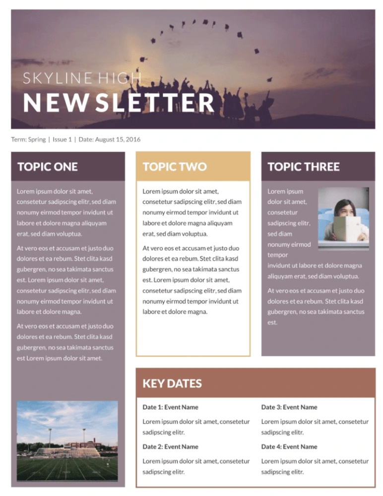
This classroom newsletter template stands out from the rest with muted colors, an inspiring header image, and lots of room to share your message. Whether you’re simply giving updates on what’s happening or sharing important news about conferences, exams or standardized testing, your message will come across loud and clear.
Blossoms school newsletter template
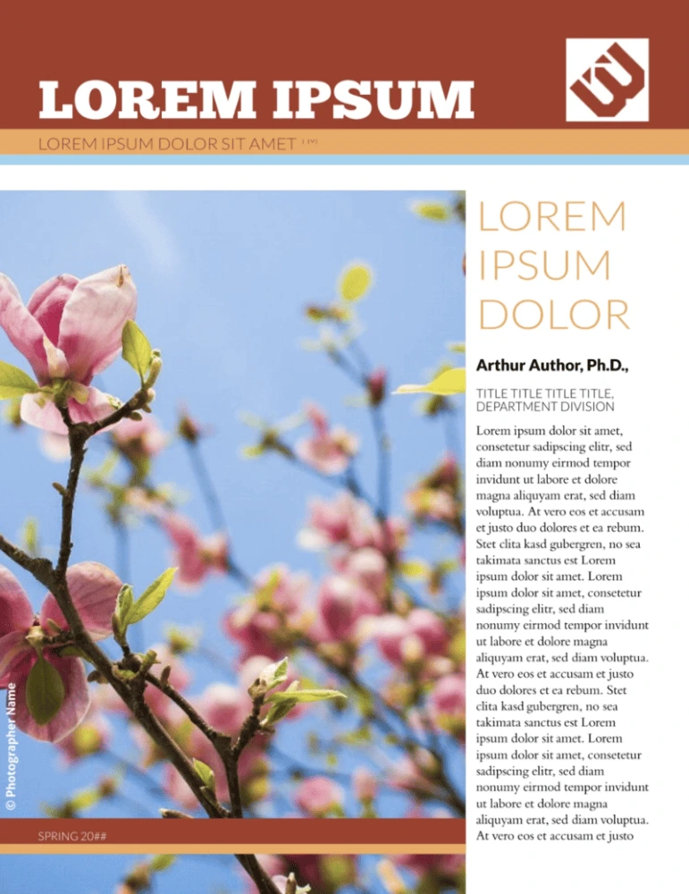
Flowers are perfect for school newsletters: they imply growth, potential, purpose, and they lend a positive, happy feeling to everything. Just add your school’s logo, the content of your newsletter and a few custom images, and you have a newsletter that parents will want to read.
Newsletters for business
City events newsletter template
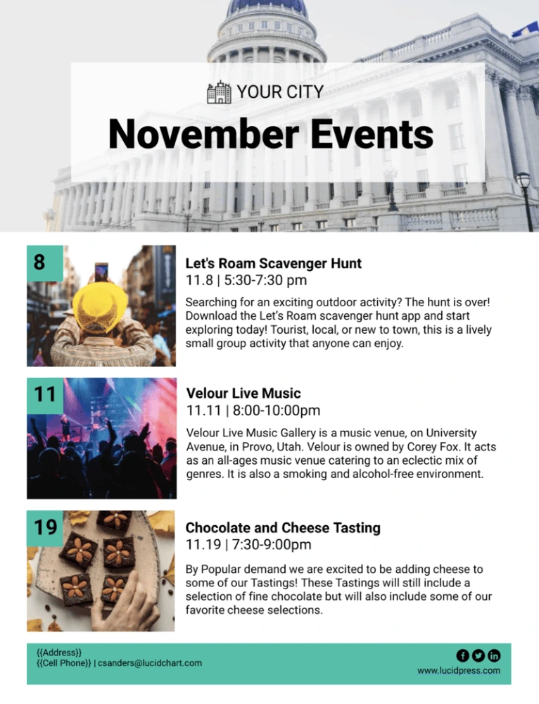
Keep your community apprised of upcoming events — both virtual or in-person — with the city events newsletter template. Insert photos from previous events (as well as your own city hall building or town committee) — or use stock images if you need to — and leverage the ample writing space to communicate with others about changes in local regulations, upcoming town halls and more.
Polaroid real estate newsletter template
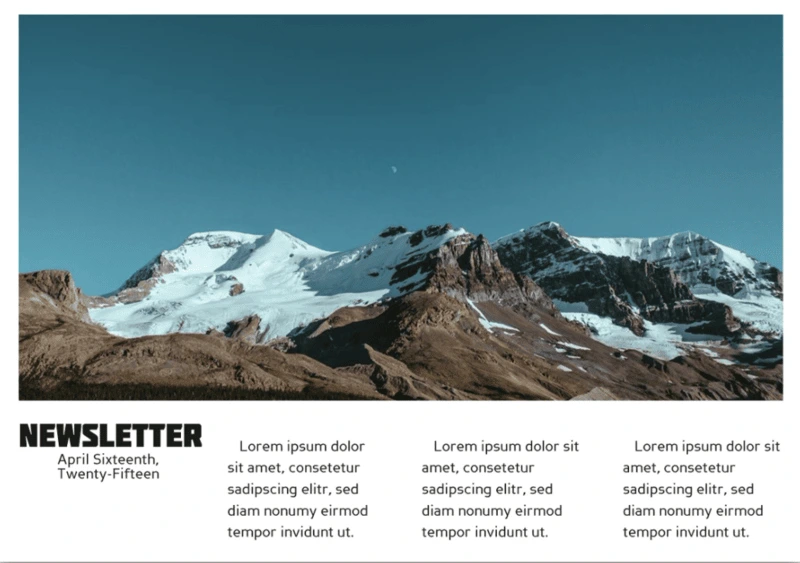
Real estate is all about pictures, and this newsletter template captures that feeling perfectly. The iconic rectangular format gives you tons of room to show off your best properties, and choosing a scrollable digital format allows for all the text you need to describe it. Optional blocks of color help your newsletter stand out from the rest, too.
Merge financial business newsletter template
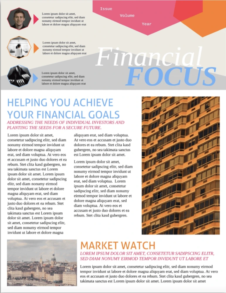
The time of boring business newsletters is over. Modern companies need to grab readers’ attention with bold colors, interesting shapes and arresting images. This financial business newsletter design has all of those ingredients in spades. The newspaper-style columns let you share different stories or ideas, and the header is great for recurring newsletters with featured authors.
Black Widow company newsletter template
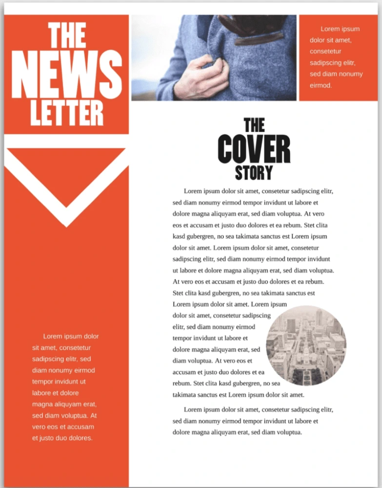
Company newsletters are often bright and airy or monochromatic and, well… boring. But this template finds a balance with bold red accents, striking blocks of black, and plenty of whitespace to make reading easy. Add images to spice things up a bit, and you have yourself a professional — but unique — newsletter template.
Citrus Splash employee newsletter template
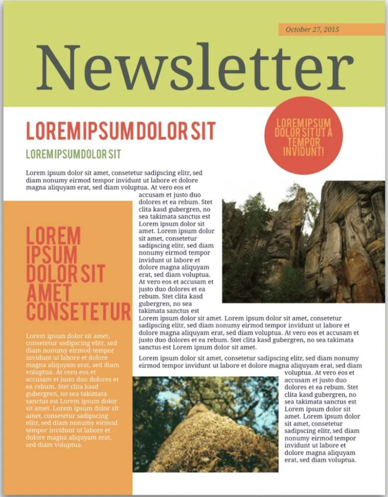
Employee newsletters have a reputation for being rather boring—and that starts with the template. Don’t settle for bland colors and cheesy iconography! This template is full of bright colors that immediately set a positive tone for your newsletter. Whether you’re in a tropical climate or a temperate one, your employees’ days will be brightened by it.
Angles company newsletter template
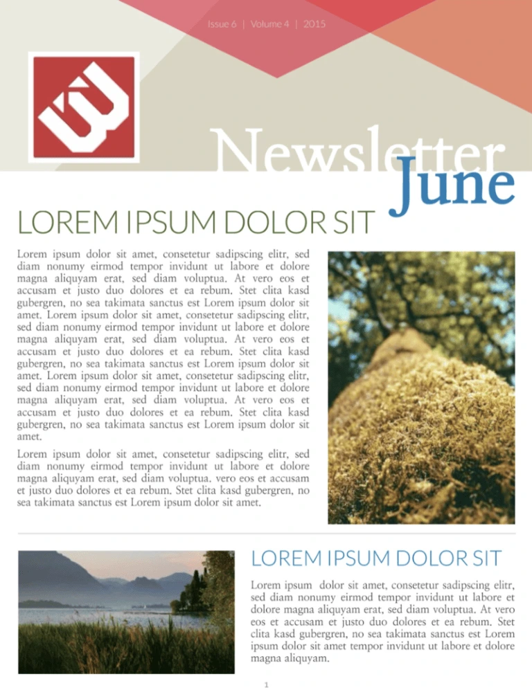
There’s something dynamic about angles in bold colors—and this newsletter template takes full advantage. A combination of bright and calm tones adds even more energy to the template. If your company is pushing forward, the vitality in this template will fit it perfectly. Plenty of room for images and multiple text sections make it as useful as it is engaging.
Bold business newsletter template
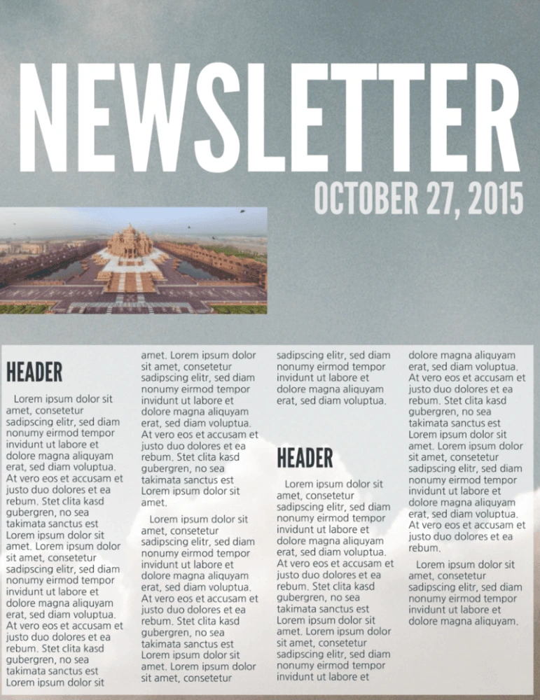
Business newsletters are so often really boring, but with big attention-grabbing text, this template will help you grab your readers’ attention. It’s not all flash, though—there’s plenty of room for the headlines and text you need to share important information with customers, colleagues, shareholders, and anyone else interested in your business.
Corporate business newsletter template
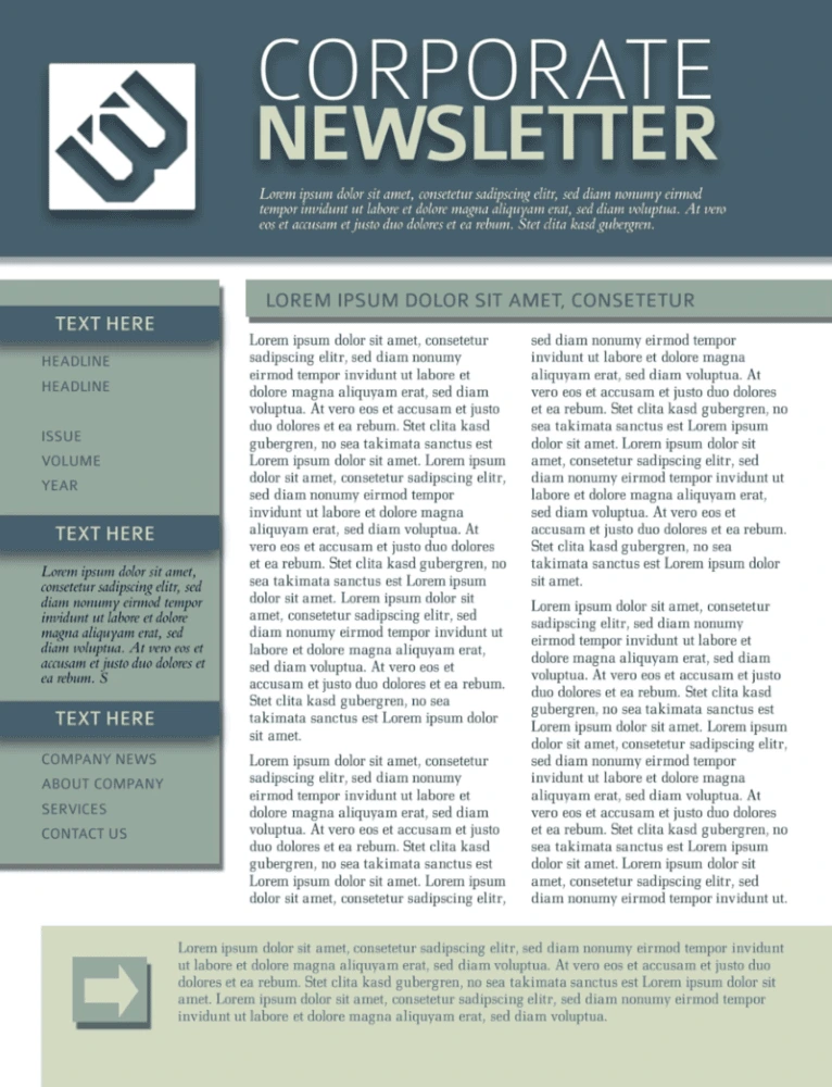
We know that not every company wants lots of bright colors in their newsletter template. But that doesn’t mean it has to be boring. This template uses a cool, muted palette to maintain a professional look. The professional design, room for images, and well-laid-out pages ensure that your newsletter shares information effectively while maintaining the tone you’re looking for.
Holiday newsletters
Holiday Christmas newsletter template
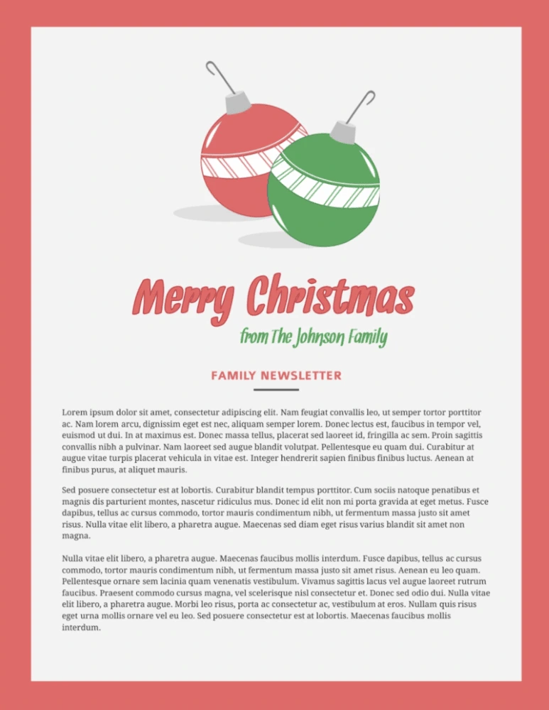
There are tons of Christmas newsletter designs out there, but most of them look the same: full of too many snowflakes, baubles and presents. They’re distracting and, frankly, a bit tacky. This Christmas newsletter keeps things simple with seasonal colors, clean layouts, and just a few ornaments.
Photo Christmas newsletter template
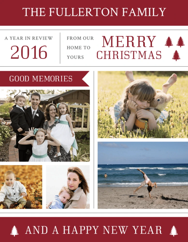
Spread some holiday cheer with the photo Christmas newsletter template. Just pop any of the year’s recent photo sessions (both impromptu and professional) into the layout, and be prepared to warm friends’ and families’ hearts from afar.
Digital and email newsletters
Restaurant email newsletter template
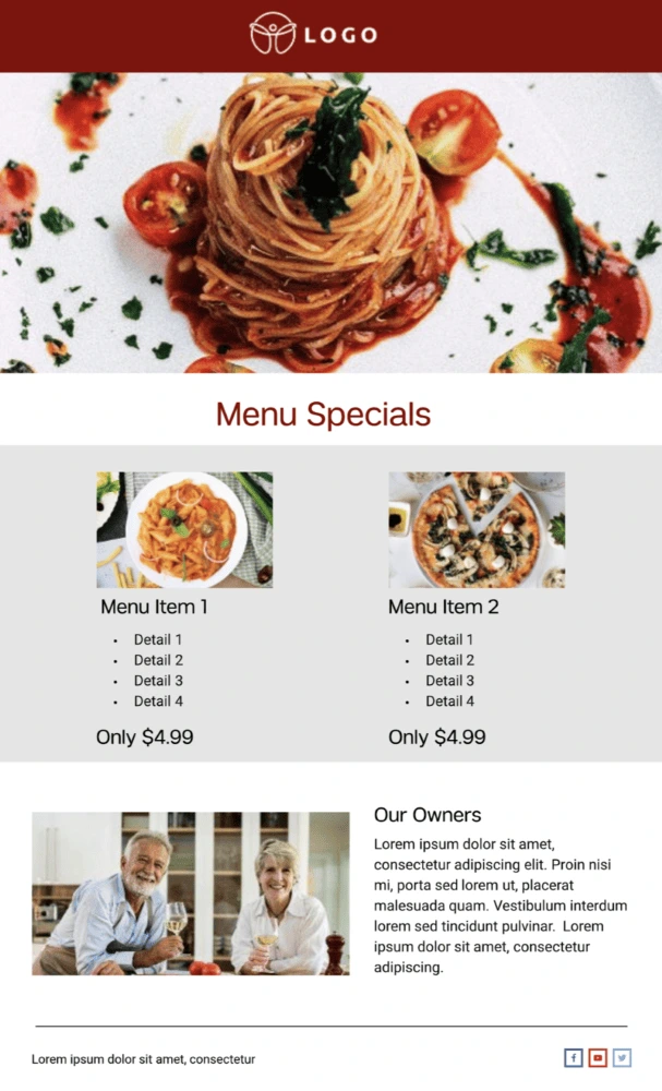
The restaurant email newsletter template is :chef’s kiss: — Highlight your restaurant and the staff that make everything possible with this easy-to-customize template. You can easily communicate any upcoming closures, events or changes in menu. Or you can simply give folks a mouth-watering reason to come back with a coupon or friendly reminder about your hours.
Conference email newsletter template
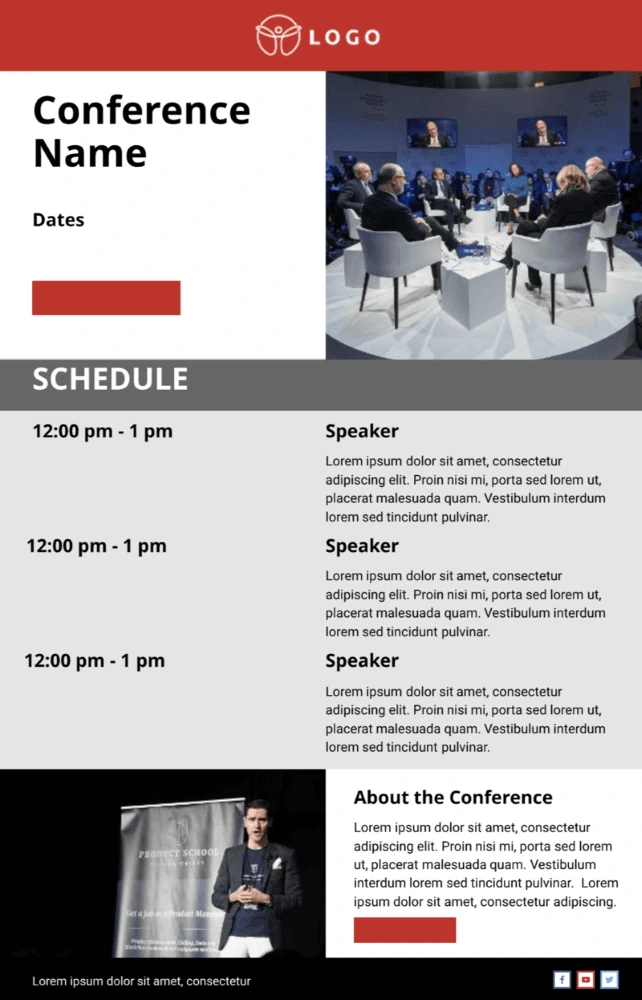
When it comes to attending conferences, attendees need you to get straight to the point — there’s no need for fancy, floral language or walls of text. Give the people what they need with the conference email newsletter template. The simplicity of this newsletter empowers you to cut to the chase, therefore keeping the agenda and end goals clear and concise.
Real estate email newsletter template
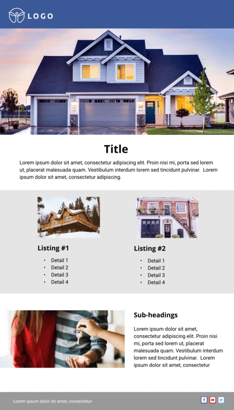
Need an easy way to keep clients, brokers and fellow agents up-to-date with the fast-moving market? Look no further than the real estate email newsletter template. Customize the images based on the MLS listing, along with any noteworthy callouts in the copy sections.
Data email newsletter template
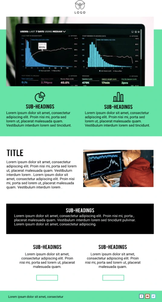
Highlight important wins, transformations in ROI or dips in sales performance with the data email newsletter template. Whatever numerical information you need to present, this newsletter helps you compile the information in an orderly and easy-to-digest format. And if you need to send the newsletter out monthly, all you have to do is make a copy of the doc and you’re off to the races!
Business email newsletter template
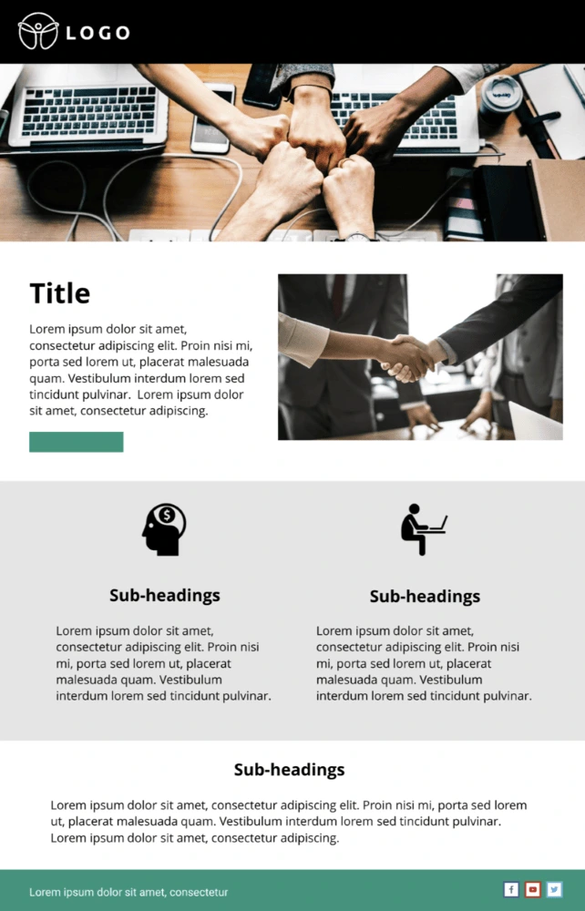
Regardless of what arena or industry you’re in, keep your business top of mind with the business email newsletter template. Whether you’re looking to periodically update board members, customers or even fellow colleagues, this easy-to-customize newsletter template.
Terra Cotta digital newsletter template
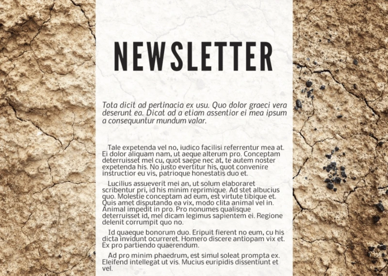
Digital newsletter designs don’t have the same requirements as print ones—they can be more image-based, use different colors, even include scrolling effects. This template allows for a wide variety of designs, all of which capitalize on ample space for powerful images. Combined with clear text and the ability to add your own images and videos, you can share any information you want in a clear, visually appealing package.
Orbital digital newsletter template
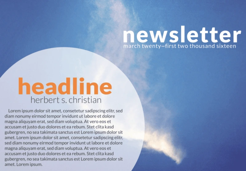
This template is all about creating the right feel with a big, powerful image. Whether you use one of our images or upload your own, you’ll be setting the tone for your entire newsletter. It could be inspirational, topical, or just an image that speaks to you. And because this digital template has room for scrolling text, you can include as much information as you want. That makes it one of the most flexible and versatile templates out there.
Textual e-newsletter template
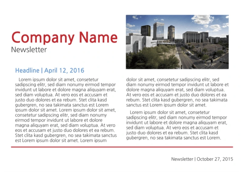
It’s easy to get carried away with images, photos, links, and other distracting things when you’re building an e-newsletter. It’s important to remember that your main goal is to share information in an easy-to-read manner. The clear fonts and white background of this template let you do that without over-complicating things. Sometimes simple really is better.
Be a memorable point of contact
A newsletter is an important point of contact. Whether you’re designing one for a school, a business, another type of organization, or just for your family and friends, you want it to reflect your message. These designs give you a wide variety of looks to do just that
So, what are you waiting for? Find a template that fits the feeling you’re going for, customize it in a few minutes with your own photos and colors, and get your message out there in style.
