Back in older days, your name, address and contact details at the top-right of your client correspondence constituted a letterhead. Today, letterheads have become a visual art, delivering a first impression of who you are, what you do, and why you do it.
Take a flight of fancy and imagine your letterhead as sort of a haiku for your brand. For instance, are you a fast-moving tech startup or a dependable financial services provider? Are you a freelance nature photographer, or do you sell vintage clothing online? Your letterhead should creatively reflect that brand identity.
Related: The 7 key elements of brand identity design
Today, letterhead is no longer just a printed heading on stationery; it’s the look and feel of the entire page. Sometimes letterheads are, as we’ll see, really “letterfooters”—and they’re just one element of your brand stationery, from business cards to envelopes.
3 keys to designing great letterhead
The keys to making a great letterhead are:
- A well-designed logo. In the examples below, you’ll notice how a strong logo makes each letterhead design compelling and unique.
- Solid brand framework. Your design should reflect who you are, not who your designer is. From colors to layout design, your brand personality should be evident in every element.
- Document consistency. Keep your marketing materials consistent. Your templates should be tamper-proof to prevent logo stretching, rogue fonts and clashing colors.
Before we present our visual smorgasbord of design ideas, let’s review some quick tips on how to preserve brand consistency while creating letterhead, and how Lucidpress can help you simplify the process.
Already know what you want and don’t want to be sidetracked by other designs? Dive in right here with Lucidpress’s free online letterhead maker.
14 creative examples that’ll change how you think about letterhead
Fill up that white space
If a stark white page feels too plain, adding a background image can provide some much-needed visual interest. Just make sure your design contains enough contrast so the text remains easy to read.
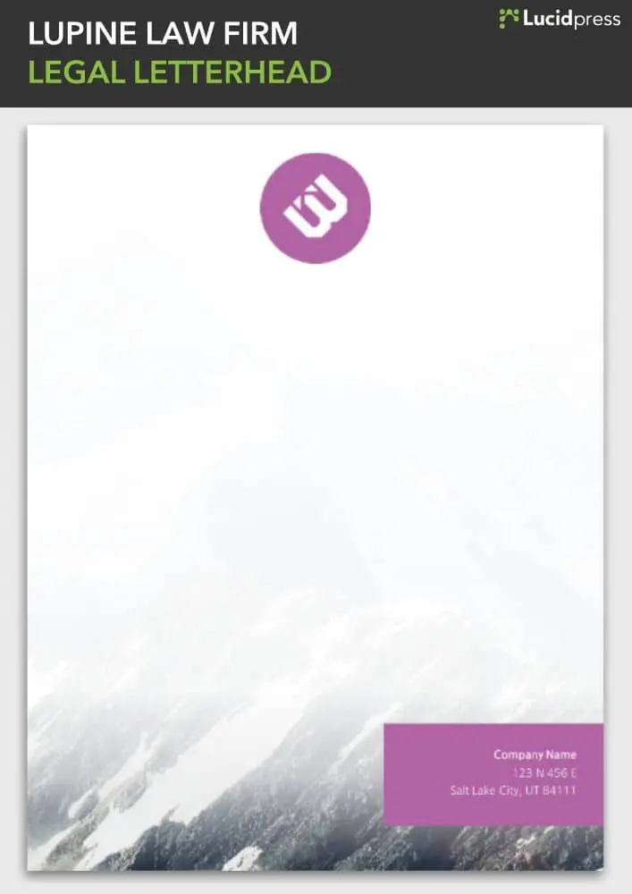
Source: Lucidpress
Color me beautiful
Color can breathe new life into most simple free templates you can download on the internet. And no, you don’t really need to worry about web-safe colors these days.
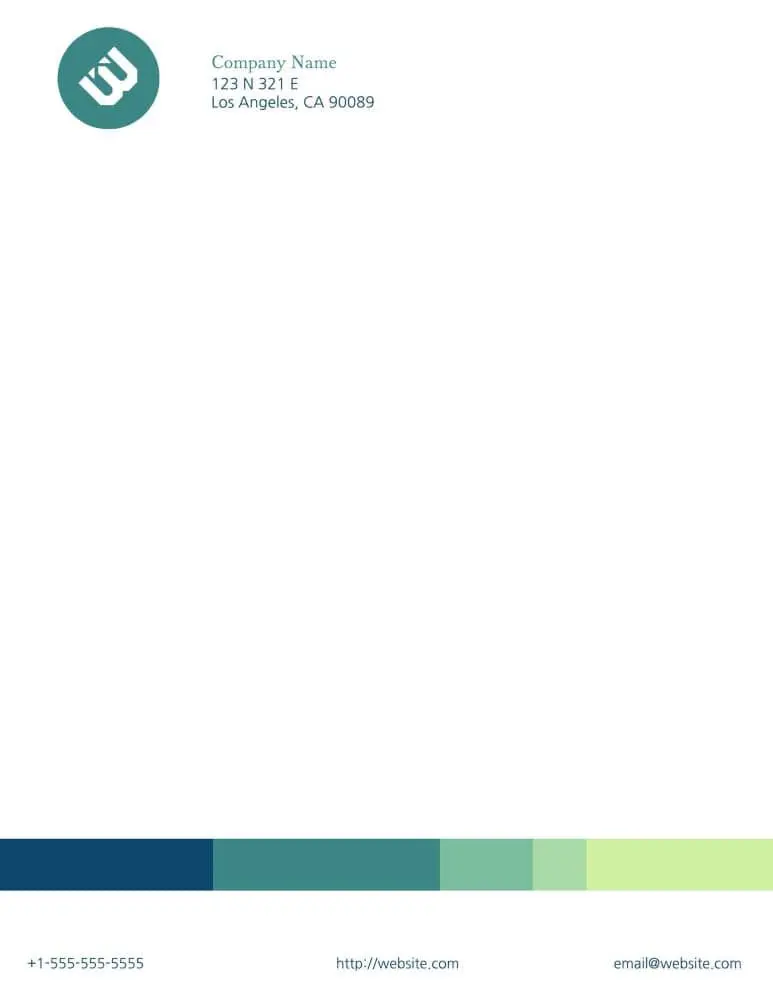
Source: Lucidpress
Zebra crossing
On a printing budget? You don’t need to go into the red (ha) with black-and-white designs. In Lucidpress, it’s easy to create layers with elements. In this example, the logo (top layer) would live on top of the background (bottom layer) so it’s easy to drag & drop your logo anywhere on the page.
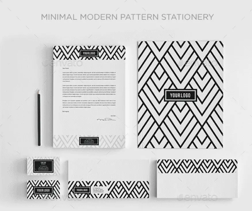
Source: Envato
Moving elements
The letterhead design police will not penalize you for moving the position of your contact details, or of anything else. It’s your party, so dance how you want to!
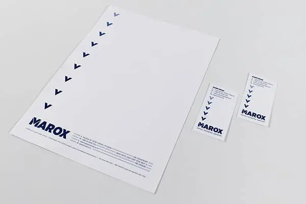
Source: CIPMANN
The spirit of the season
Why stick to the same letterhead all year ’round when you can get a little fun and festive around the holidays? Bring a smile to your recipients’ faces with a taste of the unexpected.
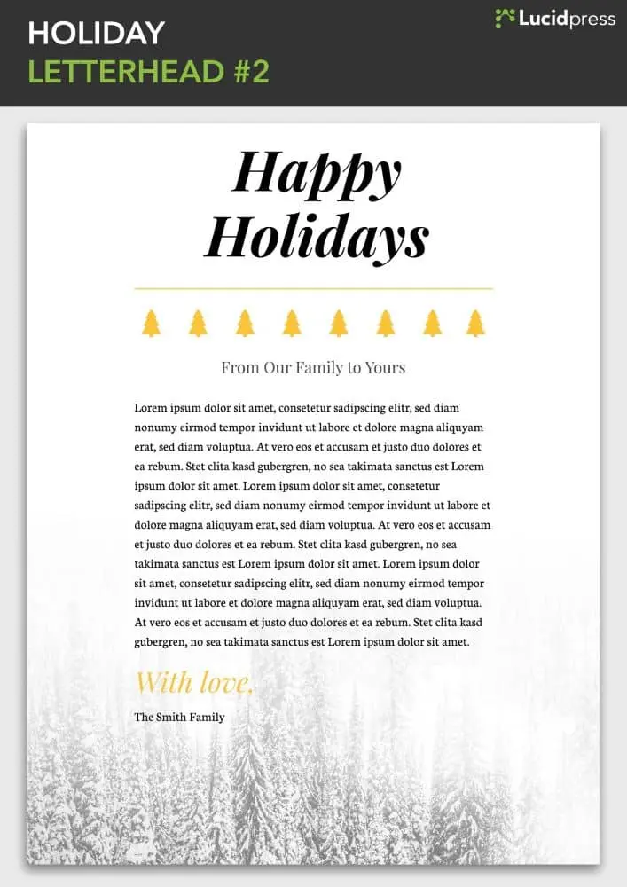
Source: Lucidpress
A picture says a thousand words
Don’t have a logo yet? All is not lost. Use free graphics and images to visually describe your products and services until you have a custom-made logo of your own.
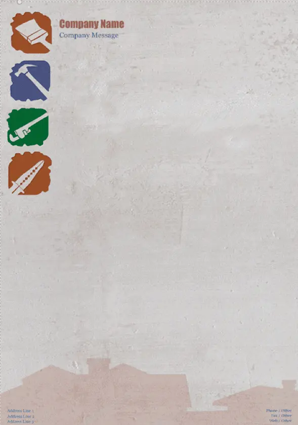
Source: Vistaprint
Fortune 500
Be inspired by the greats of graphic design. Turns out you don’t have to be a big brand to look like one.
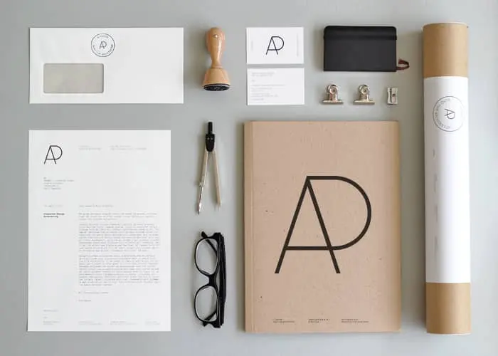
Source: YAGWYD
Turn branding on its head
The significance of lines and shapes in logo design make it both an art and a science. When done correctly, your brand can deliver surprising style while still being completely recognizable.
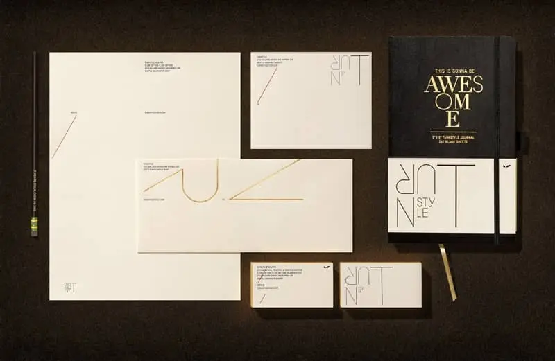
Source: Turnstyle
Stylish & eye-catching
Nearly 93% of people say a product’s visual components are the most influential factor in making their purchasing decisions. Use this to your advantage with a striking color palette and close attention to detail.
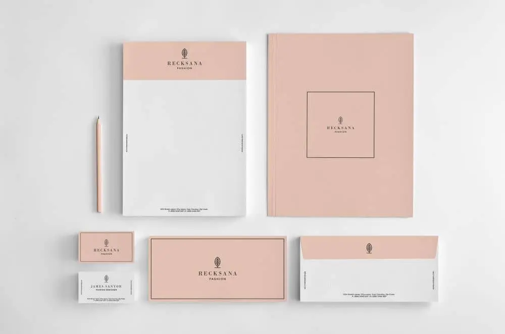
Source: Graphicsegg
A complete visual identity
When you design your logo, make sure it fits on all your marketing collateral, from brochures to business cards. Don’t be afraid to play around with your color palette to create a diverse and visually interesting library of templates.
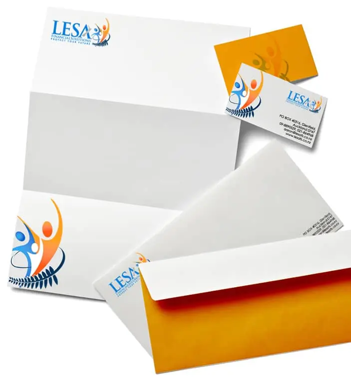
Source: Logo Design India
Contemporary & artistic
Beautiful photography can elevate your brand identity from sufficient to stunning. Why not splurge on a professional photo session to make your letterhead truly one-of-a-kind?
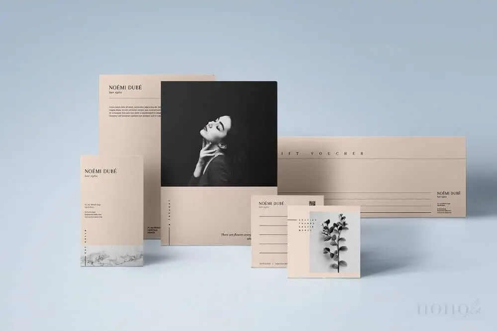
Source: Nonola
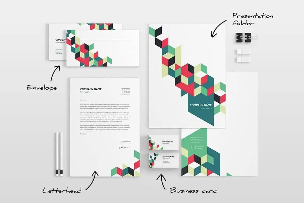
Modern & funky
Your imagery should use a theme, but it doesn’t always have to be precise—just recognizably your brand. Play around with how and where you place your design elements to create different templates.
Source: ID Vision Studio
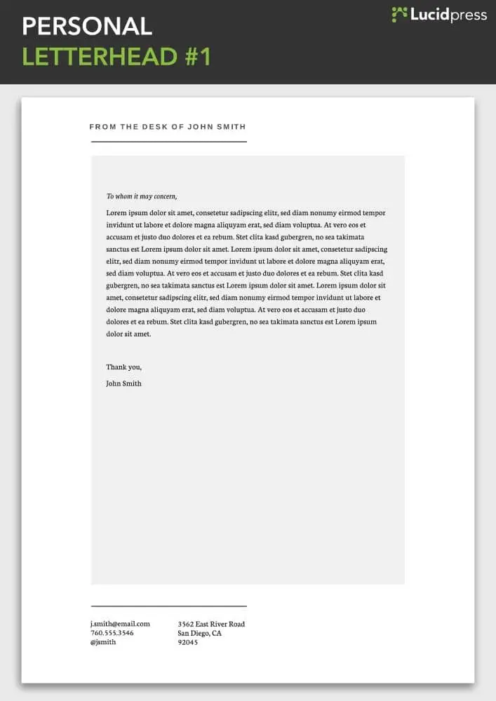
Keeping it simple
Letterhead doesn’t have to be fancy or ornate. If you find most designs too distracting, take it back to basics with a clean and simple letterhead like this one.
Source: Lucidpress
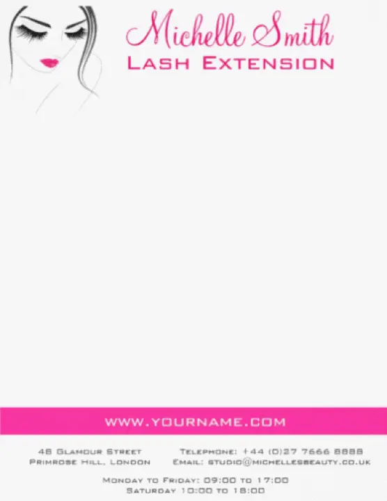
Small business savvy
This letterhead, unusually but effectively, includes important information about the business—including its opening hours. It’s a great way to remind local clients when and where to find you.
Source: Colorshop
Answering the 5 W’s
An effective letterhead serves as your calling card—both business communication and brand identity design rolled into one. Here are some questions you should consider before you start designing.
Who? Who are the targets of your correspondence—e.g. new clients, colleagues, investors—and what information needs to be included? (Read more on how to imagine your target audience here.)
What? On the internet, many brands omit contact details and opt to use contact forms instead. If you don’t want customers to phone you directly, it might be easier to include a website link or QR code to a contact form in your letterhead design. In Lucidpress, it’s easy to add links via shapes, images and text.
When? For what occasions will you use this stationery? For example, is it for sending out debt collection notices or to announce the winners of a competition? In the first instance, a bright, cheery letterhead could understandably get on customers’ nerves—the message will be clear that this is a standard form letter sent without a moment’s thought about who it’s going to and why. Additionally, how do you intend to distribute your correspondence: in digital, print or both? Lucidpress supports both RGB (ideal for digital) and CMYK (optimal for print) color profiles. This is key to making sure your brand colors appear consistent across the board.
Where? Two questions here: Where do you store your business collateral, and who is allowed to change it? Lucidpress uses advanced template locking so you have the flexibility of adapting your designs when necessary but limiting the privilege to admin users. You can also lock down important elements like logos, fonts & sizes. That way, you can give edit access to whoever needs it—like sales agents—safe in the knowledge that they can update the text without altering or ruining the brand assets.
Why? One of the first mistakes brands make while designing letterhead is including redundant information. Invariably, your stationery will be used for different purposes. For instance, it’s unnecessary to include your company’s address on internal memos. And if you have international clients, you may want to design a letterhead that accommodates more than one language—or even design letterheads for each one. Lucidpress supports the full gamut of branded collateral, from letterheads to business cards and brochures to newsletters. Simply clone your template and update it any way you like. For more ideas, the University of Waterloo provides some great examples of how to customize a letterhead for different uses.
Wrapping up
Follow these tips and, with a little inspiration, you should end up with a beautifully professional letterhead that represents your brand. Graphically challenged or on a deadline? If you’re really stuck, simply grab one of our professional, easy-to-use letterhead examples. Our designers have crafted these letterhead templates with care and expertise, so you don’t have to start from scratch. Just add your logo and text details, select your brand colors, and make any other edits you desire with intuitive drag-and-drop tools. It really is that easy to design a new letterhead that you’ll love!
