Thanks to the internet, it’s easier than ever design a beautiful digital or print magazine. No matter your niche, there are plenty of layouts and brand templates that can help get you started. In this resource, we’ll take you through some of our favorite magazine design and layout ideas to help you put your own special touch on your creation.
How to design a magazine layout
There are four core graphic design principles that will ultimately help guide your magazine layout design.
- Hierarchy — How people read or consume the information, i.e., what’s most important? What are the key takeaways here? And how do you showcase that? You want this information to be visible right out the gate.
- Purpose — Why should your audience care about reading this? What’s the point of your magazine? Is it something that needs to be communicated visually or through words?
- Readability — How easy is your magazine to read and understand? Are you pairing poetry with images, or are you articulating EOY program goals for a non-profit? Either way, your choice in communication and end goal needs to be clear.
- Balance —Chaos can be art, but it’s not always beautiful or helpful when it comes to graphic design. You want to strike a balance between cluttered and sparse.
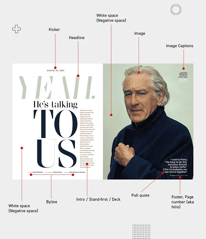
Image from Yes I’m a Designer, by Kevin Fay
In the image above, you’ll see various callouts for certain design elements — keep in mind, each of the design elements serve a specific purpose, whether it’s to help break up a wall of text, or illustrate a point with images.
Now, let’s dive into some more magazine design and layout examples!
Magazine design inspiration
If you want to create a sharp, eye-catching magazine that balances important information about your brand with spot-on graphic design, we’ve got plenty of inspiration for you.
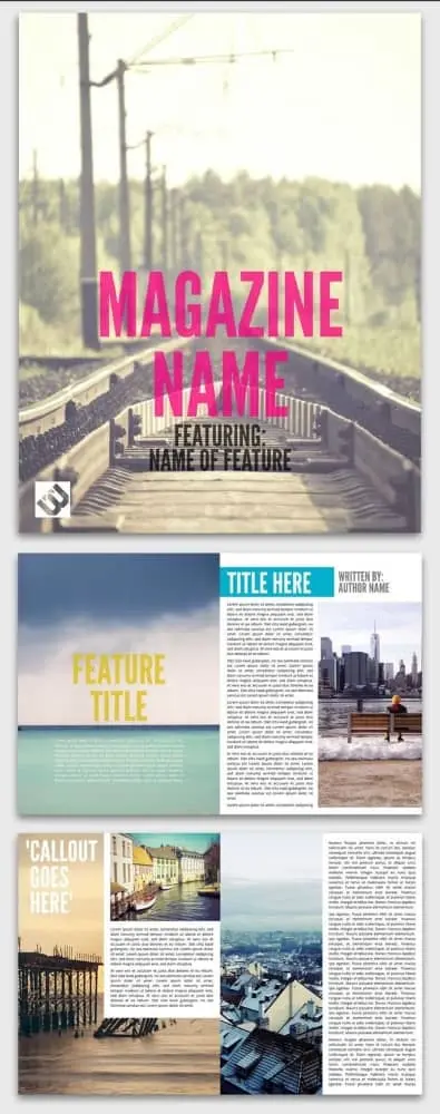
1. Adventure Digital Magazine
If your magazine features immersive photography, your magazine design and layout should give more weight to imagery than words. The layout of this Adventure digital magazine template will help you put your photos front and center while balancing them with sections of text. And, as a digital magazine, this template gives you the bonus option of scrolling text, meaning you can include long-form content without taking space away from imagery.
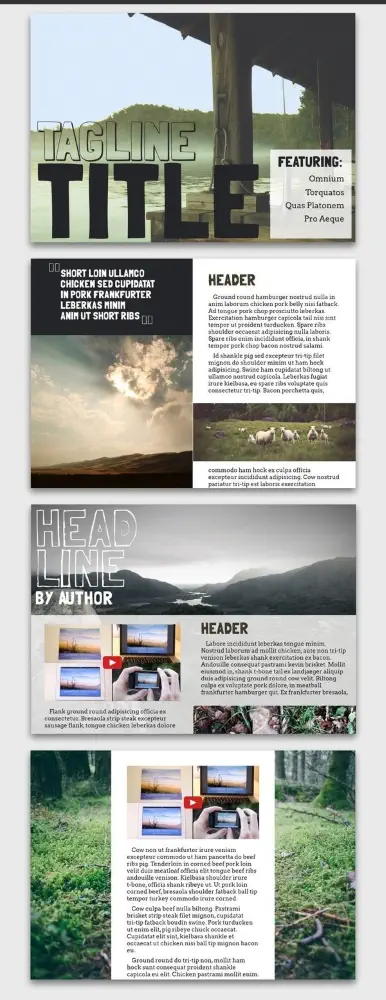
2. Aficionado e-Magazine
Traditional publications tend to avoid using a horizontal magazine layout because it can be unwieldy to (physically) hold. But as tablets and e-readers become more common, we’ve noticed that designers are revisiting the concept. This Aficionado e-magazine template is a great jumping-off point for magazine design inspiration, and offers some great ideas for orienting pages horizontally. For instance — the columns alone offer a variety of graphic design capabilities:
- Split the page in half
- Be weighted more towards one side
- Skipped altogether in favor of rich photography and breathable white space
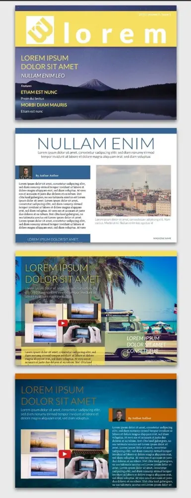
3. Azure Magazine
What’s great about the Azure magazine design and layout is how well it lends itself to color customization. Thanks to its blocky columns and bold fonts, it would be easy to read with a variety of color combos (but don’t forget to choose high contrast colors for text and backgrounds). For brands with strong, recognizeable color palettes, it’s an excellent candidate.
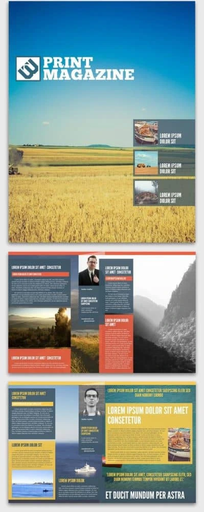
4. Connoisseur Food Magazine
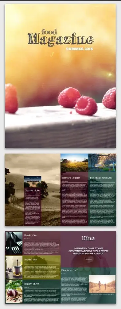
What stands out in the Connoisseur food magazine layout is its use of colorful sectioning. You can customize just about anything — from a single column surrounded by photography to three narrow columns side-by-side. Plus, this layout works vertically or horizontally, so you get multiple options in one delicious template.
5. Introspective Digital Magazine
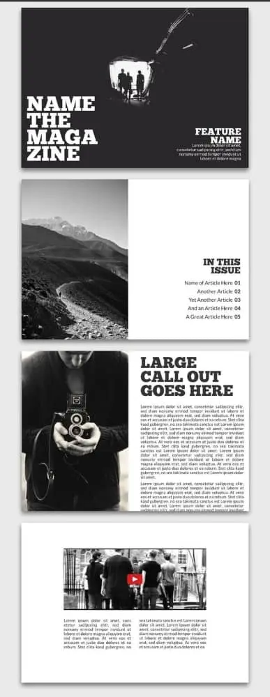
Never underestimate the power of the “less is more” design approach. The Introspective magazine design makes the most of negative space and contrast to leave a strong impression. And because it’s digital, scrolling text and rich media (like video) can be included.
6. Money Fake Magazine Cover
Have you ever wondered what it feels like to be on the cover of a magazine? The Money fake magazine design and layout template gives you the perfect chance to do so! We all know the formula: a large portrait situated front and center with a masthead underneath, surrounded by intriguing teasers for the articles inside. This template even includes little details like date and issue number, as well as a UPC code at the bottom.

7. New Yorker Business Magazine
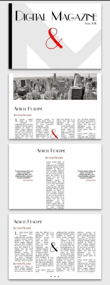
The New Yorker business magazine layout is primarily black and white, but it adds a pop of vibrant red for powerful emphasis. Its thin font and art-deco touches set it apart from the monochrome intensity of the Introspective layout in #5. Note the expansive cushions of white space, especially in the single-column layout, which features scrolling text with a single quote spotlighted on either side.
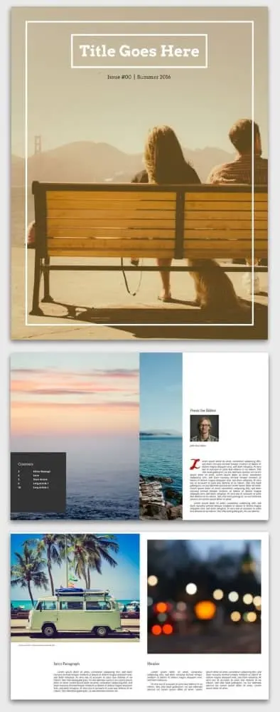
8. On the Road Magazine
There are several things to love about the On the Road magazine template. First, the white border offers the option to frame your content in a somewhat nostalgic way. Or, if that’s not to your taste, check out how one page cuts two photos together with no border at all. With plenty of choices, there’s enough here to spark anyone’s imagination.
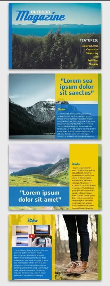
9. Open Air Online Magazine
True to its name, the Open air online magazine layout leaves plenty of room for airy background photos. Adding transparency to the content blocks and bringing them in from the margins a little bit provides a cool sense of depth. It’s a neat visual trick that works especially well with scrolling columns, a design advantage unique to digital magazine layouts.
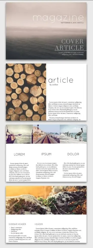
10. Seasons Digital Magazine
Who says digital layouts have to look amateur? With this template, it’s easy to craft elegant, sophisticated content that still feels like it belongs on a screen. The juxtaposition of serif copy with sans-serif headlines creates a stylistic identity that’s both traditional and modern — a comfortable in-between place for those of us who grew up with the rise of the internet.
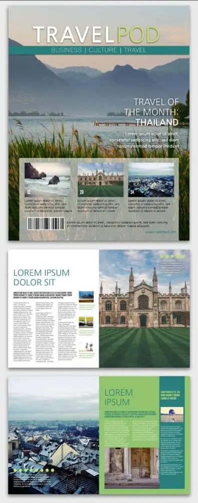
11. Showcase Travel Magazine
The Showcase travel magazine design and layout is designed for readability above all else. There’s a clear division between pages dedicated to photography and pages dedicated to copy. For a travel magazine, this is a wise choice, helping create immersive visual and narrative stories.
12. Trendsetter Fashion Magazine
Like in art, sometimes the best designs are those that purposefully ignore the rules. A look at the Trendsetter fashion magazine layout illustrates several possibilities here. If your magazine explores the avant-garde, it’s worth considering how unique font and color choices can convey your brand’s unique position.
13. Tropic Magazine Cover
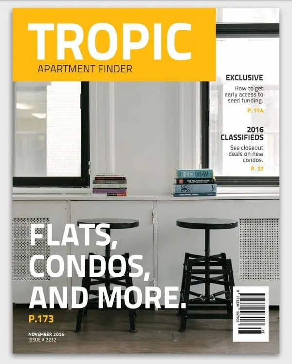
Sometimes, following a familiar formula is the perfect way to entice readers in. This Tropic magazine cover exemplifies a typical layout in a simple and well-balanced way. It’s easy to succumb to clutter (looking at you every website from 1999), but this layout uses a minimal design that still includes the necessities — the title, the headlining article, two featured pieces and photography.
14. Urban Print Magazine
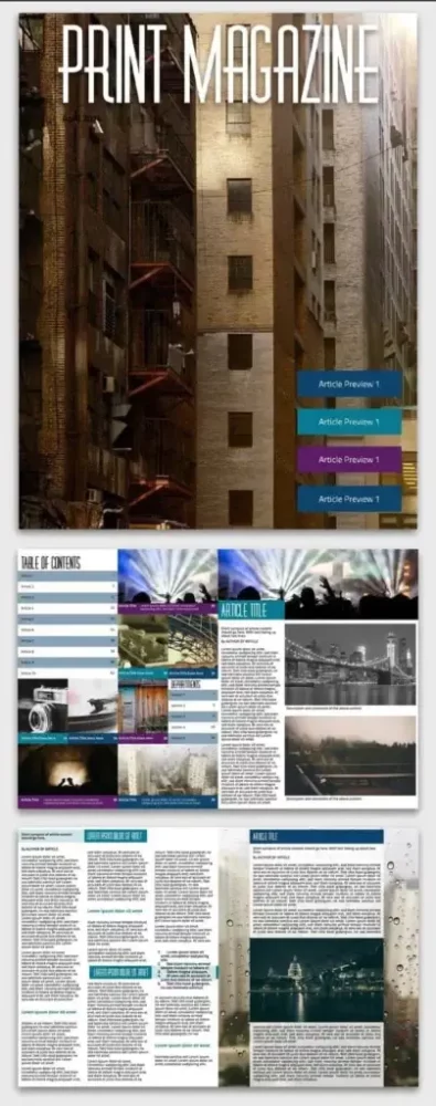
Like a newspaper, the Urban print magazine layout divides itself into many columns, presenting dense and information-rich content for readers to scan or consume at their own pace. If you’ve struggled with creating readable layouts that feature multiple columns, this layout offers a wealth of examples.
15. Simple car magazine
This simple and clean car magazine template provides the perfect cover layout to show off a classic car. When you’ve got eye candy like this, minimalism can make the most visual impact.

16. Science magazine
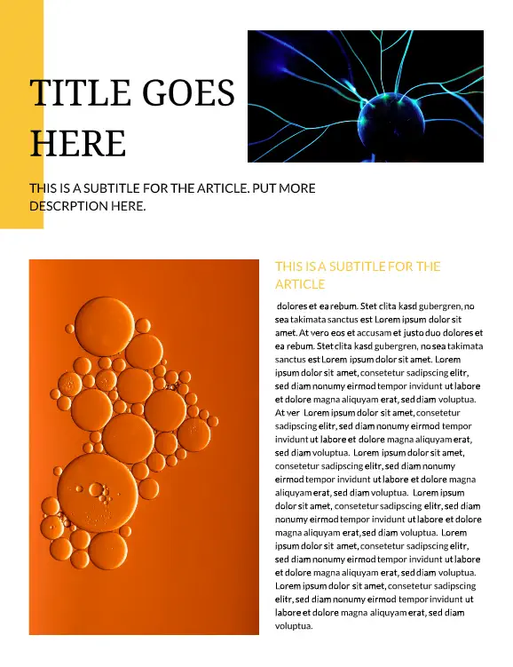
When you need a data-forward approach for your magazine layout, our free science magazine template will get the job done. A clean and clear layout leaves plenty of space for long articles and in-depth figures.

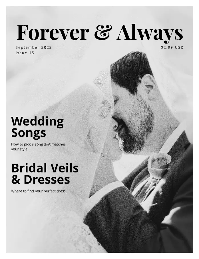
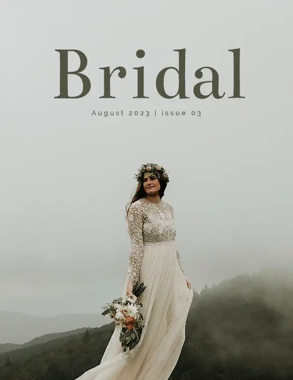
17. Bridal magazine
A simple magazine layout combined with classic photography lets your brand’s wedding inspiration shine. With subdued colors, inspirational photos, and plenty of room for copy, this multi-page wedding mag template has everything you need.
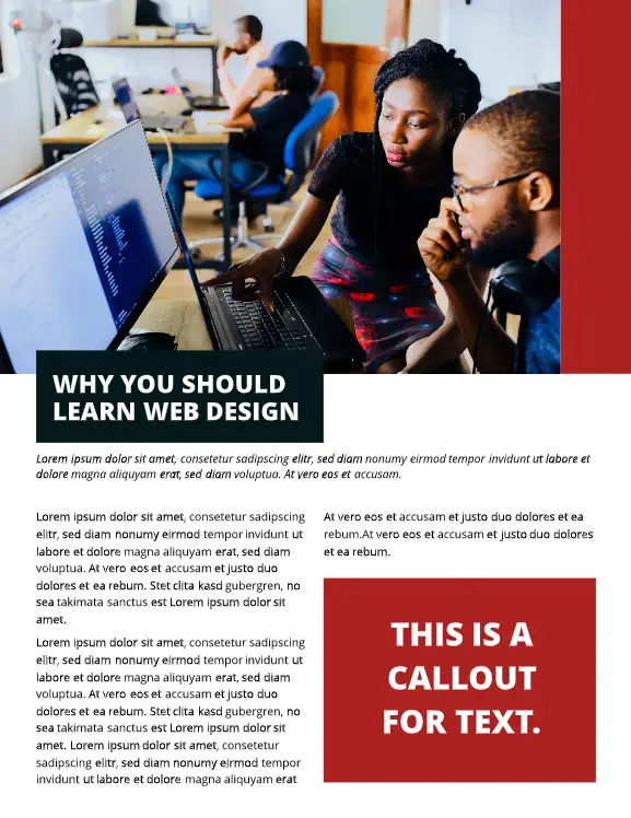
18. University magazine
Keep students, faculty, and alumni up to date on everything new at your school with this bold and classic magazine layout design. Need to run school news, announcements, and ads? You can pack it all into this straightforward template.

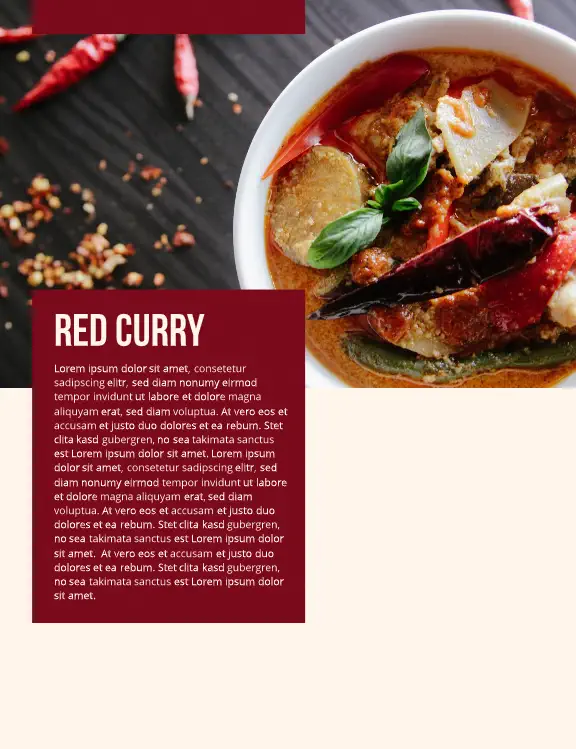
19. Food magazine
Images do all the talking in this elegantly designed food magazine layout. There’s ample room to highlight your brand’s culinary creations, with clean text callouts doing the supporting work.

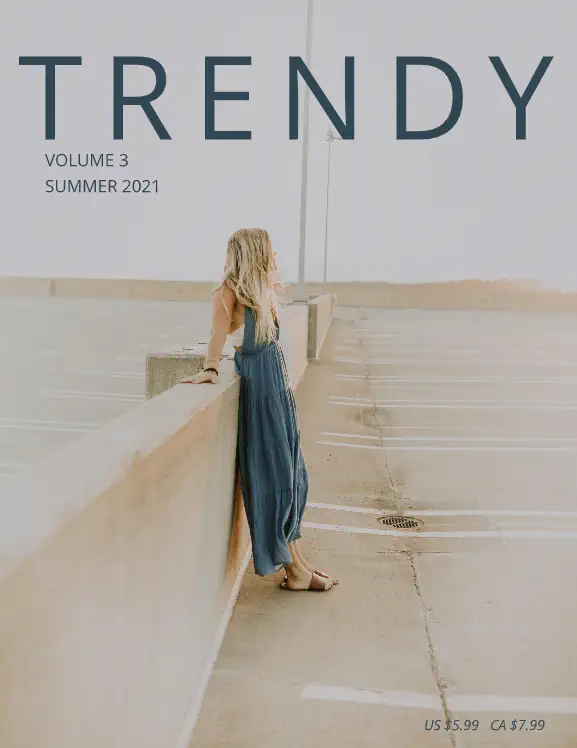
20. Minimal fashion magazine
If you need a clean and simple fashion magazine layout design, this template will help you show off your company’s looks without any of the visual clutter.
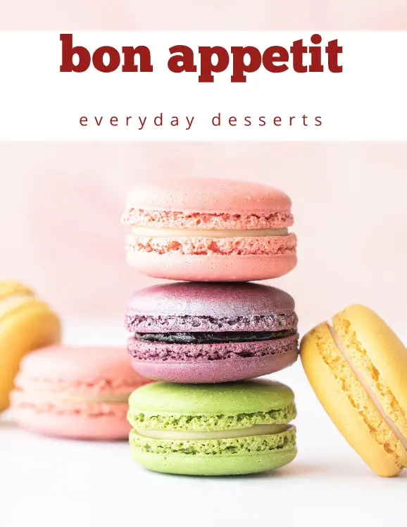
21. Dessert magazine
Put your ‘mmm’-worthy creations front and center with this brightly colored desert magazine layout. Close-up photos and fun fonts create a mouth-watering magazine template.

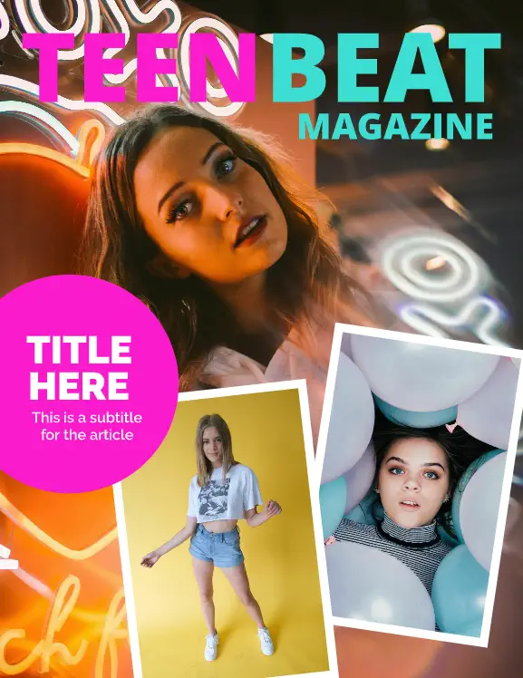
22. Teen magazine cover
A bright photo collage creates a teen magazine cover layout that’s bound to catch plenty of eyes. With bold graphics and a Y2K nostalgic touch, this design offers a familiar but fresh take on the genre.
23. Men’s fashion magazine
This men’s fashion magazine layout doesn’t shy away from the details. A well-defined balance between images and copy helps your brand show its best side.

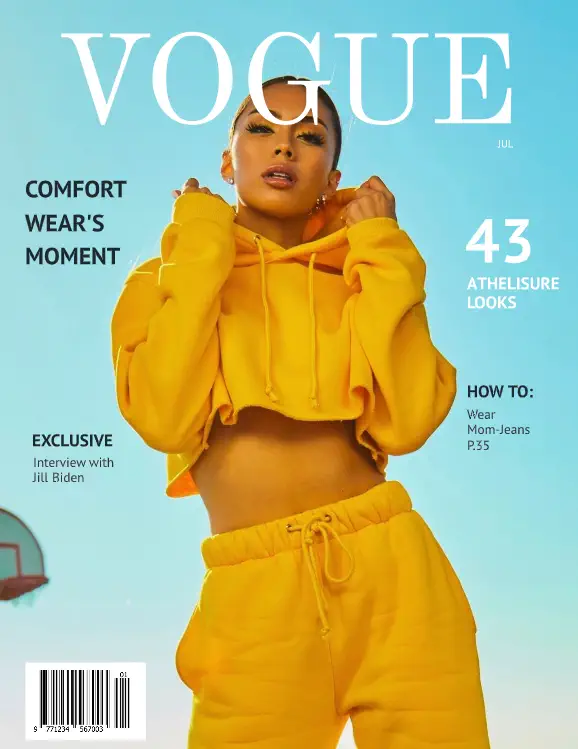
24. Fake Vogue cover
When only a fake Vogue cover will do, try this template. Pop in your preferred photo and let the classic magazine cover template do the rest.
25. Wedding magazine
It’s easy to get lost in the details of this dreamy bridal magazine layout. Soft colors juxtaposed against calming sections of text let your customers peruse beautiful wedding inspo at their leisure.
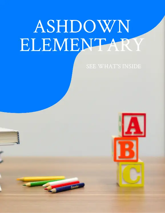
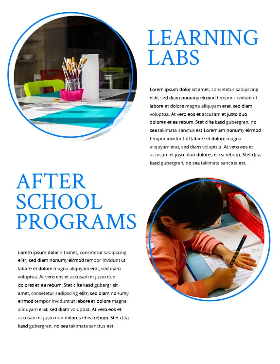
26. Elementary school magazine
Easily toss your school updates into this bright, fun elementary magazine layout. A balanced combination of photos and longer and shorter sections for text ensures readers of all ages can easily navigate your school news.
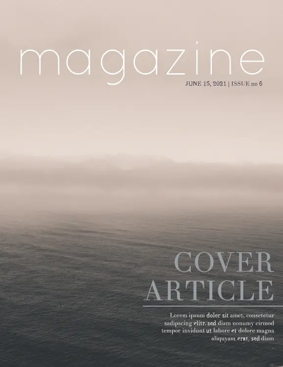
27. Seasons magazine
Want to show off your brand’s appreciation for the natural world? Give this Seasons physical magazine template a chance. Showcase nature in all her glory with beautiful, detailed photos and unobtrusive spaces for immersive articles.
28. Art school magazine
Bold sans-serif headings and bright colors showcase your art school offerings in this educational magazine layout. There’s plenty of room for the nitty-gritty details, along with space for larger text call outs and lifestyle photography.


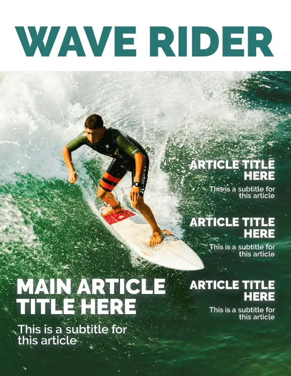
29. Surf magazine cover
Your action shot goes front-and-center in our surf magazine cover layout. A color-blocked section for your title and clear sans-serif headlines round out this tried-and-true cover design.
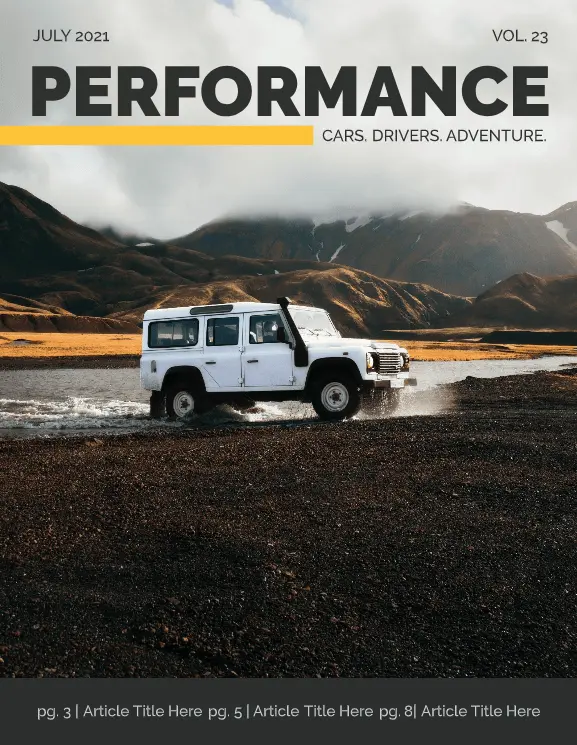
30. Performance car magazine
When you need to show off what a beautiful piece of machinery can do, this performance car magazine layout is a go-to. With lots of space for ads, articles, and glamor shots, the simple, masculine layout gets the job done.
Creating your own magazine design and layout can feel like an intimidating task, but with templates like these, it becomes a breeze. Don’t be afraid to mix and match elements from more than one template to create something truly unique!
Ready to start designing your own magazine? Get a head start in our gallery for free magazine templates & layouts.
