Almost everyone has made a flyer before, whether for a personal event like a block party or a professional event like a company picnic. As a follow-up to our most recent post about magazines, we decided to put together this list of 17 flyer layout design ideas. If you want your flyer to stand out, ditch the boring old Word document and get inspired from these flyer ideas!
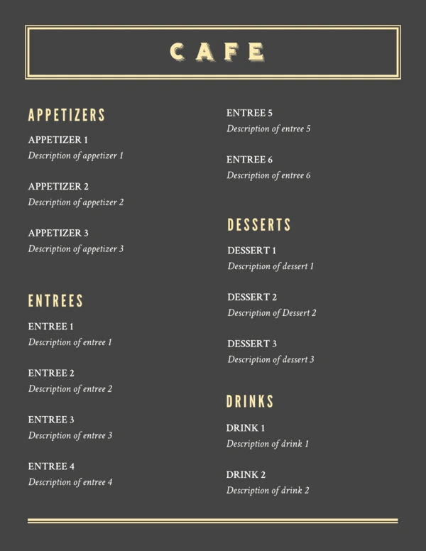
1. Bistro Restaurant Menu
Can a restaurant menu really be a flyer? You bet! Not everyone needs to read your full menu, unless they’re already sitting at a table. If you make a simplified, one-page version of your menu, you can print them out and keep them near the door for curious passersby. Then they can take them home as a handy reminder to return later! It’s the perfect way to advertise, tantalize, and stay top-of-mind.
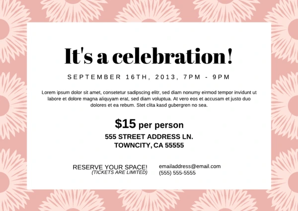
2. Block Party Flyer
Aha, there’s that block party we were talking about in the intro. Long autumn evenings are the perfect time to gather the neighborhood for a barbecue or potluck. A great-looking flyer will show them that, yes, this is a party worth attending. Or, hey, what about a street dance party? Talent show? The possibilities are endless and—given your dad’s amateur “jazz guitar” skills—endlessly entertaining.
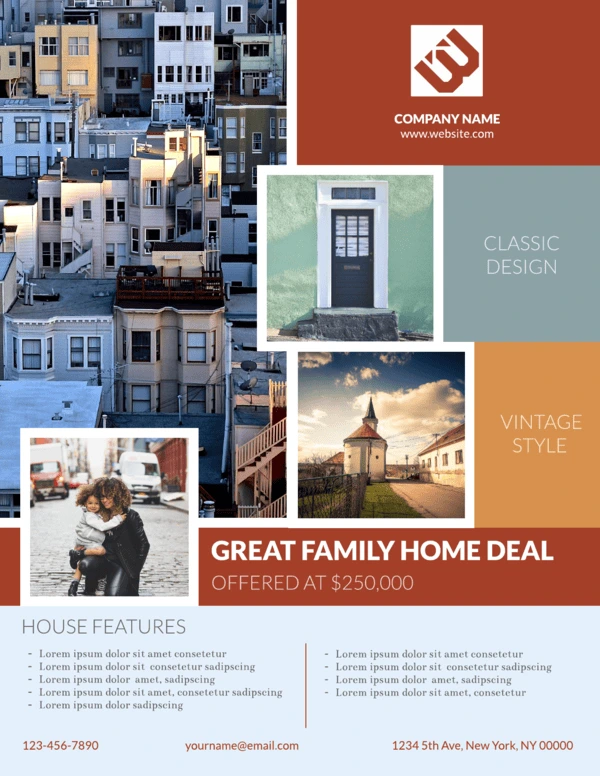
3. Bungalow Real Estate Flyer
Flyers have many professional purposes, too. For example, this real estate flyer makes it easy to showcase what’s on the market. With multiple places for photos, it’s easy to see how this design can be used for a single property (with photos of different rooms) or multiple properties (with photos of the outside). This flyer also includes contact details along the bottom, so interested buyers know how to get in touch.
4. Cobalt Cafe Restaurant Flyer
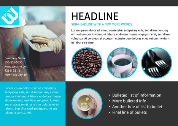
Now here’s one idea to stand out—a horizontal layout. Neatly divided into four colored segments, this design uses shapes to create visual interest. The circular photo frames are great for showcasing menu items, or items that are part of a theme. For example, if you were hosting a game night, the items pictured could include dice, game pieces, and cards. Layouts are versatile, so you don’t have to stick to whatever the template’s called. Let yourself be creative!
5. Cosmopolitan Business Flyer
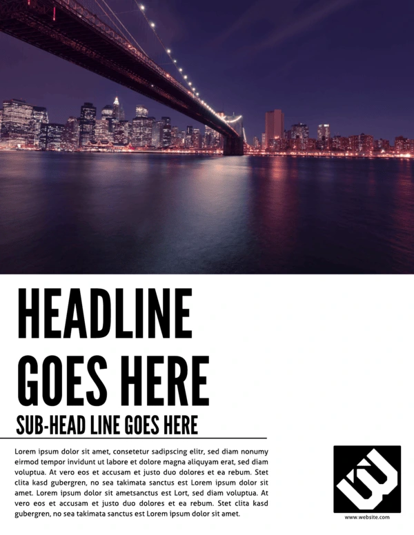
With flyers, you tend to see two design choices. Either the flyer offers very little in terms of visual interest, or the content is lost in a sea of imagery. This is a pleasing balance of the two, where the upper half of the page is dedicated to rich photography while the bottom is reserved for bold copy. When you pass by this flyer on the street or in the hall, you definitely won’t miss the point. It’s a striking layout that’s easy to design and customize.
6. Cut Glass Digital Corporate Flyer
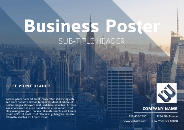
As a design element, color can be used to great impact, but it’s often underused in flyers. What’s so unique about this design is the way a sash of vibrant blue cuts across the monochrome page, drawing the eye down along with it. To take advantage of its pull, the bulk of the copy is positioned over the blue hue. When done correctly (i.e. high contrast images, spare use of color), this layout can be very effective.
7. DJ Club Flyer
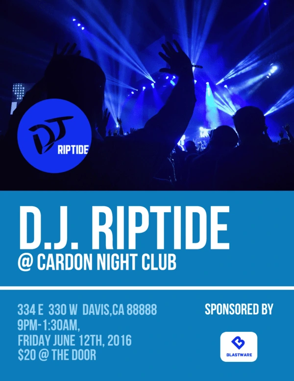
Club events are one of the most popular use cases for flyers. Surely you’ve seen them plastered around town, on college campuses, or on the walls of your favorite music shops. It’s a quick and easy way to spread the word, but because there are so many, these flyers have to be competitive. Big fonts, recognizable names, and captivating images can give your flyer an edge, so don’t be afraid to experiment.
8. Gym Fitness Flyer
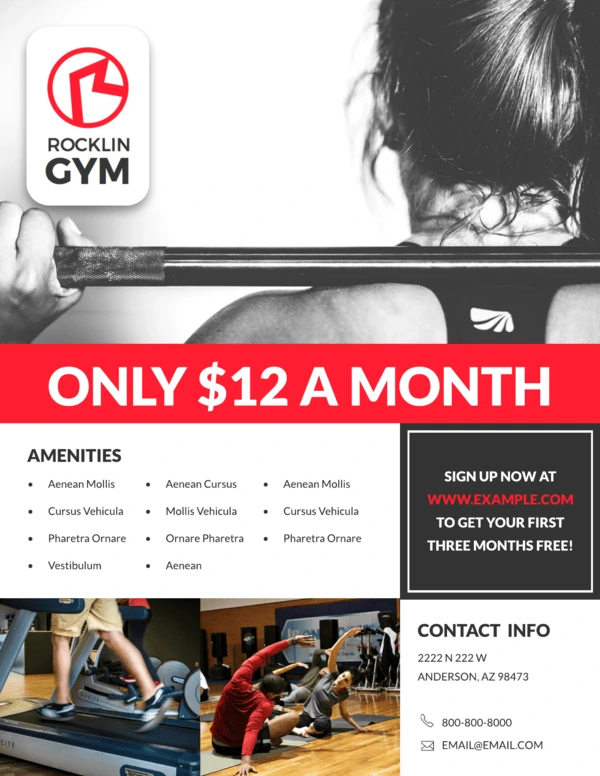
If you’re running a subscription-based business, it’s critical to draw people in with compelling advertising. This flyer layout contains several persuasive elements that you can use to punch up your design. For example, a big “hero” image has the power of suggestion. Red is a power color that attracts the eye, so it’s smart to put a bold headline over it. This one emphasizes affordability, with a coupon just below it to sweeten the deal even further. Add bullet points and contact details, and you’ve got a solid single-page flyer layout.
9. Nature Retreat Business Flyer
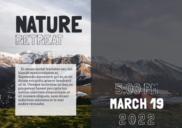
Sometimes the imagery matters more than the text. In those situations, a horizontal layout offers ample space for pretty photography, like landscapes and nature shots. This design takes advantage of transparent text to include needed details without detracting from the background. Depending on the image you’re using, elements can be moved around to accommodate it.
10. Night Life Club Flyer
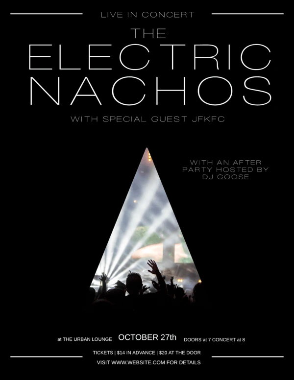
Concerts are another type of event that depend on flyers to attract an audience. The design will really depend on which artist or band is playing, since they each have their own style. But for a clean, chic layout that works for almost anyone, try out this design. We chose a triangle here, but if you open the template, you’ll find that other shapes work great, too. Each one provides a different vibe, so play around until you find one that you like!
11. Origami Banner Event Flyer
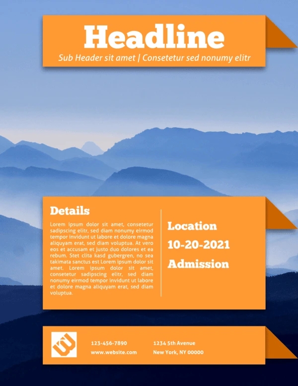
It might seem difficult to create the illusion of depth on a one-page flyer, but it certainly can be done. This layout uses a couple of visual tricks to make it happen. First, the background is an image of rolling hills, giving the viewer a familiar sense of perspective. Next, the content boxes have an added flourish: a darkened, shadowed triangle. It looks as though the content is floating on folded pieces of paper!
12. Reflections Product Flyer
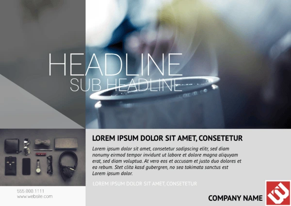
Maybe you don’t want your flyer to be whimsical. Or fanciful, or fantastical, or any other flimflam. Maybe, like the lawyer Wayne Jarvis of Arrested Development, you describe yourself with only one adjective. Well, in that case, your flyer needs to match. This design is official and confident in its authority—but also rendered in warm grays to keep it from being too coldly corporate. If you need to communicate essential information, this flyer design can’t be ignored.
13. Simple Educational Flyer
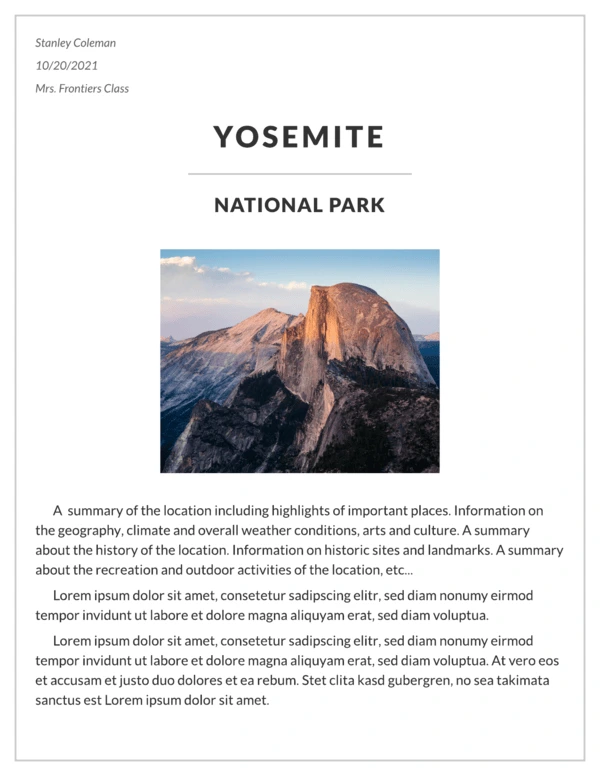
Flyers have their place in education, too. For students, this usually means firing up Microsoft Word and struggling to create a project that doesn’t look either boring or terrible. No more! A simple, elegant design like this is easy to fill out in minutes, and it prints out like a dream. Just goes to show that flyer layouts don’t have to be complex to be attractive.
14. Simple Promotional Flyer
Short, sweet, and to the point—that’s how you might describe this flyer layout. If it reminds you of online advertisements, there’s actually a good reason for that. Unlike most flyer layouts you’ve seen before, this one is digital, hence the callout button daring you to click it. A digital flyer layout like this can be embedded on a page or used in email campaigns to help customers find your latest sales and promotions.

15. Standard Advertising Flyer
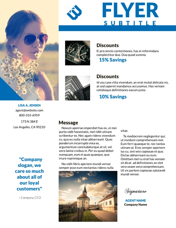
This flyer layout design is about halfway between the last flyer and a full brochure. So if a brochure would be too much, but you still want to give them a better lay of the land, this feature-packed layout might be the perfect solution. Because of the smaller font sizes, it’s not a good choice for a hanging flyer, as people will pass right by it without gleaning any details. But from person to person, especially in a sales environment, it provides valuable info with a closer human touch.
16. Swiss Alps Company Flyer
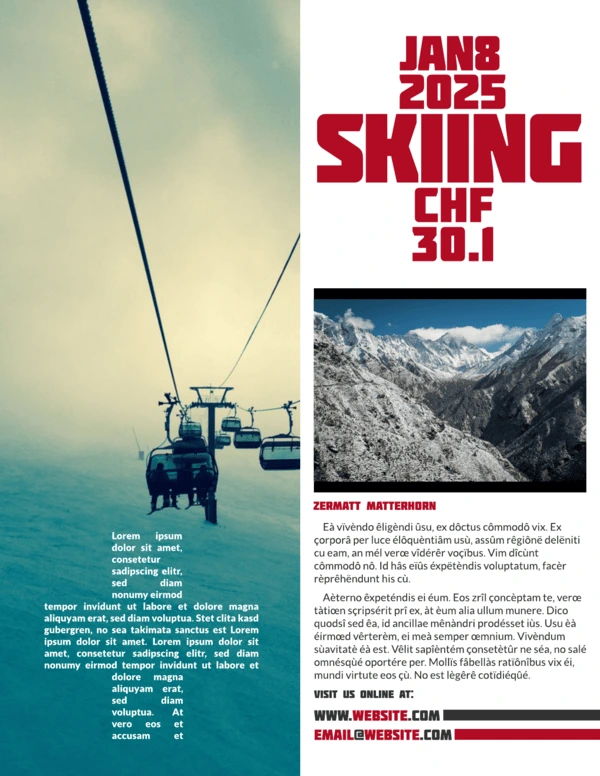
What’s one good way to create a distinctive, interesting flyer design? Don’t think of it merely in terms of what it’s for—like a company event flyer, for instance. Instead, pick a theme inspired by world culture, and incorporate its most recognizable elements into your layout design. This retro flyer borrows colors, fonts and symbols from the Swiss to promote a yearning for travel and nostalgia. Now that company ski trip looks a lot more alluring, doesn’t it?
17. Travel Real Estate Flyer
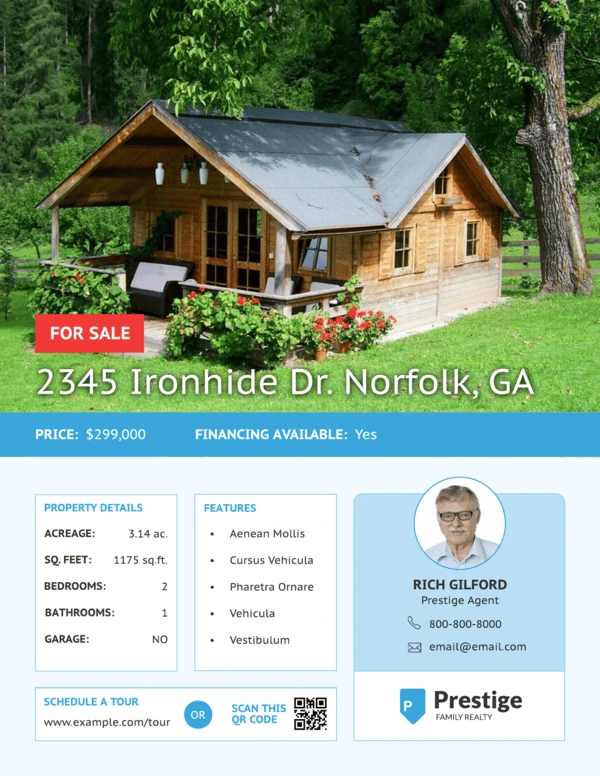
How can you include a wealth of information on your flyer without overwhelming the design? This layout offers some great ideas. The top half of the page features a nice, big photo. The bottom half is split into neat boxes that tell you everything you need to know. It would’ve been easy to accidentally clutter up the page, but the shapes and spacing give it plenty of room to breathe.
And that’s our round-up! See any ideas you like? Hopefully, these examples can give you a quick burst of inspiration, so before you know it, you’ll have a gorgeous flyer that you can’t wait to share.
