As you’re building your brand with new ideas and projects, you might not always have access to an in-house designer to assist with all your creative needs. Leaving you, someone with less creative experience, to face the perils of graphic design alone.
Okay, okay, it’s not (usually) that dramatic.
Related: 3 design tips to make your flyers stand out
But to those of us who aren’t used to creating aesthetically pleasing or practical designs, creating a line of marketing labels or flyers can be a daunting task.
These 5 design tips go out to the non-creatives of the world. You, too, can make beautifully branded designs if you start with this advice.
1. Seek & gather inspiration

Source: Etsy shop banner template
One critical element of good design is starting with a strong idea of what you want to create. But without much creative experience, you might be at a loss for where to begin.
Start by visiting some of your favorite brands’ websites or artists’ portfolios and look for designs that stand out to you. Save a few examples that catch your attention (in the creative biz, we call this a “swipe file”). Try to gather different styles to begin learning how to differentiate between them.
Once you’ve gathered a good number of examples, open that folder up and review your selections. Pay special attention to the following aspects of design:
- The color palette
- The fonts used
- The placement of various elements
You’ll begin to see that all design can be broken down into a number of basic elements. As you start to build your own designs, focus on these elements one at a time to create a cohesive finished product.
2. Use negative space correctly

Source: Large promotional banner template
Have you heard of negative space?
Negative space is the area of a design where things are simply left blank or unfilled. Not every inch of the flyer or booklet you’re making needs to be covered with visuals—and in fact, that makes the design look too busy.
Instead, use negative space to your advantage. By leaving certain areas blank, you ensure the eye will be drawn to the most important information.
There are a few easy-to-identify areas where you can intentionally make unique shapes or words within negative space:
- Between letters of the alphabet (like the Fedex logo)
- Within letters of the alphabet (like this logo for Shift)
- Writing a word with negative space on top of an image or logo
- Using a negative space logo on top of a colored section
Using negative space can be tricky but effective. Why? Because our minds search for messages in everything, even in blank space. By using negative space deliberately, you’ll stimulate the viewer’s mind and capture their interest.
3. Limit your fonts
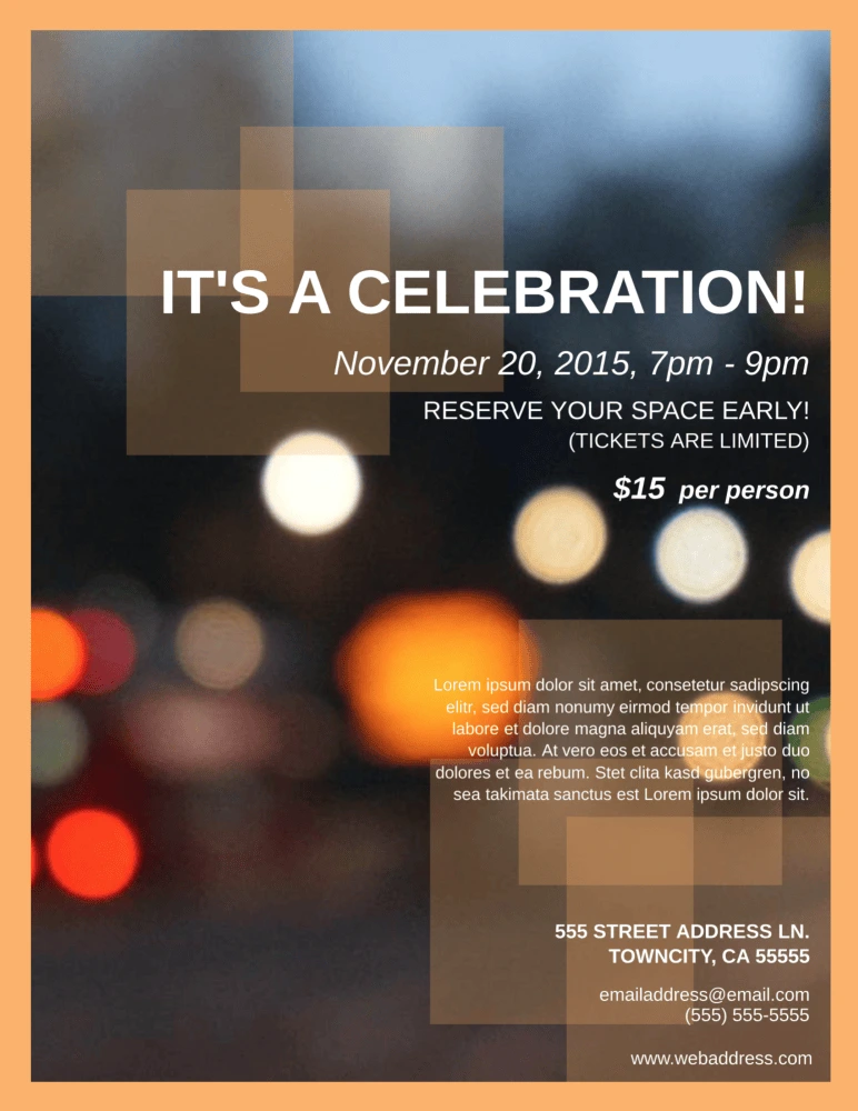
Source: Block party flyer template
When beginners get into design, they’re likely to be amazed and overwhelmed by the sheer number of fonts available. From pre-programmed fonts to free-use fonts that can be found online, there are literally thousands of options… and that can lead to some design disasters.
Beginners and non-creatives have been known to use five, six, or even more fonts within a single project. While it can be fun to choose these fonts, the end result will usually be messy.
Follow these guidelines to keep the fonts clean and classy:
- Limit font types to 2 or 3 typefaces per project.
- Try to choose typefaces within similar font families for smooth transitions.
- Don’t change fonts in the middle of a piece of text.
- Make important information the largest and most eye-catching.
4. Consider your color palette
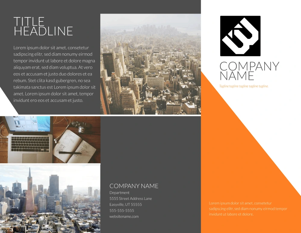
Source: Contempo modern brochure template
Choosing the right color scheme is an essential part of design. Colors have strong psychological effects on the viewer, so you want to be sure that your colors send the right message and match your brand palette.
Think about common color associations that people’s minds make:
- Red: energy, boldness, love, excitement
- Pink: romance, soft, appreciation
- Orange: warm, young, enthusiastic
- Brown: rugged, simple, serious
- Yellow: happy, warm, friendly
- Green: healing, safety, growth
- Blue: dependable, trustworthy, loyal, calm
- Purple: luxury, mystery, sophistication
- Black: elegance, distinction, tradition
Now that you see the reactions different colors can evoke, let’s see how you can inspire those feelings with your color palette.
- Create a mood board of photos that represent your brand’s personality. Once you have a large collection, find six colors that appear regularly in those photos.
- Try out different tones, shades and variations of these colors until you find a balance between them.
- Check out pre-existing color palettes to see if any of them line up with your colors.
There are more concepts that can help you finalize your color palette—such as monochromatic, analogous and complementary—but most non-creatives probably won’t need to get into the weeds quite this much.
Instead, it’s time to move forward with what you’ve already created.
If you’re using a design template, you have access to a range of color options. These pre-selected color palettes are well-balanced and specially created for those designs, so copying them can make your project simpler. You can also choose a color scheme that matches previous in-house designs.
5. Creatively challenged? Don’t worry
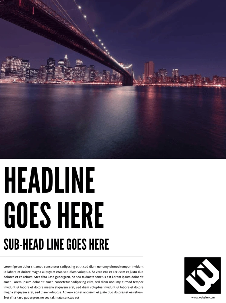
Source: Cosmopolitan business poster template
Even with these design tips, those of us who are creatively challenged may still struggle to create a design we feel confident in.
And that’s okay! There are ways to keep it simple and still create a great design.
Lucidpress offers hundreds of templates for various types of marketing materials, and they already include font selections, color palettes, and all of the design aspects covered above without you having to think about it. Better yet, each of these elements is customizable, so you can quickly and easily adjust templates to match your ideas.
