5 popular logo design trends in 2017
What makes the design world exciting is that there’s never a dull moment. Design is continually evolving with new trends, and these trends often dominate the scene for a time. We’re in the middle of 2017, and already, there have been several logo design trends enjoying their share of popularity.
As we know, a logo is critical to your branding regardless of business type, products or services. It is the first thing that catches the attention of your target audience and establishes a strong business persona.
Related: Learn the 10 essential brand assets for digital success
Keeping track of these trends is enough to make anyone’s head spin. Well, we took a dive into the subject so you don’t have to. Today we present you with what we believe are the 5 most popular logo design trends in 2017.
1. Minimalism
“Through simplicity comes great beauty.” It is often the simplest of logo designs that catches attention. Perhaps this is why flat design is currently dominating the business world. Its popularity has been spurred by the likes of PayPal, Airbnb, Foursquare and Netflix. Minimalist logo designs are purpose-driven, easy to remember, and can be identified at a glance. No matter what trends come and go, a minimalist logo design has timeless appeal.
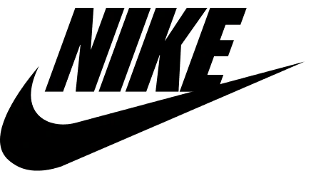
Example: Nike
Can it get more minimal than the classic Nike swoosh? The logo design for this popular sports brand is simple, iconic, and anyone can understand the message behind it.
2. Negative space
Negative space refers to the space in or around an object that is creatively used to form another shape within the logo design. Logos with negative space are popular because they encourage the audience to pay attention and discover the hidden clue. A logo with negative space can be cleverly designed, witty, and come with a deeper message.
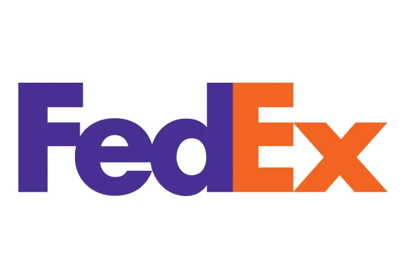
Example: FedEx
The FedEx logo was created in 1994. Since then, it has won around 40 design awards and been ranked as one of the best logos in the last 35 years.
If you take a closer look at the space between the E and the X, you will see a tiny arrow hidden within it. This arrow symbolizes FedEx’s fast speed coupled with accuracy.
There is significance in the color choices, too. To creatively separate the whole of FedEx from its individual services, they use different colors for “Ex.” For example, the orange Ex stands for “Express,” while the red Ex is for freight. FedEx has managed to pack a whole lot of information in its simple, clean logo.
3. GIF (moving logo)
GIF logo design features animated images that are continuously moving. This kind of logo design is like a hybrid between static images and video. It’s caught on recently because they offer a whole new way to capture a viewer’s attention.
Thanks to social media sites like Twitter and Tumblr, GIFs are enjoying a new heyday of popularity. Including tiny animations in the logo design is fun and can be done fairly quickly.
Example: Giant Owl
The logo of Giant Owl (a London-based production company) features two giant, owl-like eyes that illustrate the company’s name and resemble digital tape spools. The logo is further brought to life by animating the eyes, which grabs a viewer’s attention because the movement is so unexpected.
4. Letter-stacking
Letter-stacking is a technique designers use to place long phrases and text without spreading across a large area. Logos can include vertical or horizontal inscriptions along with complimentary graphic elements—a great visual combination. Letter-stacking logos are compelling: spending a few extra seconds to unravel what it says results in increased memorability.
Example: Oakland Museum
The Oakland Museum of California created a logo which playfully arranges the letters of its lengthy name into three sections and emphasizes its initials. Letter-stacking logos are a great option for incorporating long, verbose business names.
5. Hand-drawn style
Despite the name, hand-drawn logos are not technically drawn by hand—rather, they give the impression of a free-form sketch. These logos offer a retro sense of charm and connect with audiences on a personal level. The warm, down-to-earth appeal that hand-drawn logos offer is sometimes hard to achieve with a purely digital design.
Example: The Fitness Lab
In this case, a hand-drawn logo design perfectly expresses the fun, quirky and casual vibe the brand is aiming for. Your business logo doesn’t always have to feature pristine digital design—a cheery doodle or sketch can be a great starting point (like this version!).
Wrapping up
Your logo is possibly the most significant branding tool in your arsenal, so make sure you have a strong one. These logo design trends will help you stay on top of the game even as they keep evolving.


