Everybody loves a good poster. From colorful movie posters to out-of-the-box wood cut prints and more, there’s something about this versatile medium that always grabs our attention. Still, creating a memorable design can be challenging. Unlike a magazine or flyer, you’ve got much less wiggle room to include information, and your graphic elements need to immediately capture someone’s eye. With the right understanding of design principles though, designing an incredible poster for your brand or business can be a breeze.
Working on your own graphic design poster? Take a look through this quick guide to explore our top tips and advice on designing a fluid, unified, and memorable poster.
6 essential elements of graphic design posters
Typography
One of the most important but often overlooked aspects of poster design is font usage. Whether loose and flowy or strict and rigid, your choice of font can go a long way in relaying your poster’s message.
While it may be tempting to pick multiple creative fonts, ideally, you want to choose two or three total fonts for your design. Fonts used for titles should be a display typeface (either creative or sans serif fonts), while fonts used for text should be serif fonts because they are designed for readability. Your chosen fonts should be different enough to be easily distinguishable from one another, but also similar enough to convey a unified design.
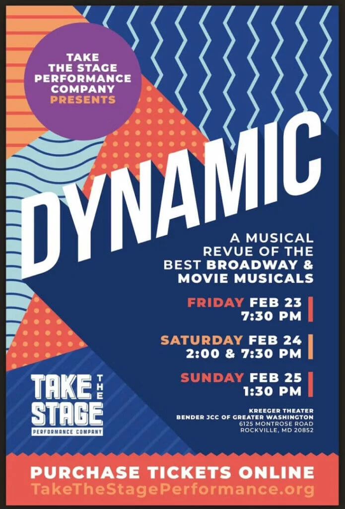
We like how this graphic design poster incorporates two main fonts – one to immediately grab your attention, and one to convey more detailed information.
Balanced
The second element of graphic poster design to consider is balance. Balance in graphic design is exactly what it sounds like – how unified and cohesive something looks. When designs are unbalanced, they feel off, and can be uncomfortable or confusing for your audience.
In general, there are two different ways to create balance: through symmetry and asymmetry.
Symmetric layouts
In a symmetrically balanced layout, similar design elements are aligned in an equal way on either side of the vertical axis. This often results in a mirror-image effect, making it a great layout for a formal or static look. If you’re designing graphic posters for formal events, art gallery viewings, or informative gatherings, a symmetrical approach might be just right.

Asymmetric layouts
In an asymmetric layout, balance is achieved with an unequal arrangement of elements. Often, with the asymmetric layout, there could be a large object on one side balanced by a small object on the opposite side.
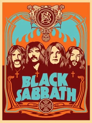
In general, these designs are more difficult and complex because the visual weight of each element and its arrangement need to be carefully considered. Asymmetric designs appear more casual than symmetric layouts and create excellent posters for rock concerts, museums and personal services.
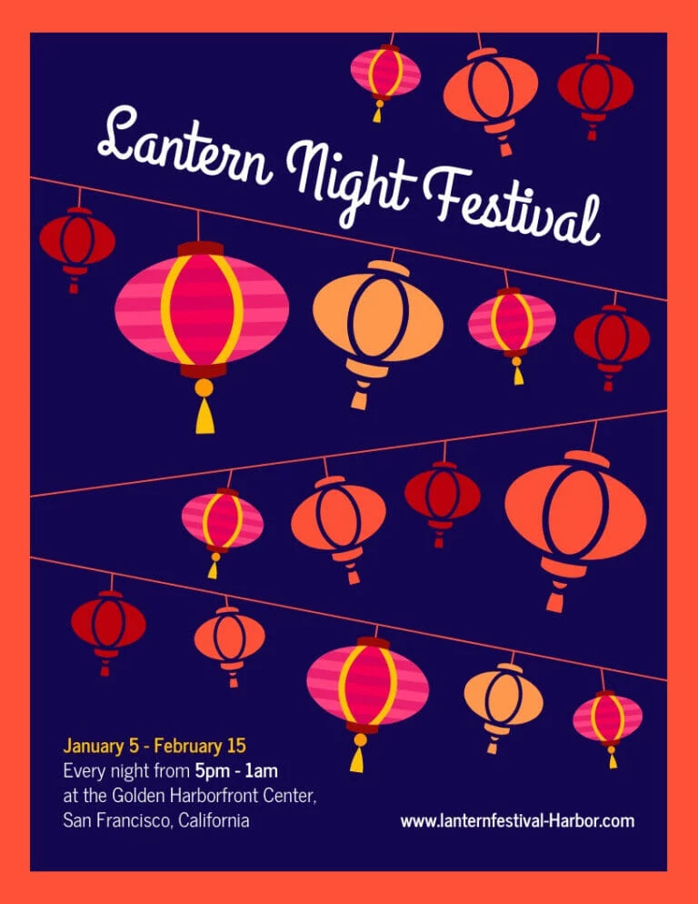
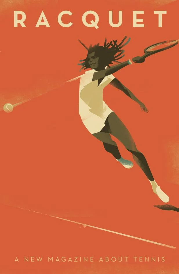
Below are three excellent examples of asymmetrically balanced graphic design posters.
Color
Color is incredibly powerful, not only in conveying meaning but creating a cohesive look and feel to your graphic design poster. No matter who your audience is, color can be universally appreciated and used to communicate a variety of things. Learn more about color theory and color meanings here. When deciding which colors to use, consider how they will look together. Harmonious color schemes are based on balance, and can help tie your poster together. Below are a few different types of harmonious color palettes:
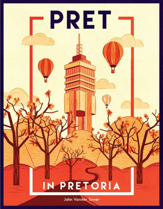
- Monochromatic palettes are limited to tints and shades of a single color
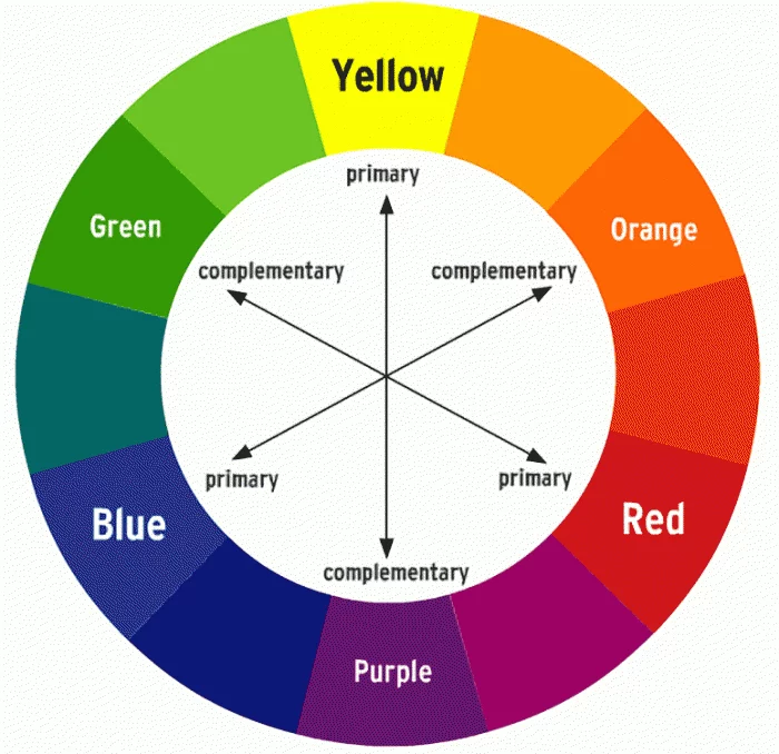
- Complementary colors color palettes include colors that are opposite to each other on the color wheel, such as red and green, or blue and orange. These color pairings can often look intense or bold.
- Split complementary colors occur when hues in a color scheme are equidistant from one another on the color wheel. For example, green, red-orange, and red-purple.
- Analogous color combinations
Contrast
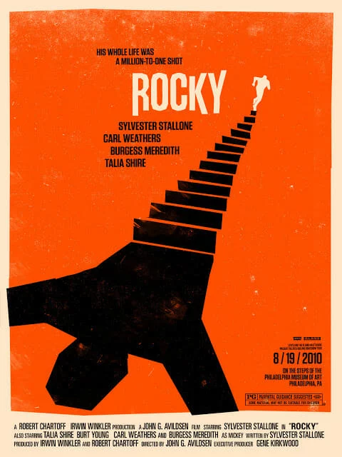
Like balance, contrast is an essential element in creating a memorable, easy-to-look at poster. To create contrast, place two elements in opposing ways. This helps draw the eye and create a focal point within your design.
The elements you can use to create contrast include shapes, colors, lines, size and negative space. In the image below, you can see how the juxtaposition of distinct colors makes certain elements stand out.
Poster design hierarchy
In addition to contrast, utilizing visual hierarchy in your poster design can also create a focal point. Visual hierarchy is the arrangement or presentation of elements in a way that implies importance. Put simply, it provides an intuitive direction for your eyes to move from most important information to least important information.
Here are a couple of ways to create hierarchy in your design:
- Alignment
- Size and scale
- Color and contrast
- Leading lines
- Negative space
- Repetition
- Proximity
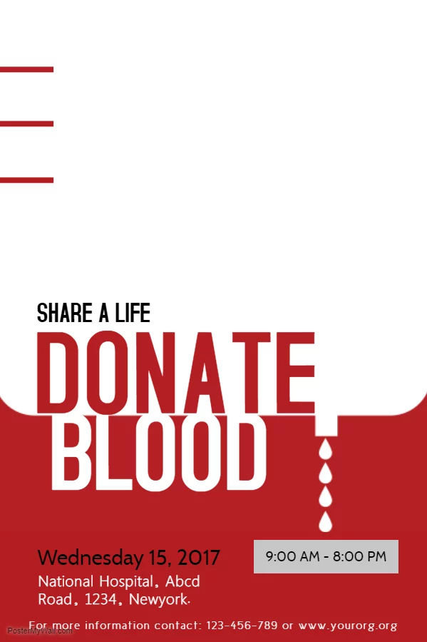
Here’s a great example of a poster using the size, scale, and color/contrast of its typography to create a sense of visual hierarchy.
Shapes in poster design
A seemingly basic element, shapes have the power to help create a path for your eyes to follow as they scan a poster. When used intentionally, shapes can also give emphasis to the most important information in the poster. For example, designers often place text in front of squares or rectangles to draw attention.
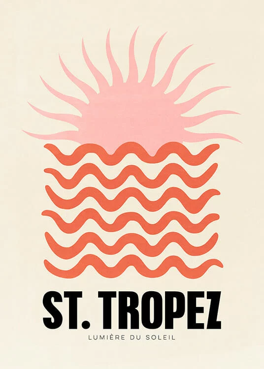
Shapes can also alter the mood of your design. Softer shapes with curves, circles and organic lines can create a more fluid and relaxed mood.
Take the easy, breezy, flowing lines of this St. Tropez poster, for example:
Triangles, squares and other geometric shapes with sharp edges, on the other hand, are often associated with more serious, elevated, or masculine ideas.
5 graphic design poster templates to help inspire you
University poster template
With a bold color palette and a clear place for your call-to-action, this poster template makes a great choice for universities and educational centers. Just swap out your logo and choose a picture that best represents your school.

Duo campaign poster
Great for speaking engagements, local government, or other events, this template makes it easy to grab attention quickly with its asymmetric design.

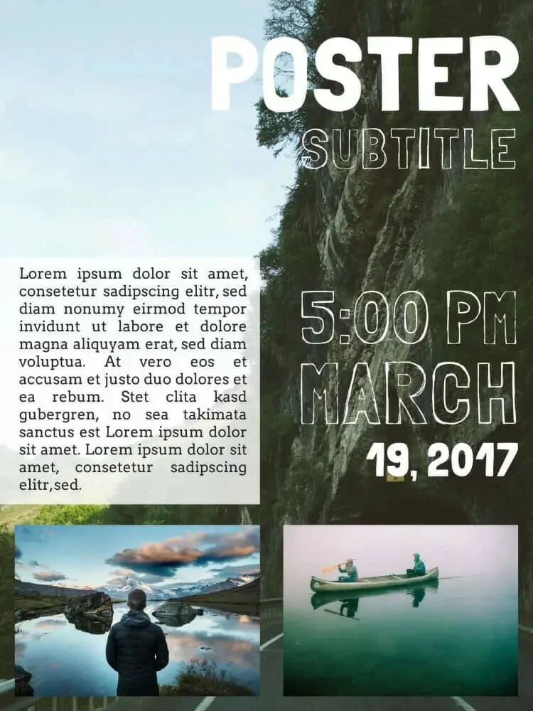
Nature retreat poster
Inspired by the layout of print magazine covers, this informal, slightly whimsical poster template is super versatile – especially when it comes to drumming up hype for events.
Into the unknown movie poster
Sometimes the best way to make an impact isn’t through your messaging. If you’ve got a beautiful piece of art or photography you want to showcase, this is the poster template for you.

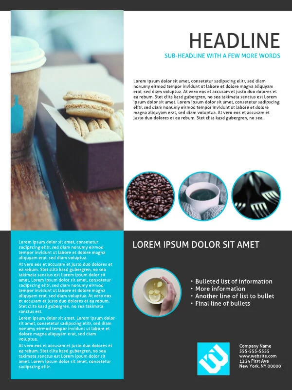
Cobalt café e-poster
Great for highlighting visual businesses like restaurants and real estate, this balanced poster template makes it easy to highlight your unique brand imagery and provide detailed information for readers.
Ready to design your own poster? Explore our full free template library here.
