A picture truly tells a thousand words. From pie charts to cartograms, infographics have been around since the first humans learned to scratch symbols into the dirt. After all, an infographic is composed of only three vital elements: visual, content and knowledge—qualities shared by the earliest of cave drawings and the most technical of modern computer-aided data visualization.
Today online tools empower anyone to create infographics, but this visual format is not new. In fact, they are among the oldest forms of communication, and it only makes sense that they’ve retained their function throughout human history. People are visually wired.
Related: 32 stats & facts that prove infographics aren’t dead
An astonishing 50% of the human brain is involved in visual processing, and 70% of its sensory receptors are in the eyes. It takes less than one-tenth of a second to take in new visual scene: 150 milliseconds to process a viewed symbol, and another 100 milliseconds to attach meaning to it.
Every day, people are exposed to increasing amounts of information. In fact, the average person is exposed to five times as much information today than in 1986. As our brains adapt to process more information, the infographic’s efficiency at quickly and clearly conveying a message makes it a more vital form of communication. It’s no wonder the use of infographics in literature has increased by more than 400% since 1990. Likewise, the use of infographics on the internet—where users are barraged with a constant stream of changing information—has grown nearly 10x since 2007.
People of earlier times may have had less data to deal with, but that didn’t make the infographic any less useful for them to share their understanding of the world. Early forms of visual communication helped people of long ago tell stories, document the lay of the land and visualize scientific discoveries. Here are 6 ways infographics changed the course of human history.
Cave paintings
In its most basic form, an infographic is a visual communication method that tells and records a story—and isn’t that precisely what prehistoric cave drawings did? Forty millennia ago, the first storytellers painted the tales of early human culture, recounting births, deaths, massacres and celebrations, as well as plants and animals living among them in the Ice Age. Those early recordings provide invaluable information to modern audiences. For example, the paintings within Brazil’s Serra da Capivara, thought to date back as far as 36,000 years ago, challenged the theory that humans first migrated into South America in about 9,000 B.C.

But cave paintings are more than mere artwork; they were also informative to ancient men. Western European cave drawings depicted complex designs that archaeologists believe are primitive maps of the stars. One particular French cave contained thousands of drawings of people, animals and abstract representations believed to be part of the Summer Triangle constellation. Other cave paintings studied by archaeologists are now thought to be the earliest-known depictions of volcanic eruptions and help modern scientists understand volcanic activity in the early days of human history.
Hieroglyphics
It’s been 5,000 years since the ancient Egyptian civilization thrived, but the society left vast recordings of its culture. Hieroglyphics are a form of infographic used to describe ancient Egyptians’ lives, work and religion, while fabulously preserving their way of life. Not only did hieroglyphics feature drawings that represented objects and ideas, the written language also evolved to represent sounds with symbols.
Like many infographics, Egyptian hieroglyphics were meaningless to early archaeologists without a key. Therefore, the Rosetta Stone, the 1799 discovery that deciphered Egyptians’ pictorial language, is without a doubt one of history’s most valuable infographics.
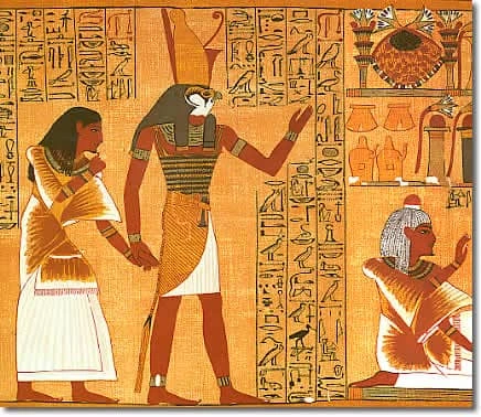
The stone engraving, a decree from King Ptolemy V, features three scripts: Egyptian hieroglyphs, Egyptian Demotic script and Ancient Greek. By comparing the pictorial decree to other known written languages, archaeologists were finally able to decipher the ancient hieroglyphs uncovered across time.
Just as the Rosetta Stone unlocked the secrets of Ancient Egypt, translation and common understanding are key in today’s global society. According to K International, translation can make or break a brand now more than ever before—all because of the e-commerce market. Since 2007, global online sales have increased 17%, and China is now the largest global consumer of luxury goods—25% of all sales.
While words and phrases may vary, images are universally understood around the world.
Maps
Maps were one of the first infographics early people designed and distributed, and cartography has remained an integral science for thousands of years. From primitive maps drawn inside caves and the ancient maps of Babylon to the Age of Exploration’s changing maps and 21st-century maps of the universe, people draw diagrams to help them navigate the world.
The earliest-known maps don’t depict cities, roads or waterways at all, but the heavens above. Dots drawn within caves map out parts of the night sky and its constellations. Dots drawn inside a French cave more than 16,000 years ago map stars as seen by ancient Europeans. The oldest atlas ever discovered, the Dunhuang star atlas, was created on an ancient Chinese scroll almost 1,400 years ago.
The earliest-known map representing the natural landscape was a crude representation discovered in the Czech Republic and has been dated to 25,000 B.C., and ancient Babylonians were already using accurate surveying techniques by 600 B.C.—although their view of the world was limited to the known environment of the time: a circular area surrounded by water.
Regional maps retained the primitive qualities of the Babylonian Map of the World for centuries, but by the end of the medieval period, Europeans were mapping their nautical trade routes using accurate navigational directions.
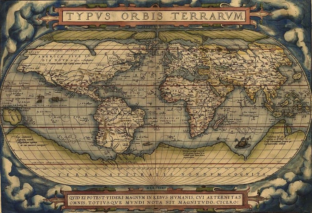
With the discovery of the Americas, Europeans’ interest in mapping piqued as nations struggled to control new lands and resources. The first-known cartographic representations of the Americas—as well as Europe, Asia and Africa—were designed by Spanish cartographer Jean de la Cosa, who sailed across the Atlantic with Christopher Columbus. Were it not for him and a handful of other Spanish and Portuguese explorers, the New World would have remained in darkness, discouraging the settlement that followed.
Even today, maps are one of the most common forms of infographics. Easily-recognizable locations form the basis of many efficient infographics that instantly convey a message. For example, when Fractl needed to create an infographic that was not only timely but could appeal to a large audience, it chose to map the hometowns and locations of 75 Marvel characters. The infographic was highly effective, and the map was featured in 365 publications.
“Maps are great for compiling a lot of information into a single graphic,” explained the map’s designer. “When you look at a map of the United States, you are effectively viewing 50 different data sets at once, but because we see maps all the time, the mind can easily absorb the information being presented.”
Early charts & graphs
Throughout most of human history, data visualization was limited because data was limited. Then, thanks to various sciences, scads of information—about demographics, economics, geography and weather patterns—emerged. And people needed a way to more easily analyze all this information.
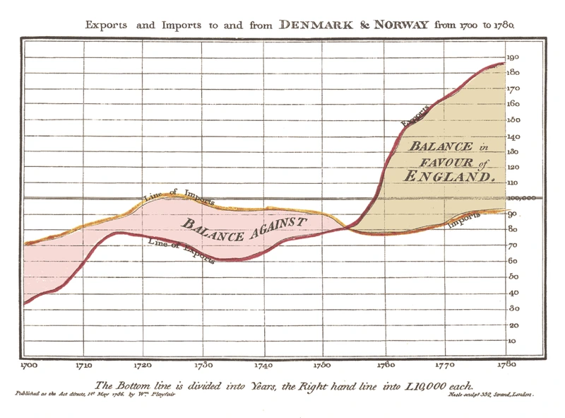
By the end of the 18th century, most charts used today—histograms, pie charts, bar and line graphs—were already in use, introduced to the world in William Playfair‘s 1786 publication, Commercial and Political Atlas.
A Scotsman schooled in drafting, Playfair decided to use his skills to illustrate economic data. At the time, such information was commonly represented in tables, but Playfair transformed the data into infographics. In one famous line graph, he charted the price of wheat against the cost of labor, countering the popular opinion that wages were driving up grain costs and demonstrating that wages were, in fact, rising much more slowly than the product’s cost.
Playfair held a keen understanding of data visualization for his time, and he speculated that the brain can process images more efficiently than words. He argued that good data visualization is about “giving form and shape to a number of separate ideas, which are otherwise abstract and unconnected.” According to Playfair’s writings, data should “speak to the eyes,” because they are “the best judge of proportion, being able to estimate it with more quickness and accuracy than any other of our organs.”
Political diagrams
One of the greatest social issues of the 19th century, slavery was the subject of one of America’s most historical infographics. After the southern states seceded in 1860 and 1861, Union military leaders needed a strategy to invade Virginia.
Meanwhile, the federal Coast Survey department produced a map of Virginia that would prove pivotal in the Civil War. Based on data from the 1860 census, the map depicted slave populations in each of Virginia’s counties, one of the first to represent population with shading—the darker the county was shaded on the map, the more slaves were held there.
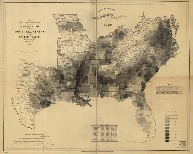
By examining the map, it immediately became evident that eastern Virginia was a slavery hotspot, while the western portion of the state was relatively slave-free. Therefore, Union forces deduced that Virginians in the western counties would likely fight for slavery less ferociously, and they might even change teams.
“It was a breakthrough map,” noted Susan Schulten, University of Denver historian and author of “Mapping the Nation.” “It was an attempt to influence how the government saw the nation, and how the military understood it. It drove Lincoln’s attention to where slavery was weakest.”
Later, when the U.S. Coast Survey produced another map that charted slave density across the Confederacy, President Lincoln consulted the infographic throughout the remainder of the war, relying on it to understand in which areas Southerners would be more and less dedicated to a fight.
Political maps and diagrams continue to influence public policy today. Although the United Nations High Commissioner for Refugees consists of an 8,000 person staff that collects enormous amounts of data on global refugee displacements, the organization has struggled to communicate its information in a meaningful way.
In a new approach, the agency commissioned an infographic to narrate 40 years of refugee data. The interactive graphic highlights where and when refugees emigrate and tells the complex stories of political, social and economic turmoil that lead to each displacement.
Since launching in 2014, the project has accrued more than 5 million page views, has been shared on Twitter to millions via humanitarian organizations such as Amnesty International, and it was even awarded a Gold Medal for Interactive at the prestigious Molofiej 22 Infographic Awards.
A message from Earth
The 20th century saw the advent of mass media, and publications quickly adopted infographics to efficiently convey complex information and data. As programming languages were born, computer-generated graphics pictorially depicted massive amounts of data, advancing all aspects of science and technology. But throughout all the advancements in visual storytelling, one thing remained clear: infographics are a universal language.
Thus, when NASA decided to send a message from mankind to extraterrestrial lifeforms, it determined an infographic would most likely do the job. In 1972 and 1973, aluminum plaques were placed aboard the Pioneer 10 and 11 spacecraft, each depicting a pictorial message. Each plaque featured simple drawings of a nude male and female human, as well as symbols designed to indicate the Sun’s position in the galaxy.
The Pioneer 10 and 11 spacecraft were the first human-built objects capable of enough velocity to escape the solar system. NASA turned to world-famous cosmologist Carl Sagan to design the ultimate message in a bottle. One diagram depicted the chemical makeup of hydrogen, the most abundant element in the universe.
The drawings of the humans included a diagram that pictorially calculates their height compared to the spacecraft, and the man’s right hand is raised as a sign of good will. (Of course no person on Earth can know if extraterrestrial intelligence will identify that raised hand as a peaceful symbol, but scientists hope the gesture is universal.)
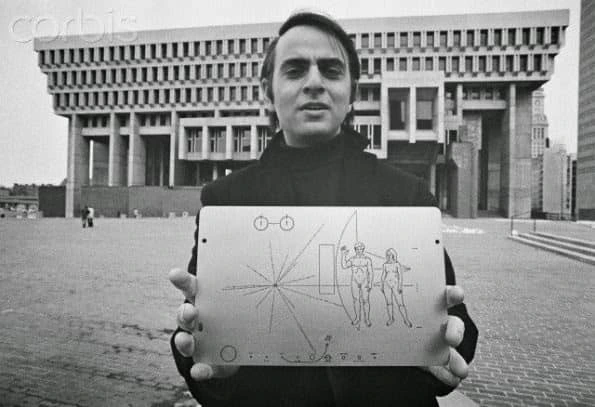
A radial pattern on the plaque consists of 15 lines emanating from a center origin, indicating the distances of pulsars to the Sun, allowing recipients to pinpoint the location of launch in space and time. Finally, a diagram of the Solar System was inscribed on the plaques, depicting the launch location and trajectory of the two spacecraft. With any luck, the universal languages of mathematics and visual storytelling will tell unknown intelligent life that we are here, and we come in peace.
We most certainly live in an era of data visualization. Graphics charting everything from election polls to physical activity are found everywhere from the newspaper and television to the computer and smartphone. But in order to understand the elements of a successful infographic, we must remember that visual storytelling isn’t a new phenomenon, and the elements that worked for the ancients are still at play today.
