Did you know that, every day, nearly 145 billion emails are exchanged? And what’s more mind-blowing is that 84% of these emails end up in a spam folder. To me, this makes it obvious that many people fail to understand how to send effective email messages.
You might think nobody even notices an email signature, but I’m here to tell you otherwise.
It’s more than just a decoration; an email signature communicates your identity to someone you want to build a professional relationship with but who might know nothing about you.
Related: Advertising do’s and don’ts for beginners
Let’s go over 7 do’s and don’ts that’ll help you send better emails to coworkers, customers and leads.
1. Do find a good layout (for mobile, too)
This is the first and most important step for creating an impressive email. A good email signature should be informative and neat.
What information to include will depend on the brand you’re promoting. Remember that everyone is a fan of simplicity, so keep all information to-the-point.
Everyone has smartphones these days, and the number of people opening emails with their phones is on the rise. Did you know that 48% of the emails delivered every day are opened on phones? That’s something to take note of.
Pay attention to the scale of your design. For smaller screens, you need to optimize the sizes of logos & images, and shorten any long website links & email addresses. If you’re going to use a wide logo, make sure to use a vertical template.
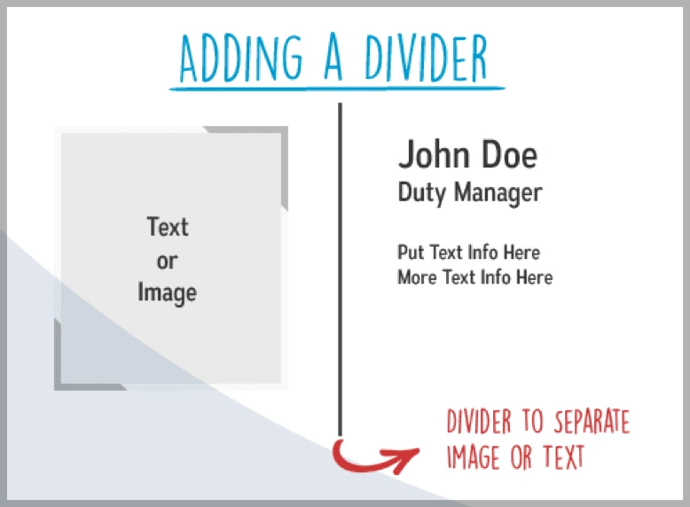
Use dividers to keep the signature organized and maintain a strong hierarchy. Full-bleed dividers will highlight your name and contact info—the most important info in your signature.
2. Don’t clutter with too much information
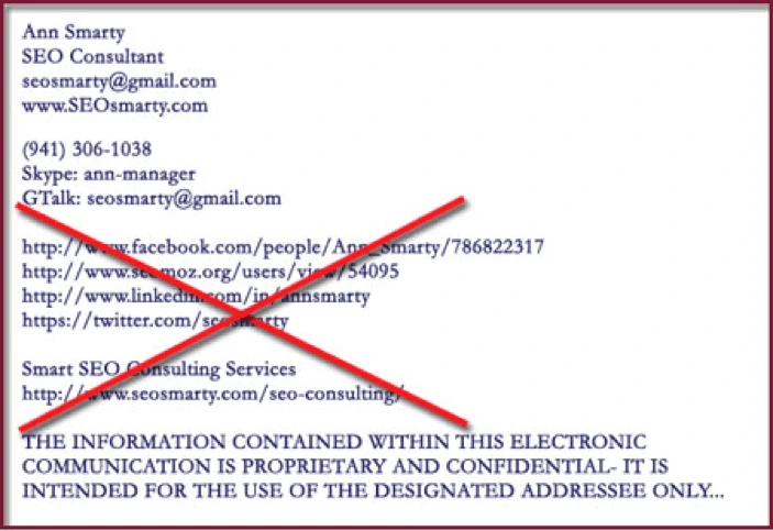
There is no point in using an email signature to share your autobiography. If you overstuff your signature with truckloads of links and information, it will be a turn-off for your potential clients. Plus, the chances of anyone opening the never-ending list of URLs are nil.
3. Do include blog & social media buttons
Digital marketing is all about making your presence felt on the web, and social media has leveled the playing ground for everyone. If you and your brand have no presence on social media, people are less likely to trust you. That’s modern psychology.
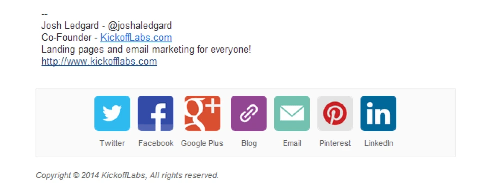
Adding Twitter, Facebook & LinkedIn to your signature will help you generate more traffic, and most importantly, your brand will get noticed.
Including your blogs, podcasts, and webinars in your signature is another clever marketing move. If you keep adding fresh content to your blog and hyperlink it in your emails, the recipients will get easy access to new content and will keep coming back for more.
4. Don’t use multiple fonts & colors
Minimalism is in right now. Treat your email signature like a signature, not a medium to show off your graphic design skills.
To avoid making the design overly complicated, limit the number of colors and use just one type of font.
A pro tip is to take inspiration from the colors in your logo. This will help your audience recognize your brand more easily, as we know consistency is key.
Using the same font in both the email and the signature gives it a nice touch of consistency. Choose a font face and size that’s easy to read (e.g. Arial, Calibri, Tahoma, Verdana, Gill Sans, and a few others).
Using different fonts to highlight different texts makes your email signature look like an amateur school project. If you want to get a flexible typeface that can be customized according to your liking, the internet has a plethora of options for you.
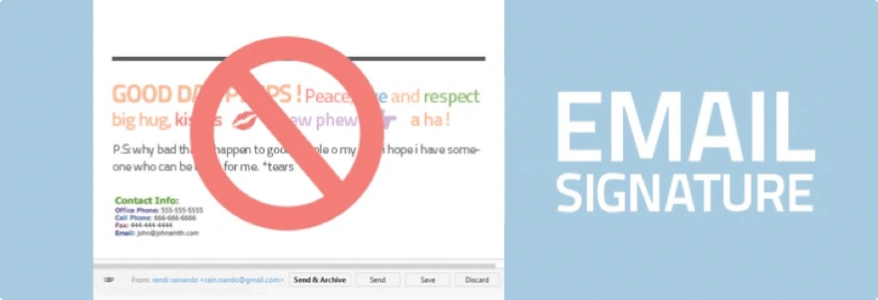
5. Don’t use personal quotes
If you’re promoting a professional brand, you must leave the right impression on email recipients. The best way to do this is to only include information related to the brand. Using personal quotes, unless you are a well-recognized celebrity, would appear over-the-top and tacky.
6. Don’t add long disclaimers
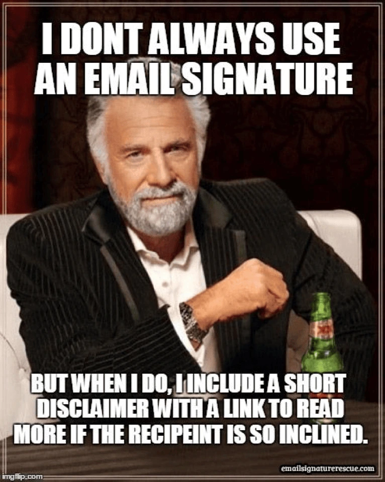
Including a long disclaimer in your email signature is a common mistake. Now, you might argue that it’s better to be safe than sorry. Well, I’m afraid I’ll have to pop that bubble. No legal advisor would ever tell you that email disclaimers hold any weight. Its function is strictly limited to annoying people.
7. Do use a professional headshot
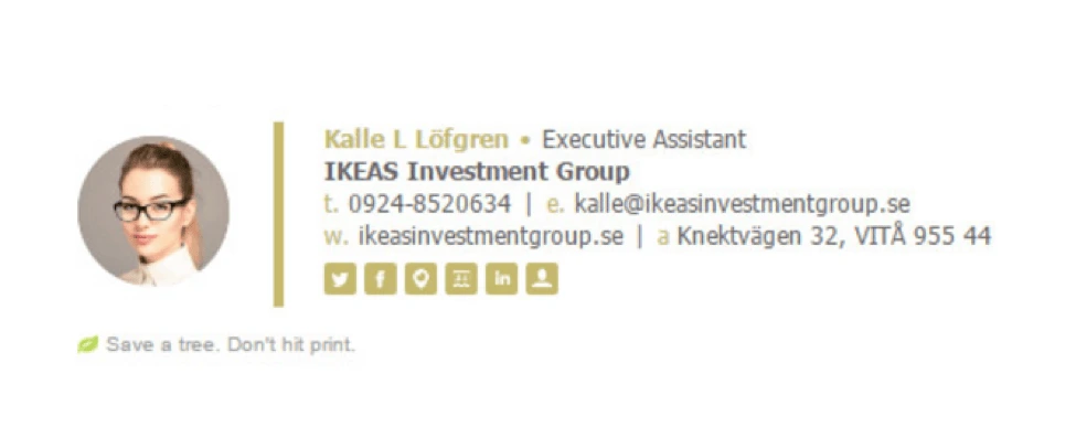
Using a headshot instead of a selfie is another tip for leaving a lasting impact. Try to look professional in the photo: dress formally, keep your hair well-groomed, look directly at the camera, and pose against a neutral background.
With these tips, you should feel prepared to create a strong email signature that communicates your brand as well as your own professionalism. Update your email signature and start leaving a better impression today.
