There are so many things that job hunters think about when it comes to their resume. These are usually the obvious things, such as making sure they’ve listed all their previous jobs and any suitable skills or experience that they might have. Anything that’s going to set them apart from other applicants will no doubt go straight on the resume. However, there is one part of a resume that not too many people think about: the font.
Related: How to make a resume employers will notice
Even though you might not realize it, the font you use on your resume will give the reader an insight into the type of employee you are. For instance, using a fairly childish font could really put someone off inviting you in for an interview. Ideally, you need to go with a font that’s professional, clear and easy to read.
When there isn’t much difference between the top candidates for a job, an employer might make their final decision based on smaller details, such as a resume’s font choices. Are you ready to think about the best fonts to use on your resume? Here are some of our favorites.
Serif fonts
A serif font is one that features small strokes and extra features on the letters. In some cases, these are known as Roman fonts. Here are a few of the best serif fonts to use on your resume.
Garamond

Do you prefer an old-style or more traditional font? If so, then you might want to choose Garamond for your resume. The font is named after a famous 16th-century French typeface designer called Claude Garamont. Many people working on their academic resumes tend to go for this style as it looks sophisticated.
Cambria
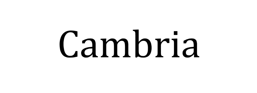
Another serif font, Cambria is very popular — and there’s a good chance you’ve already heard of this one. It features on Microsoft Word, so you might already be using this for your resume without even realizing it. It was designed in 2004, and since then, it has only been gaining in popularity thanks to its clear letters that are always easy to read (even when printed very small). Even though this font isn’t all that old, it’s still considered to be quite traditional and is favored by older job applicants who are applying for mature roles that demand a lot of experience.
Didot
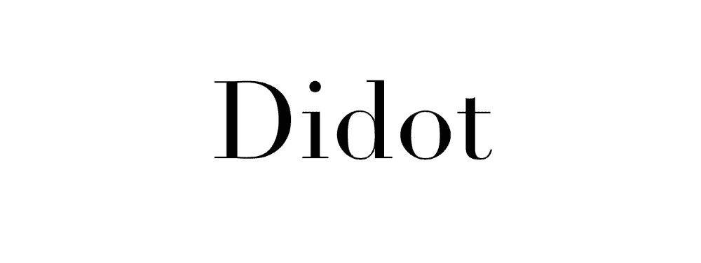
If you’re applying for a role in the creative industry, then you will no doubt want to go for a font that is both easy to read but also shows off your personality and creative flair. Didot is just the typeface for you. This font’s debut was a long time coming, as it was developed between 1784 and 1811. Once perfected, though, it became a staple with creative brands, individuals and organizations. One thing to bear in mind, though, is that this might not be the best font choice if you’re going to print it out small, as some of the serifs might not be all that visible.
Georgia
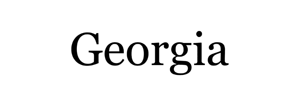
One final serif font that you might want to consider is Georgia. This is another very traditional font, and many people like to use it as an alternative to the overused Times New Roman. Georgia is really spacious and readable, so it will certainly help a recruiter skim through your resume.
Sans-serif fonts
If you would rather not use a font that features unnecessary flourishes, then you might prefer these sans-serif ones. They don’t feature any extra features at the end of the letter strokes, which makes them a popular choice for digital job-seekers & hiring managers.
Arial
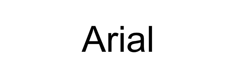
A font that you most likely have already heard of and used is Arial. The lines in all of the letters are always clean whenever you use Arial. This will make your resume look very readable indeed, and there won’t be an issue whether someone is reading it on-screen or on paper. One thing to bear in mind, though, is that it’s very widely used. In fact, some people think that it’s a boring font choice because of how widespread it is these days.
Calibri
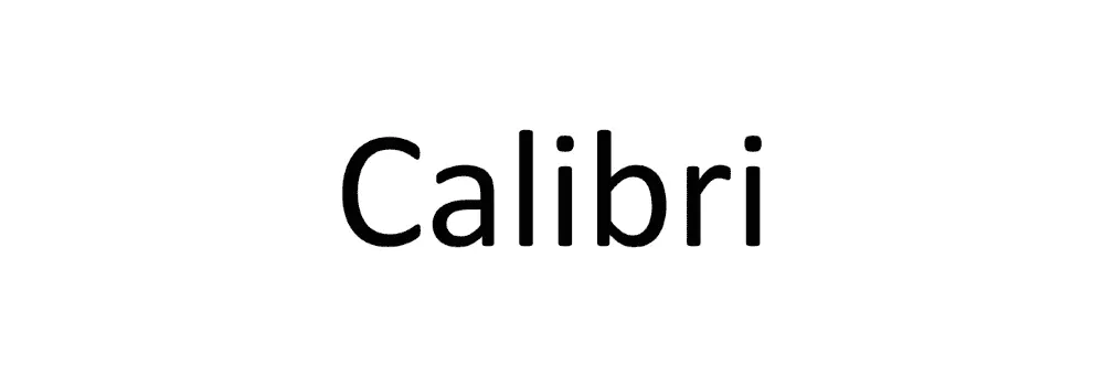
Calibri is, once again, another very popular font that you might have already used in various Word docs. In fact, this font is so common that it has now replaced Times New Roman as Microsoft Word’s default font. It is one of the most easy-to-read sans-serif fonts, so your words will be very clear to anyone who scans your resume. It looks great on computer screens and will also look very attractive when printed out.
Helvetica
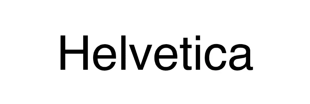
Helvetica is a font that is quite well-respected in the design world. It’s regarded as a very contemporary font, and it’s one that many typographers & designers choose for their own work. In fact, you might be able to spot it in a few big-name brand logos. (For example, it features in the Lufthansa and Panasonic branding.) As it is widely regarded as a professional design font, it would be a good choice for your creative resume.
Trebuchet MS

If you know that your resume won’t be printed out after you email it to the recruiter, then you could always go with Trebuchet MS. This font was specifically designed to look great on a computer screen. It looks very modern, and some people say that it has a nice texture to it. It’s a great option if you want a font that’s clean and will give your resume a modern edge.
Key takeaway
Did you realize there were so many excellent, readable fonts to choose from for your resume? This is only the tip of the iceberg. Now that you know some of the best fonts to use, your design choices can really make a difference in your next job application.
