You likely already know that a logo is an important part of any business’s branding. Not only does it make your modern real estate company stand out from the competition, but a solid logo can attract and win over new customers. That’s what we’re always aiming for, right?
Related: Real estate branding—a comprehensive guide
But, it’s tricky to design a custom logo for your real estate firm. You’ll need to think about the colors, fonts and shapes you’re using—not to mention arranging each individual element to create an impressive design.
So, we collected eight of the best real estate logos to help inspire your own.
What makes a good real estate logo?
The logo you’re creating for your real estate agency is one of the first things you’ll need to nail. But before we share some of our favorite modern real estate logos, let’s chat about what makes a logo so great.
A strong logo usually is:
- bold
- unique
- easy to understand
Yet above all, the logo you’re creating for your real estate company needs to be on-brand. There’s no use in having a bright and colorful logo if your website, social media channels and letterheads are black and white.
Your audience won’t understand it, and you won’t see the 23% average revenue increase that businesses with consistent branding experience.
(Remember, that’s the aim of a logo: to make your business stand out.)
8 awesome real estate logos to inspire your own
You don’t have to start from scratch when you’re creating your own real estate logo. Take a look at these examples, pick out the ideas or concepts you like, and find a way to work them into your custom logo.
However, we’re coming at you with a word of warning: Please don’t directly copy these logo examples. The best logos are unique, innovative and stand out from the crowd, so take these ideas and try to put your own spin on them.
1. Smith Mountain Homes
First up is this beautiful logo from Smith Mountain Homes.
You can quickly understand the type of homes they sell, right? And it’s not just because the word “mountain” features in the brand name; they’ve used graphics to signal the type of property they sell.
Granted, the design and font choices are simple—but that’s often the best way to create a memorable logo.
2. Cabo Cribs
If you’re looking to buy property in Cabo, I’ll bet Cabo Cribs’ logo catches your attention.
Similar to the real estate logo above, this design is simplistic, but it doesn’t scrimp on the essentials of a good logo. It’s easy to understand, elegant, and has a small graphic that makes it obvious they’re selling homes.
3. Williams & Williams
If you’re in the market for a luxury property, you’ll love Williams & Williams’ logo.
Take one glance at this logo and tell me what you interpret. It’s gold-themed, has elegant writing, and shows palm trees with the properties they’re managing. It ticks one huge element of a great logo: It’s perfectly on-brand for their commercial real estate company.
4. Compass
Who said a logo had to contain words?
Think of the world’s most recognizable logos. McDonald’s, Nike or Adidas will likely make their way onto that list—and none of them have a brand name in their logo.
Real estate firm Compass looks like they’ve drawn inspiration from those huge brands with their word-free logo. Although you can’t clearly see they’re selling properties, it’s a great way to make their audience stop and pay attention. After all, what are realtors for if not providing their clients with valuable guidance and direction?

5. Blue Key Property Management
I’ve included this logo concept for Blue Key Property Management here purely because it’s so simple, yet so effective.
You might’ve seen by now that many real estate logos contain property-related graphics. But instead of taking the standard route of a house, this firm opted to use keys—a factor that helps them stand out from the competition.
6. Delicious Real Estate
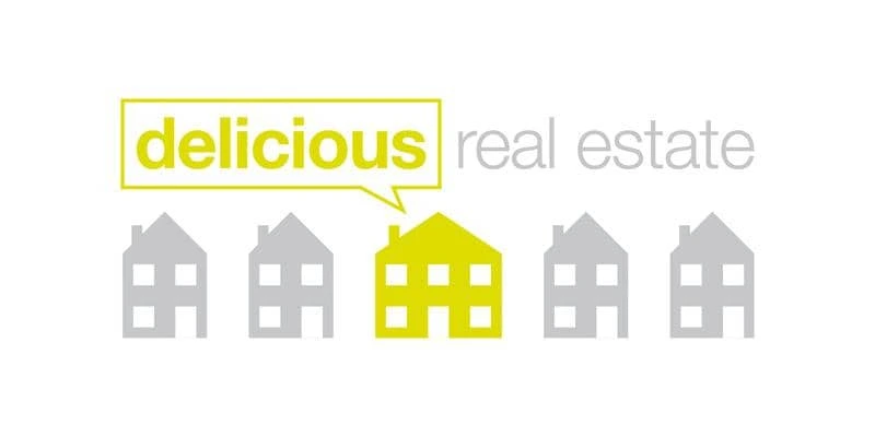
A simple—yet effective—way to build your real estate logo is to think about your buyer personas and their pain points. What are they looking for when they’re purchasing or renting a home from your firm?
It seems like Delicious Real Estate think it’s a reasonably-sized home. That’s why they’ve portrayed the situation their customers are usually stuck in through their logo.
7. Crown Real Estate
Remember how we mentioned real estate logos should be simple and easy to understand? Take a look at Crown Real Estate’s logo, which does exactly that while using simplistic fonts, a black-and-white color scheme, and a basic crown icon to match their brand name.
8. Live Dubai
The final logo on our list comes from Live Dubai.
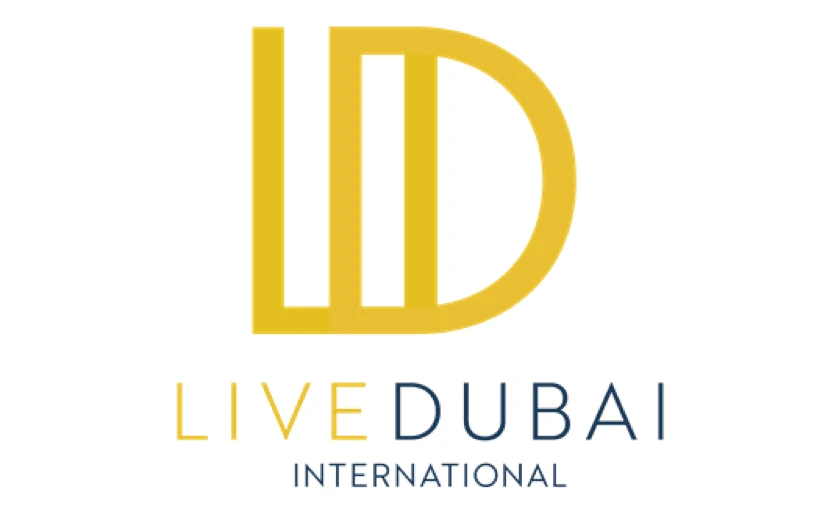
Much like the other real estate logos we’ve listed, this one is simple. But, what we really love about this design is the way lettering is used to create an interesting logo that’s totally unique to their brand name.
This gives them two options: use the graphic & text together as their logo or crop the image just to use the lettered graphic.
How to create your own real estate logo
Feeling inspired and ready to start designing a new logo for your real estate company?
You don’t have to hire an expensive graphic designer to create a custom logo design. There are thousands of templates you can customize, making a DIY logo the best way to create a professional brand for your real estate business—even if you’re on a tight budget.
However, if you do have some cash to splash on a fancy real estate agency logo, hiring a graphic designer is a great way to make sure your logo is unique. …Just make sure they’re sticking with your brand guidelines.
Key takeaways
As you can see, there are tons of incredible real estate logos that can inspire your own.
Remember, the most effective logos are unique, bold and easy to understand. And while each real estate logo design we’ve listed here ticks those boxes, you’ll need to add your own spin to each design when you’re creating your own.


