In today’s digital economy, it’s easy for businesses to look dated quickly and out of sync with what’s “in.” If you’re worried that customers or clients are finding your work or services blasé, you can easily send the message that you are on top of your game with a webinar presentation.
A well-curated webinar presentation can be a game-changer by keeping your branding consistent, visible and top-of-mind. It also engages the audience by offering visuals that help them retain information for longer periods.
With the aid of our modern marketing presentation template, you can easily highlight how your business is staying on top of current trends. And, ultimately, our professionally-designed slide template saves you (or your sales team) time by not requiring you to start from scratch.
To create the perfect webinar slide or webinar template (for others to recreate down the line), follow along with the tutorial below using our modern marketing presentation template.
Best practices for creating a webinar slide
In short, you need your webinar template slides to be:
Captivating

Just as you were taught in school, you need the beginning of your webinar presentation to be captivating.
Remember how your teachers drilled it into you that that first line of your book or essay was the thing that would hook people into continuing [to read your piece]? Well, that same principle will apply for your title webinar slide.
Not only will the title slide be the first thing your audience will see, but it can also potentially be used for promotions along with the splash screen (a.k.a. the thumbnail) for the on-demand version of your presentation.
To create a captivating and enticing title slide, you will need to use a few things:
- Title: Keep the title of your presentation exciting but straightforward. Use an easy-to-read sans serif font.
- Subtitle: The subtitle will be smaller in size than the webinar title and should also be written using the same sans serif font — but with styling such as italics or bold. Use this section to expand on your title so your audience will know exactly why they should click and continue.
- Logos: Never forget to include your logo in any promotional material that your business produces. On your title page, this will clearly show who is hosting the webinar. If you are co-hosting with another company, be sure to include their logo on the title slide as well.
- Image: Select an appealing and eye-catching image as the background of your title slide, or as a supplement to the design. With our modern marketing presentation template, you can see how the title sits on a white rectangle, allowing readers to read the necessary information easily while also providing an engaging and professional look.
Consistent
With any (and all) branding for your business, your webinar slides need to have a consistent color palette, along with consistent font usage and other design elements.
You don’t necessarily need to use brand colors, but the colors should remain consistent throughout the slides. Pick two to three colors that are easy to read with your text and stick with them throughout the entire presentation. You can use these colors for shapes and backgrounds, text boxes, or even as transparent image overlays.
Simple

The more crowded your webinar slide deck, the more likely you are to lose your audience.
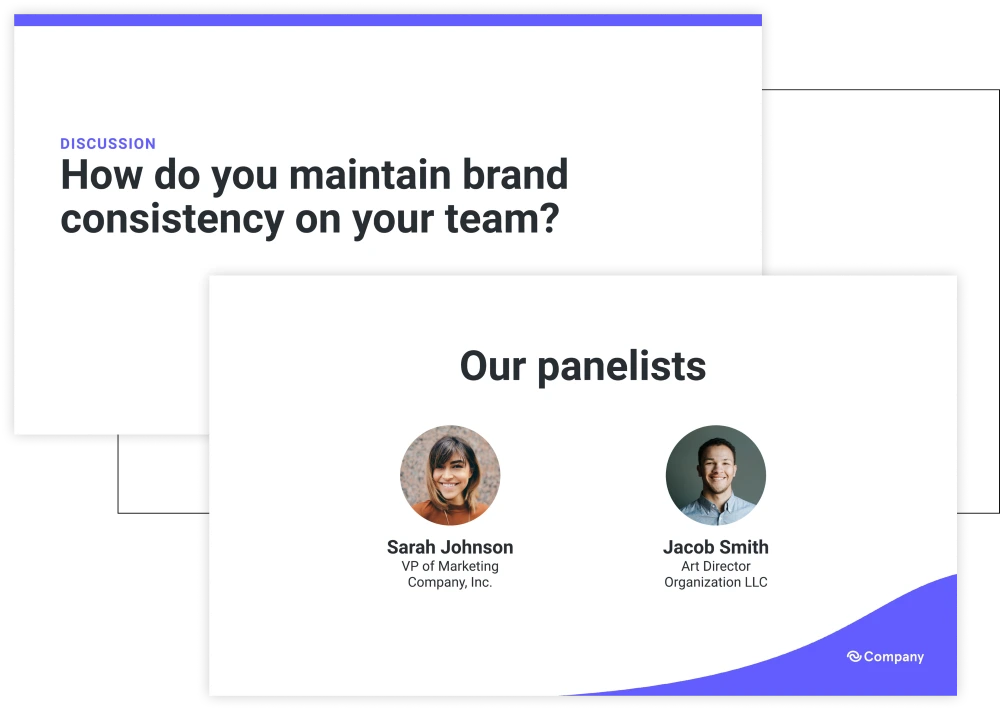
For example, when creating your webinar template slide, if you create a slide to introduce your webinar speakers, have the slide include headshots of each presenter along with their name and title. Skip the bios. Those can be included in your script, but will only clutter the slide. A good rule of thumb is that if you are going to be talking about the context of the slide in your script, then don’t include it as text, or only do so as bullet points.
Compelling
Include an agenda slide at the start of your webinar presentation. By doing so, this slide will help your audience know what to expect from your presentation.
Make this slide extra compelling — tell them right off the bat what they stand to gain by engaging with you and your webinar. The more compelling this slide, the more likely they are to continue. Remember to keep it simple by using bullet points and keeping the slide’s text concise.
Informative

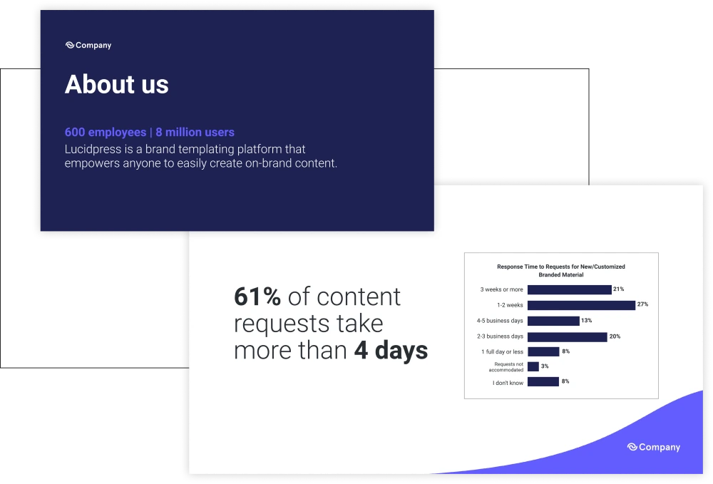
Try to include a few slides highlighting stats about your business or services. Stats can add credibility to your message while also solidifying your script. Infographics are a great way of demonstrating compelling stats.
That said, you also need your webinar to have:
Screenshots
Because we spend so much time on our phones and computers, there is a chance you will need to include screenshots during your presentation to help explain things.
Your webinar template should include slides featuring mobile screenshots and computer screenshots. Again, keep these slides simple: include the screenshot with a couple of explanatory bullet points.
Visual aids

Graphs, charts and icons can take your webinar to the next level.
They will help explain key points while also aiding in getting end goals across. Photography is another way to make your presentation stand out. If you don’t have in-house photography, consider using stock photos.
A recap
A recap slide is a helpful way to wrap up and remind audience members about the key takeaways for your webinar.
Enough of us know what it is like to get to the end of a webinar and have already forgotten several key points. Use a recap slide that provides key takeaways. Repetition will help your audience remember your key message and also give them something to think about after the webinar.
A call-to-action (CTA)

A CTA slide is must-have-necessary for your webinar presentation template.
Use this slide to engage your audience by allowing them to sign up for another webinar, try a new product, complete a purchase, etc. Make sure your CTA truly resonates with the audience and make sure it’s the last thing they see before exiting the webinar.
Let’s get started
Now that you know the elements needed to create the perfect webinar template and presentation, you can start creating your own. Or better yet, download our modern marketing presentation template here and save even more time. You can also find more marketing presentation templates right here.
If you are looking for help in hosting a webinar, check our blog post “How to host a webinar.”


