A good logo represents the brand positively to the world, which is one reason why there are so many agencies dedicated to designing outstanding logos. Although the names and objectives of many organizations remain unchanged for many years, their logos are often renewed periodically.
Rebranding is sometimes necessary for shaping the future of the company, but you can reap some of the benefits simply by improving your logo design. A redesigned logo goes a long way in attracting and influencing customers. Here are 9 great examples of famous brands who have successfully redesigned their logos.
Related: 8 tips for designing logos that don’t suck
Pizza Hut

Since Pizza Hut’s opening in 1958, its logo has been redesigned many times. From the original mascot Pete holding the words “Pizza” and “Hut” in both hands, the logo has evolved to feature an iconic hut-shaped roof as its main element. With this redesign, Pizza Hut has stamped its signature slanted roof in sauce—to match an upgraded menu with bold sauces and premium ingredients.
Pizza Hut’s renewed logo is simple and classically designed with a minimal color combo of red and white. Developed as a flat design, this red logo still inspires hunger.
MailChimp

This example comes from Jessica Hische, the designer of the revamped MailChimp logo. The redesign looks quite similar to the previous version; there are minor improvements rather than a complete change.
MailChimp’s old and new logos may look alike at first glance, but there’s a difference in typography which makes the new logo cleaner and easier to read. Redesigning your logo doesn’t always mean a total overhaul. In fact, improving the look and feel of an existing logo can preserve and enhance the brand identity you’ve already built.
Firefox
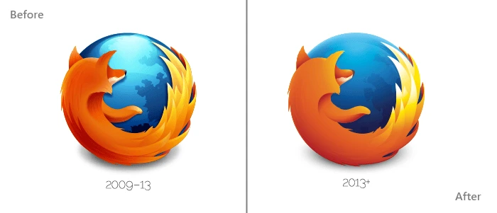
Firefox, the open-source internet browser, uses a logo which has gone through several iterations since 2004—but the imagery and symbolism remain the same. This logo features a dark blue globe (the web) with a bright orange fox speeding around it.
The logo design team at Mozilla have modernized the existing logo by changing several visual elements. The glossy touch on top of the globe has been removed, while the contrast of the fox’s tail has been heightened. It’s a flatter design that’s still as vibrant and fiery as ever.
Mall of America

The launch of the Mall of America’s new logo is a perfect example of rebranding. The largest retail and entertainment complex since 1992, the Mall of America has recently upgraded from its older, nostalgic brand to something new, modern and dynamic.
Before, its logo recalled the American flag with its star shape, color scheme, and waving lines. An old-fashioned serif font proclaimed “MALL OF AMERICA” at the bottom.
In contrast, the revamped logo features a multicolored star made of ribbons, along with the company’s name in a sans-serif font. This represents the changing vision and diversity of the mall, while still retaining its recognizable American star.
Motorola
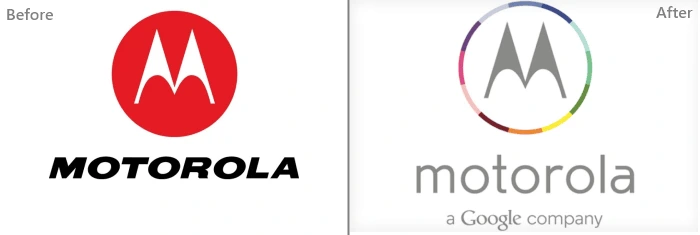
Motorola’s new logo first debuted in Techweek back in 2013. Motorola was acquired by Google, and its redesigned logo represents this merger well. The flat design and letter “M” are common to both versions, but the font has changed and the colors are aligned more closely with Google’s branding. And in case that isn’t clear enough, the tagline “a Google company” is added below the Motorola brand name.
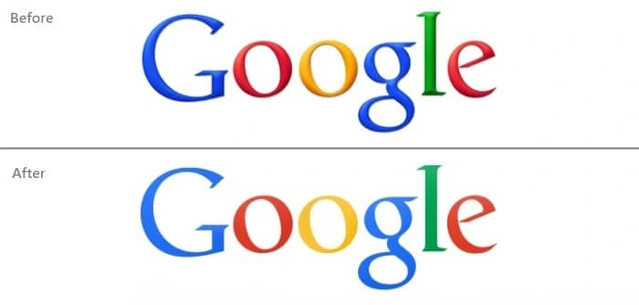
Speaking of Google, its current logo was unveiled in 2015. Its original logo was designed in 1997 and digitized by founder Larry Page. In 1999, further visual elements were integrated into the logo such as an exclamation symbol, enhanced hues, and a background shadow.
Like many of today’s modern logos, the current Google logo is a flat design. There have been minor changes to Google’s logo throughout its journey, but it has always retained its classic serif typography and bold colors.
Tampa Bay Buccaneers
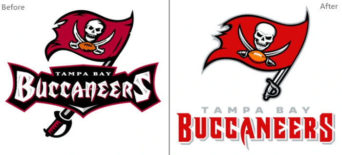
Illustrations can certainly make your logo more visually interesting, but they can also become too complicated. Thus, the recently redesigned logo of the Tampa Bay Buccaneers was simplified to look more polished but still feature the same pirate imagery.
The colors here are smartly used—a brighter, richer red calls attention to the flag, and black outlines the illustration without overpowering it. Redesigning a sports logo can be tricky business because fans are so attached to their team, but this logo retains all the crucial elements of the original, right down to the flag’s sword handle.
eBay

The disordered arrangement of letters in eBay’s logo were the main target of this redesign. eBay’s new logo looks modern, featuring a flat design with no letters overlapping. The colors have been lightened to make them easier on the eyes, as well. In this svelte version, eBay has elevated its brand from the wild early days of internet commerce to a long-standing and trusted online marketplace.

Facebook occasionally launches different logos with new versions of its site. As the most popular social network, Facebook must keep up with its users and reflect the latest design trends—but its identity is always the same.
This new logo, like many of its digital peers, is designed in flat format with the bottom line removed. Also, the “f” now extends all the way to the edge. With its navy blue background and bold letter “f,” Facebook’s rounded square icon is still instantly recognizable across the web.
So there you have it—9 examples of logo redesigns from some of today’s successful brands. Trends like flat design and bright colors can bring new life into an old logo. As the market changes and evolves, these logos will change again, too. But most importantly, they will continue to represent and build a strong, consistent brand identity that resonates with their customers.
