Regardless of your industry, it’s becoming increasingly difficult to gain and keep an audience’s attention online. You have mere seconds to capture their interest, so it’s critical that you create engaging content.
While we all understand the value of content marketing, how you develop your content is just as important as what you actually put out there. Providing consistent, interesting content will boost traffic, which will increase brand recognition, engagement and (eventually) sales.
But, how do you provide engaging content in a world where everyone is fighting for the attention of the consumer? Answer: Include visual assets in your content strategy. The human brain processes visual information quickly, and people remember more of what they see than what they read.
What is visual content?
Visual content is any piece of content that incorporates visuals or is primarily image-based. Visual content examples include video, infographics, photos, charts and GIFs.
Why create visual content?
We often say not to judge a book by its cover, but our brains are hardwired to do just that. It’s the reason why we ‘eat with our eyes’—we like when things look nice. The visuals that accompany your content are what viewers will see first, whether that content is an advertisement, the packaging of your products, your business card, a social media post or anything in between. Thus, these visuals are the first impression potential customers will get of your brand, and they’ll use them to decide whether your brand appeals to them or not.
To illustrate just how effective visuals are in attracting visitors, consider these statistics:
- In 2016, over 60% of B2B marketers and small businesses planned to increase investments in video marketing strategies. (CMI)
- On average, tweets with images receive 150% more retweets than tweets without. (HubSpot)
- On average, Facebook posts with images receive 2.3x more engagement than posts without. (BuzzSumo)
Point is, visual design leaves an impression on visitors. You must learn how to use them wisely.
Beyond first impressions, the importance of visual stimulation doesn’t diminish. Once the eyes aren’t engaged anymore, the brain knows it’s time to move on. Digital marketers pay close attention to engagement metrics because they show how many consumers were driven to react or interact with the content. Of all the possible customers that were reached, those that engaged with the content were the ones that stayed from beginning to end. Visually stimulating content helps engagement because it compels users to continue watching, reading or experiencing the content.
Additionally, visually exciting content is much more memorable. When someone is stimulated with pleasing, compelling visuals, the brain has a much easier time paying attention and remembering the information it processes. You may encounter an online lead who doesn’t need your product or service yet, but in the future, they will. By visually stimulating them during their interactions with your brand, they’ll be more likely to recall you when the information is relevant. This also makes visually pleasing content more shareable, because the longer someone can recall it, the higher the likelihood of finding it relevant to a friend or family member.
How to make visually stimulating content
Visual stimulation has long been a primary concern for marketers. If the eyes are bored and unstimulated, then the brain will tug the viewer’s attention to something else. In the digital age, where consumers are exposed to several different brands and messages all at once, that “something else” is likely going to be a competing brand’s content. In other words, if your visuals don’t provide high levels of stimulation, then your online leads will be more likely to defect to a competitor.
All these reasons make a compelling argument for the relationship between visual stimulation and client retention, which might’ve started the wheels turning about how you can produce more visually stimulating content. Before those wheels drive you in the wrong direction, it’s important to look at how you should improve your visual content.
- Quality is paramount: As already mentioned, quality is a huge indicator for your brand. In your quest for more visually exciting content, pay close attention to the images and other visuals you use. Visuals are great, but bad or low-resolution visuals are not.

Source: Contemporary Communications
- Relevance follows quality: Like avoiding bad or low-quality images, you want to avoid visuals that aren’t relevant to the information being provided. In other words, don’t include visuals for the sake of adding visuals. (See: cats.) They should make sense and pertain to the content in question.
- Cover is crucial: We already know that people judge a book by its cover. Your initial visual should be the most compelling because users only spend a few seconds on a webpage before making the decision to stay or go.
- Over-stimulation is real: If there’s too much going on with too many visuals, the brain won’t be able to accurately process it all. Think of it like an action movie: while there are scenes with explosions, lasers and car chases, there are also slow scenes to develop the plot and its characters. Why? Because if the whole movie were action, we’d be overloaded and our brains would mentally withdraw us from the experience.
- Visuals carry the eye: Researchers have been studying the way the eye moves across a page for decades. By understanding eye tracking, marketers can ensure that the viewer’s eyes move logically across the page to pick up all the vital information. Images are one way to influence how someone’s eyes scan a page. We’re naturally drawn to images, so by placing them strategically, you can control where the eyes travel.
Types of visual content
In this post, let’s discuss how visual content like infographics and video can encourage your visitors to convert.
1. Create impact with the right typography
Unlike someone reading a book, visitors on a website don’t consume content from left to right then go down to the next line. In fact, virtually nothing happens in progression. Visitors will either go straight to what they need, or they’ll stop in their tracks if something more interesting catches their eye—like a 30% discount on another brand of detergent, for example.
Today’s designers are using typography to catch and keep visitors’ attention. The size, shape and placement of different fonts will enhance your message, and you can direct the focus where you want it most.
Consider the bold typography on this webpage. The cursive font complements the typewriter font, giving the site a vintage, personal feel. The use of color to emphasize certain words attracts the eye and sets a positive tone.
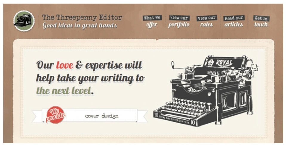
Source: Intechnic
2. Present data visually with infographics
Would you rather read through a bulky PDF filled with stats and long-winded sentences, or a colorful infographic which uses simple icons and text to display information? The choice is pretty obvious. Including a well-designed infographic in your blog post or webpage will persuade people to pause and see what you have to say.
But does it increase conversion? Here’s some compelling evidence:
- Images increase memory retention. People who hear information will only remember 10% of it three days later. But, if the information is paired with an image, they’re likely to remember 65% of it in the same timeframe. People will have an easier time reading and remembering an infographic detailing the health benefits of bananas than they would three paragraphs of text. And the more time visitors spend with your content, the more likely they are to convert.
- More shares lead to more exposure. According to NN Group, infographics are shared and liked on social media 3x more than any other type of content. Since people are more likely to share a post with an infographic, it helps you reach more people on social media faster.
3. Incorporate video
It’s estimated that adding video to a marketing email can improve click-through rates by a whopping 200-300%. Need more proof? Additional research indicates that 73% of adults in the U.S. are more likely to purchase a product or service after watching a video that explains what it is.
Videos can be used to evoke emotion, explain how your product or service works, or introduce your company. It helps potential customers put a face to your name, which makes your company more relatable. The keys are to keep it under 2 minutes (even 30 seconds might be ideal for certain social channels), optimize it for mobile, and ask a question or tease the content in the caption.
4. Create a gifographic
Speaking of using video, you can also upgrade a static infographic by incorporating animation. Gifographics are still relatively new, which means your content will stand out. While some marketers worry that gifographics might be difficult to make, it’s worth the effort to present your information in a way that’s more engaging and dynamic.
5. Use quality photos with text overlays
Using compelling photography is a strategy that should always be in your back pocket as a marketer. Images make content more interesting, and it’s easy to overlay a quote if you have a quality image to start with. Photos with quotes or callouts are super shareable and can gain traction on social media very quickly.
Using high-quality images is obviously important if you’re creating campaigns for Instagram, but it’s also effective on Twitter. Tweets with photos are 150% more likely to be retweeted than those without pictures. If you’re concerned about your ability to create shareable pictures on your own, don’t worry. Plenty of companies like Lucidpress have templates you can use to create clear, engaging visuals for your next post or status update.
6. Incorporate comics or memes
If you’re looking to bring a little humor into your marketing strategy, creating a comic or meme is one of the best ways to do it. Memes—like those tweeted by restaurant chain Denny’s—offer excellent social engagement if you do it right. Watch out, because you’ll have to take care to not overstep your brand. Comics are also easily recognizable. If humor isn’t part of your brand voice, comic-style fonts and formats lend themselves to a more lighthearted vibe and make it easier to explain complex products or topics.
7. Present information in a tool
Making content interactive is another way to engage with potential customers while demonstrating the value of your product or service. This runs the gamut from tools that help readers figure out which streaming services they want to bandwidth speed-test calculators.
The benefits here are two-fold: you can garner a lot of traffic on the main tool page itself, and you can also include smaller widget versions of the tool on other pages to inspire readers to act. Clickable graphics that link to your tool can also grab the attention of readers who are scanning another article or blog.
8. Develop a quiz or checklist
As a marketer, your job is to convert leads into sales. Use a visual quiz or checklist to help prospective customers figure out what they already have, which services they need, and how your product can get them to the next step.
You can also use interactive graphics to gather email addresses and create custom ad targeting. For example, if someone takes a home security quiz, they’ll likely be interested in follow-up information about how they can fill in the gaps to keep their family safe. Then you can provide that info and, eventually, lead them to a sale for a product to meet that need.
9. Go back to basics with charts and graphs
Charts and graphs are a quick and simple way to visualize information. They make complex information very easy to understand and are regularly shared because it saves other people the effort of creating a graphic to explain the original concept or statistic. Just make sure you don’t sacrifice clarity for style. If your reader is short on time, clear and direct charts are often the best way to go.
10. Leverage screenshots
If using screenshots in your content sounds easy, that’s because it is. Include screenshots to show client testimonials, create step-by-step tutorials, or introduce a new feature in your product. Screenshots provide clear context if you’re talking about something that people can customize (like a toolbar), making your point easier to understand.
11. Try flowcharts
A lot of online content deals with complex and sometimes confusing processes. In those cases, try simplifying concepts with a flowchart. Breaking down an idea will give your readers insight into the bigger picture—and where they fit into it. Don’t be intimidated by building a flowchart on your own. There are plenty of tools out there that can help you create clear, customized charts to take your ideas from start to finish.
Key takeaway
To keep up with other brands, it’s imperative to incorporate visual design into your marketing strategy. The key is to do it purposefully so that your content stands out from the rest. If done well, we’re confident you’ll see a great return on your efforts.
