“We need a logo” is a loaded request that designers and creative agencies hear from their clients. High expectations are always involved—that’s a fact. Every client wants a remarkable logo for their brand, and they’re counting on you to create it.
Related: 9 excellent logo redesigns for famous brands
How do you deliver an innovative, impactful design on demand? If you’re running low on creativity, we’re here to fill in for your muse as she turns a blind eye to your deadline. Load up on logo design inspiration from the guidelines and examples below to get those juices flowing again.
Logo design examples for your inspiration
Consulting Logos
Consulting logo idea #1: Accenture
Accenture is one of the biggest management consulting firms. The company offers strategy, consulting, digital, technology and operations services. Their revenue was around $40 billion in 2018, so we could definitely learn some design lessons from them.

Consulting logo idea #2: Capgemini
Capgemini is another consulting giant that can teach us a valuable design lesson.

The key lesson here is that you can build a financial empire… even if your logo isn’t closely related to the services you’re selling.
The Ace of Spades has been present in their logo since its inception, but it has little to do with their business. In fact, it refers to bridge—a card game that the founder of the company, Serge Kampf, enjoys. In bridge, the Ace of Spades is the highest-value card.
Consulting logo idea #3: DLA Piper
If you’re offering legal consulting services, here’s what you can learn from one of the biggest global law firms. (How big? DLA Piper has lawyers in more than 40 countries and over $2 billion in revenue—that’s how big.)
The open-ended shapes represent out-of-the-box thinking. Something you might actually want from a lawyer, right?
If you look at it from a different angle, the logo seems like a talking bubble, which shows they value the art of communication… or that they’re friendly. You decide.
Lucidpress: Click the image to use the template
Use one of our consulting logo templates as inspiration for your own logo. Switch out colors, fonts and texts to create your logo in seconds.

Real estate logos
1. Smith Mountain Homes
First up is this beautiful logo from Smith Mountain Homes.
2. Cabo Cribs
If you’re looking to buy property in Cabo, I’ll bet Cabo Cribs’ logo catches your attention.
3. Williams & Williams
If you’re in the market for a luxury property, you’ll love Williams & Williams’ logo.
Lucidpress: Click the image to use the template
Use one of our real estate logo templates as inspiration for your own logo. Switch out colors, fonts and texts to create your logo in seconds.
Health and fitness logos
1. Heavy Mettle Fitness
When you have too many ideas, just stick to the basics, even if it’s cliché.
Source: GLDesigns
2. Peachy
What’s that number-one thing your audience wants? Point it out, and people will remember you as that gym or that fitness instructor or that nutritionist who can help them get it.
Source: 99designs
3. Necessary Payne
If your ideal audience is into hardcore training, a logo like the one below could be a great strategic move.
Source: Design your way
Lucidpress: Click the image to use the template
Use one of our health and fitness logo templates as inspiration for your own logo. Switch out colors, fonts and texts to create your logo in seconds.
Striking use of color
Powerful colors make a logo vibrant and eye-catching. In recent years, logo design trends favored simple and spirited colors that appeal to new generations of customers.

It’s interesting to see the process behind this logo and Volusion’s brand identity design.

TeleMadrid’s rebranding is another example of a colorful and adaptable logo design.

And Duolingo’s 2019 logo update builds on their playful and energetic brand.
Memorable use of layout
Another way to make your logo unforgettable is to surprise people with an unexpected layout.

This example from Bajo Protección invites a second look with its 3D effect.
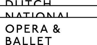
The Dutch National Opera & Ballet logo has us peeking from the balcony.
And Moonpig champions creativity by updating their logo to match their surreal name.
Beautiful use of typography
Fonts are another excellent source of inspiration.
Typography can help you balance simplicity and intricacy in logo design. It’s also an essential element for your brand creation process.
Typography was just what Tom Sands needed to make this logo a timeless presence on their acoustic guitars.

Typography can also create a sense of motion, as it does in this example.
And sometimes, like in the case of UK-based creative agency Dry, fonts are all you need to capture your brand spirit.
Clever use of symbols
The symbols you include in your logo give people a glimpse into the brand’s spirit and generate emotional connectivity.
This redesign concept uses the nave ship, a historical symbol of Paris.

Airbnb logo redesign is a great example of mixing various symbols into a memorable logo.

Chairish provides an honest and straightforward testimony of their dedication to their craft.
Creative use of patterns
You can incorporate different patterns into logos while still maintaining brand consistency—and these examples are proof.
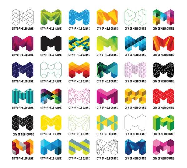
The redesign of Melbourne’s logo provides a playful space for patterns and placements.
The German Historical Museum’s logo uses juxtaposed shapes that can fit well in intricate contexts.
In this example, patterns and negative space convey a message of unity.
Surprising use of negative space
“In the end, creativity isn’t just the things we choose to put in, it’s the things we choose to leave out.”
Austin Kleon
In this quote from his book Steal Like an Artist: 10 Things Nobody Told You About Being Creative, author Austin Kleon captures the inspiration negative space can unleash.
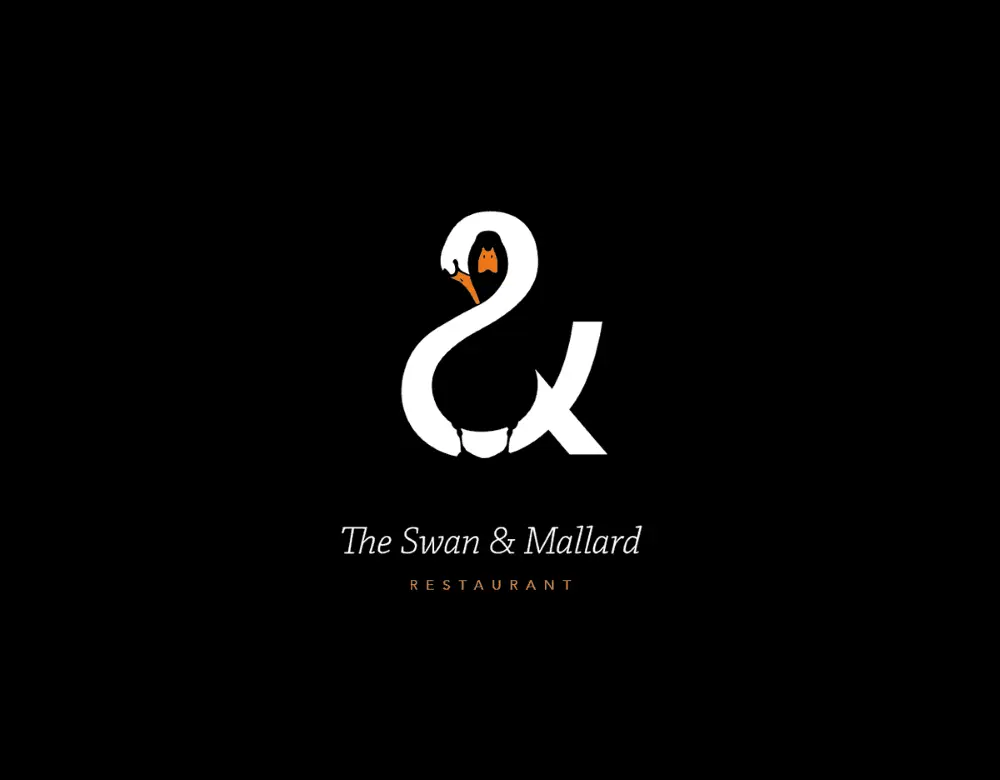
The Swan & Mallard logo challenges you to find the intertwined characters.
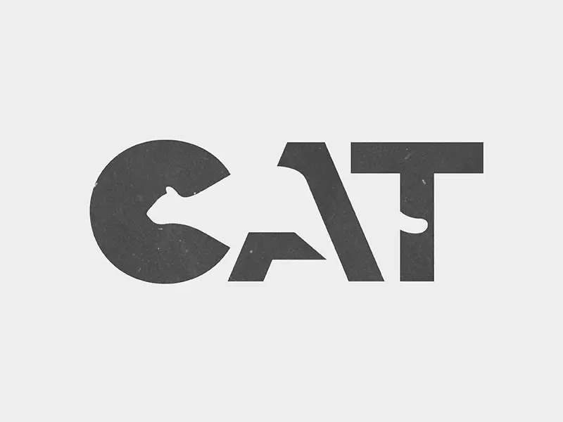
Whether you’re into cats or bears, you can’t help but spot the figures that hide behind this typeface.
This Flight Finder logo creates a sense of motion and pleases the eye with its symmetry.
Surprising use of animation
We live in the golden age of GIFs, and their cultural impact now influences logo design ideas as well. These examples show how you can add animation to a professional logo.
PetCloud’s logo has adorable spelled all over it, wouldn’t you agree?
I bet the designer behind this logo knew his clients would be over the moon with its design.
And this creative used animation to deliver his logo design with a bang!
Before you go, remember this
As a designer, you know coming up with cool logo ideas is a complex process. What helps is to lead with a deep understanding of your client’s business and brand values.
It’s equally useful to draw inspiration from diverse sources and experiment with your ideas until you find the right fit. Play with colors, layout, typography & symbols to design the creative, custom logo your client expects.
Once you have it, use the logo to build branding that’s consistent across all channels. Give customers a familiar and reliable presence to count on and build meaning with.
Use this 5-step process to design creative logos
Unfortunately, a clear creative brief for logo makers is a rare occurrence. That’s why designers and agencies explore, select and clarify ideas before proposing anything.
Here’s a secret experienced creatives know: Sometimes you can reach your best ideas by using a systematic approach.
Whether you’re building a brand from scratch or planning a thorough rebranding, this 5-step process can help you come up with cool logo ideas.
1. Understand the customer’s business
The logo is central to a brand’s identity. In fact, the best of them are deeply rooted in the company’s mission. If you’re lucky, your customer has their mission clearly articulated. If not, roll up your sleeves and focus on research.
First, observe and analyze how their customers talk about them.
Explore:
- Testimonials & reviews that highlight their best features (for B2B, try G2Crowd or Clutch; for B2C, try TrustPilot or Google Places)
- Answers to surveys that show how customers feel about the business
- Case studies that reflect their process and results
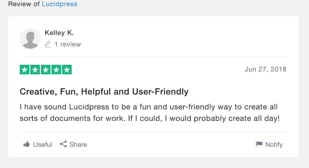
Source: TrustPilot
For brand new businesses, you can look for similar details in their competitors’ activity to give you a starting point.
2. Map out the brand’s values
The best branding relies on a deep understanding of what people want when they buy something.
A custom logo that builds differentiation has to speak to customers’ psychological needs. A powerful design triggers a reaction and influences the choices consumers make when they see it.
Define what the business stands for to ensure your logo design speaks to the brand’s values.
For example, Patagonia strives to “build the best product.” They aim to “use business to protect nature” and do so in a way that’s “not bound by convention.”
Buffer commits to “default to transparency,” “cultivate positivity” and “improve consistently,” among other values.
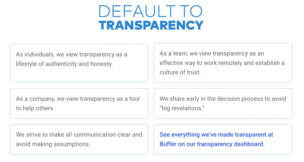
Source: Buffer
Using your customer’s brand values to guide your logo design can be incredibly inspiring.
3. Choose a series of adjectives
Now that you know what the business is all about, you use this information to pin down specifics. Make a list of adjectives that capture the brand personality.
For example, when you think of Patagonia, words like humble, altruistic & adventurous may come to mind. Buffer inspires words such as helpful, calm & dependable.
Examples of adjectives you could use:
- Bold
- Serious
- Rational
- Imaginative
- Idealistic
- Generous
- Clever
- Humorous
- Whimsical
- Luxurious
- Glamorous
- Rugged
- Brave
- Rebellious
- Cooperative
- Edgy
- Gentle
- Playful
- Old-fashioned
- Youthful
Want to go the extra mile? Analyze the vocabulary customers use when they talk about your client and dig up adjectives from it.
Single out associations that point to what makes the company different. Narrow your list down to 3. Now you have the emotional substance that fuels your logo.
4. Collect inspiring ideas
Logo design ideas often come from unexpected sources. Take it from people who faced the same challenges as you do now:
“I use weird sources for inspiration. I look at forms in nature and try to reduce them to basic shapes. I’m always trying to invoke a sense of humanity to a logo.”
Josh Baron, Media Art Director at Sparxoo
Multiply the opportunities for creative inspiration to kick in and increase the chances to get that grand idea. Look for compelling symbols, icons and patterns.
Check out fresh photography from sites that offer free stock images. Peruse design websites like Dribbble, Behance, Designspiration & Dunked.
Even better, browse countless logo examples on Logoed, Logospire, Logo Gallery, Brand New, Logo Moose & Logo Design Love.
Collect fonts & color options to create a mood board. This collage of elements helps define your concept at this stage. Include notes to explain your thought process so you can give your client a consistent overview of your creative direction.
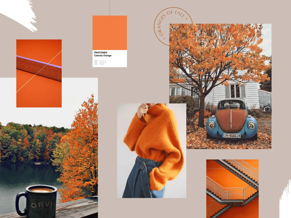
Source: Dribbble
Ask for feedback at this stage. Get input from your client to save you time and energy down the road. For example, knowing which elements your client notices can help you come up with better, more relevant logo design proposals.
Feedback in hand, it’s time to create the best logo you can.
5. Choose & validate the best ideas
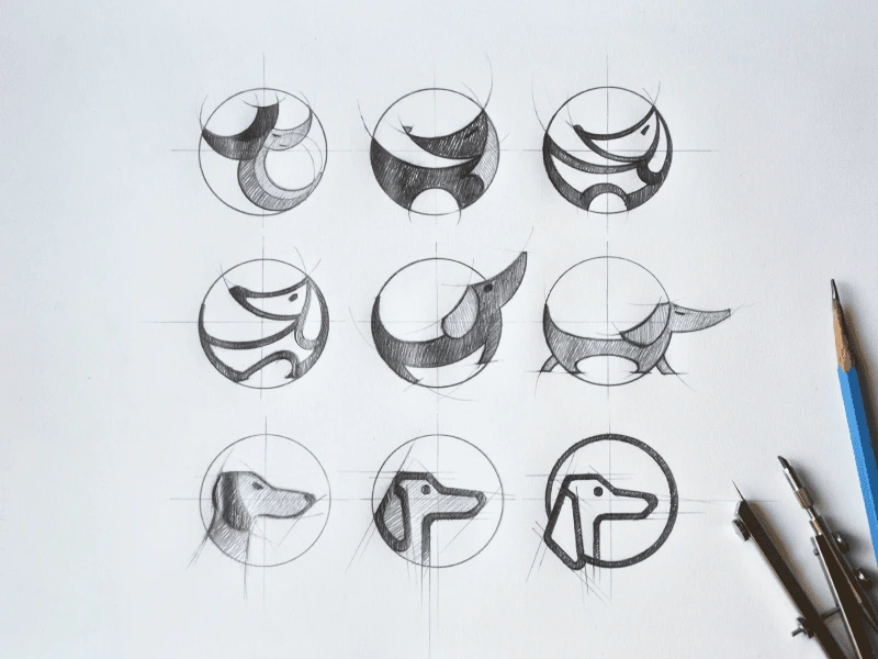
Fast forward through dozens of iterations to logo_v27_final_FINAL.indd.
You’ve received feedback, integrated it and designed (what you assume will be) the final version.
Source: Tubik Studio
Your moment of glory awaits, and so does your deadline.
Use this time constraint to strengthen your creative process. Stop before you get caught up in a never-ending cycle of “I know I can do better.”
Instead, focus on shaping a logo that can outlive design trends. Give people a chance to build meaning into your logo over time.
Here’s what experienced creatives recommend:
“All logos should be four things: simple, memorable, timeless and flexible.”
Cory Schearer, Creative Director at Ferebee Lane
Keep in mind adaptability when you design your client’s logo. Your creation will be used in print, in emails, on social media, on websites and digital advertisements.
Wherever it may be featured, the logo’s role is to get an emotional reaction.
