What is a research poster?
A scientific research poster (or conference poster) is a tool that researchers use to present information in a structured way.
It may be used instead of a talk and can often prove more effective, particularly in a situation where a researcher doesn’t feel confident presenting in front of large audiences.
Related: 18 cool and creative poster design ideas
One of the key advantages to using a scientific research poster is that it allows the researcher to interact with their audience in a one-on-one or small group setting. This gives the researcher plenty of opportunities to measure the reaction to their findings and listen to important feedback from their audience.
That audience might consist of colleagues within the same field, fellow scientists in a different field, or members of the public who have no background in conducting or analyzing scientific research. It’s crucial that the researcher tailors the information within their poster to suit the intended readers’ level of ability.
While a scientific research poster may be primarily used within a conference setting, where the researcher is on hand to elaborate and discuss their method and findings, the poster should also be able to stand alone. It might be left on display following the event, so it needs to include all the relevant information that a reader could be looking for.
What to include in your scientific research poster
To meet the expectations of your audience and provide them with thorough but concise insight into your work, your scientific research poster should include:
- A heading
- An introduction
- Your research method
- The results
- Your recommendations/conclusion
- Your name
- Your contact details
- Funding acknowledgements
- Institutional affiliation
You should also prepare:
- A short verbal explanation of your research
- Handouts that accompany the poster
Design tips for your scientific research poster
Now that you have a good understanding of what a scientific research poster is and what it should include, it’s time to look at how to design one that’s appealing and effective.
Your scientific research poster should be a simplified version of your full research paper. But, rather than just cutting and pasting sections of text from your paper, you should carefully consider how best to present the information in a visually appealing way.
Your poster should be attractive and attention-grabbing, but you also need to ensure that it’s easy to read and follow.
Try to focus on just two or three major points, and limit the word count. Leave plenty of white space, and use charts and visuals wherever possible.
Here are our top tips and tricks for designing an effective scientific research poster that stands out:
1. Catch their attention with a big headline
It’s important that you stand out among your rival researchers if you want to arouse interest in your work. To catch the attention of passers-by, use a large, bold font and leave plenty of white space around your heading. Choose a heading that highlights the most interesting aspect of your research.
2. Keep it simple with a plain background
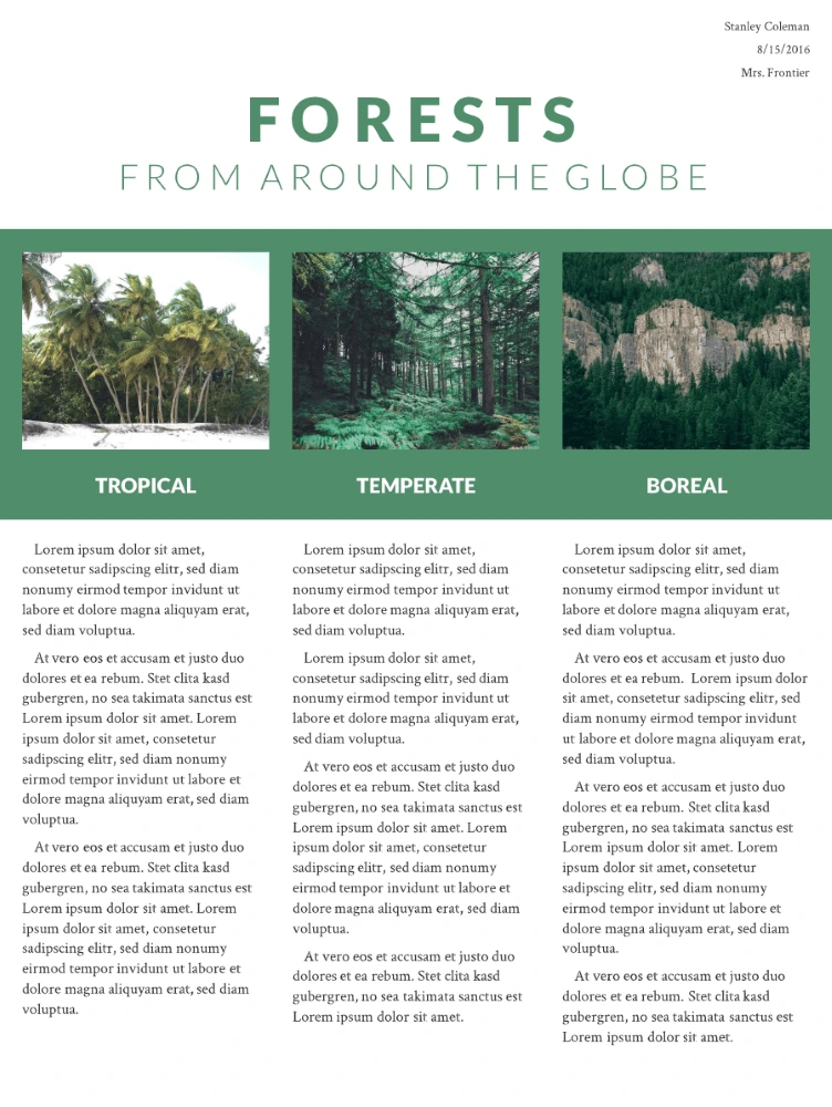
When a document contains too much clutter, it can cause confusion and distract us from where we should be focusing our attention. Use dark type on a light, plain background, and your scientific research poster will be easy to read.

Here’s an example of a poster with dark text on a light background.
3. Use no more than three colors
Too many colors can wreak havoc on our eyes. The rule of three is simple to follow, and it produces stunning results. It’s simple: pick one key color, then pick two other complementary colors. As long as you don’t put three strong colors together, you can’t really go wrong.
4. Choose easy-to-read fonts
Fonts like Georgia, Helvetica, Open Sans and Verdana are all popular choices for print materials. Try running a test print of your poster and looking at it from a few steps away. If you can’t read the text, try a larger size or a simpler, bolder typeface.
5. Use small blocks of text
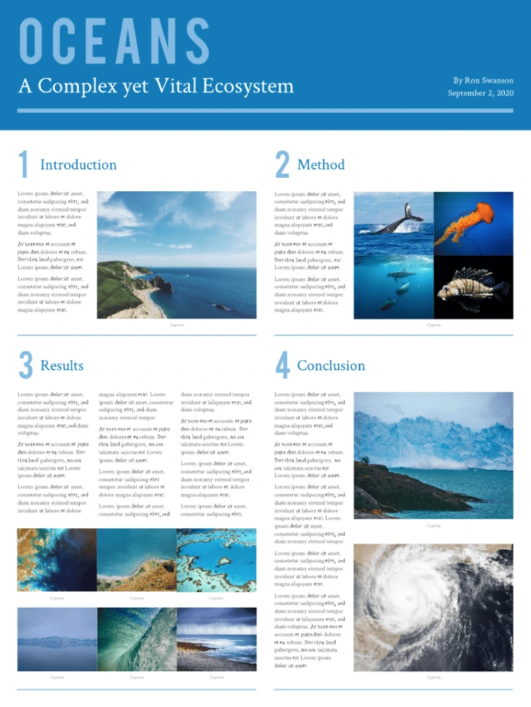
Your scientific research poster should tell an engaging story, but it’s essential that you keep it brief. Long rambling paragraphs and big clumps of data won’t make anyone happy, especially not when they’re standing in a crowded conference room. Use short sentences and paragraphs, and keep your text blocks small. If you need to, you can go into more detail in the handout and the short verbal explanation you prepare for the event.

Here’s an example of a poster with small blocks of text.
6. Add simple data displays and visuals
Any scientific research poster that’s worth its salt will contain photos, visuals and charts that present the data in an appealing way. Many of us are visual learners, and it is these details—the graphics—that will really help your reader understand and appreciate your work. Ensure all graphics are a high resolution and are captioned with a brief explanation.
Make it simple with Lucidpress
To get started designing your scientific research poster now, sign up for a free account with Lucidpress. Our drag-and-drop editor makes it simple for anyone to customize our free, professionally designed templates or create their very own design from scratch.
As if that wasn’t enough, our cloud-based storage makes collaborating easier than ever before. You can forget the hassle of sending PowerPoint, InDesign or Illustrator files back and forth—with Lucidpress, your team can make updates in real-time and you’ll each have access to the latest version at all times. Once you’re done, you can download your poster in print-ready files or order a glossy print version directly from Lucidpress.
You’ve already worked hard on your research. Let us simplify the design process.


