So you’re wondering how to how to design a brochure that will impress. Dealing in the medium of brochures is a tricky thing, because they’re all just one step away from the garbage. But don’t worry, this post will show you how to make a great-looking brochure that’s not destined for the recycling bin. You’ll learn how to master the 2 most important components of brochure design: the copy and the photos.
For a brochure to be a success, your copy and images should be an integral part of the design, not just an addition. The finished product should also be consistent with your brand. Let’s jump in.
Related: How to make a travel brochure that looks stunning
Brochures are a powerful sales tool and have been around for decades. Today, anyone can make their own. But what is a brochure, really? Let’s review standard layouts, sizes, folding options, and suggested brochure content.
What is a brochure?
A brochure is a folded document that presents information in a segmented, easy-to-digest way. Brochures are similar to other printed documents, but with key differences. Like pamphlets, they are informational, but brochures are designed to advertise a particular brand, product or service. Unlike flyers and posters, brochures are folded into sections, so they can retain their size but present more information.
In previous decades, making a brochure was far more complicated, requiring long lead time and cross-departmental cooperation to bring together photography, hand-drawn elements, and typography. A design would go through several physical drafts before the final version was painstakingly created. Changes weren’t easy to implement, either. Today, one person can create a brochure from scratch using modern design software, and the brochure can easily be tweaked and edited to perfection.
When to use a brochure
It’s not uncommon to wonder when it’s appropriate to use a brochure rather than another format, like a flyer. The answer lies in the **buyer’s journey**. Flyers are great for attracting attention, building awareness, and sharing a short message. But brochures are far more effective down the road, when a prospect is gathering the information needed to make a wise purchasing decision. Brochures provide more information about a company, its products and its services, at a deeper level than a flyer can. For that reason, they’ve remained an essential marketing tool for many companies and organizations. Here are 12 excellent examples of when to use a brochure. There are many, many more, but these will give you an idea of the possibilities. +
Direct marketing — Brochures can easily be included in a marketing campaign like direct mail.
Financial — Banks can provide brochures in the lobby to explain their account options, loans, and other money-related services.
Food service — Restaurants can create catering and to-go brochures that patrons save for later. The best ones will include a full or simplified menu, along with contact information.
Healthcare — Doctors and hospitals can introduce themselves to a new community with a brochure explaining their services. Brochures are also handy for patient education on a variety of illnesses and other health concerns.
Marketing — Marketers can hand out brochures to interested visitors at trade shows and expos.
Offices — Offices with heavy foot traffic can provide brochures about their services in the waiting room. Visitors can read them while they’re waiting, and the staff won’t have to spend as much time explaining their services to each person.
Personal care — Spas and salons can use brochures to list all of the different services they provide, as well as their prices.
Politics — Politicians can use brochures to inform voters about their platforms and stances on important community issues.
PR — Public relations managers can include brochures in press releases and media kits, so the news media can craft better, more accurate stories about a company.
Retail — Stores with heavy foot traffic can provide brochures at the front of the store. A brochure of popular product highlights is far less expensive to produce than an entire printed catalog.
Sales — Salespeople can hand out brochures to business associates, partners, and potential clients after a demo or presentation.
Travel — Airlines and travel agencies can use brochures to advertise exotic destinations and affordable vacation packages.
Standard brochure sizes
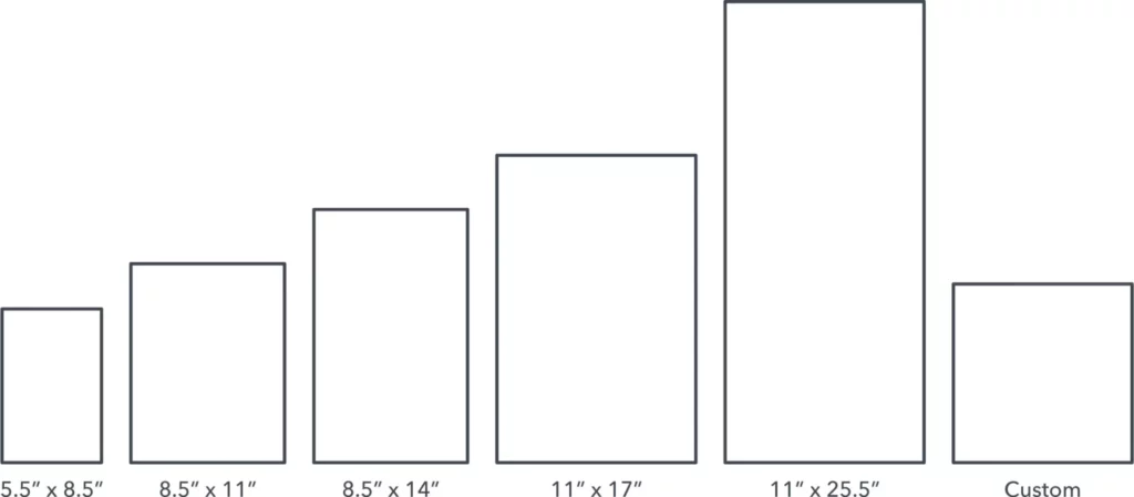
5.5″ x 8.5″ Often called a half-fold, bi-fold, or statement. This layout is created by folding an 11″ by 17″ sheet neatly in half, so that it opens and closes like a book. Commonly used for menus and event programs. If you fold it in half again, you can create a quarter fold brochure with 8 miniature panels.
8.5″ x 11″ You’ve likely seen many brochures of this size, since businesses often use them as sales and marketing pieces. This is the most popular size because it can be folded into several useful configurations that fit easily in an envelope. A tri-fold creates 6 long panels, and we’ll discuss the different tri-fold layouts in the next section.
8.5″ x 14″ Slightly larger than its predecessor, this size also makes for great tri-fold brochures. More space means more folding options, such as double gate or parallel folds. In fact, a double parallel fold creates a slender brochure that has become a staple in tourist information racks.
11″ x 17″ Larger brochure sizes are most helpful as visual aids. This size is often used for amusement parks or other tourist attractions, because there’s enough room for a map. It’s a great size for showcasing travel destinations as well.
11″ x 25.5″ The largest standard brochure size. What it lacks in portability, it makes up for with visual impact. Brands who depend on gorgeous, detailed photography benefit from the extra space. For example, real estate agents can show off their properties with full-color photos of a house and its rooms.
Custom If you’re hoping to make something unique, you can always talk to your printing partner about custom sizes. Just be prepared to discuss pricing, because custom printing will be more expensive than sticking to the standard. For some creative inspiration, check out this Pinterest board of unique brochure designs.
Popular brochure layouts
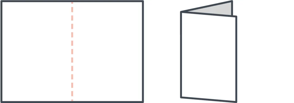
Bi-fold
The simplest brochure layout is a bi-fold, where a single sheet of paper is folded in half. This results in 4 consecutive panels that can be read from left to right like a magazine. The vertical layout is more popular, but a bi-fold can be oriented horizontally, too.
Tri-fold
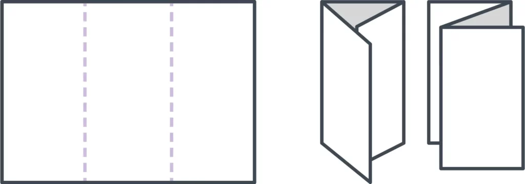
The most popular layout is the tri-fold, a single sheet of paper folded into thirds. Tri-folds are versatile, giving you multiple folding options. Even though they each contain 6 panels, how you fold the paper will determine which panels end up where.
- C-fold — A C-fold resembles the letter C when open. When closed, one third of the paper is nested between the others, like a spiral.
- Z-fold — A Z-fold resembles the letter Z, opening and closing like an accordion.
French fold
A French fold is created by folding a sheet of paper vertically and then horizontally. This separates the paper into quarters, resulting in 8 panels overall. With a French fold, your brochure is small and portable, but it expands to the size of a flyer or poster. If you want to present a large design across multiple panels, this fold can be very effective.
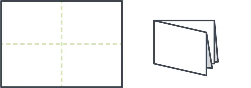
Gate fold
Sometimes called a window fold. Though this is technically a tri-fold, it does not result in 6 equal-sized panels. Instead, the right and left sides of the paper fold in to meet in the middle. This makes the center panel twice as large, creating more space for visual design inside the brochure.
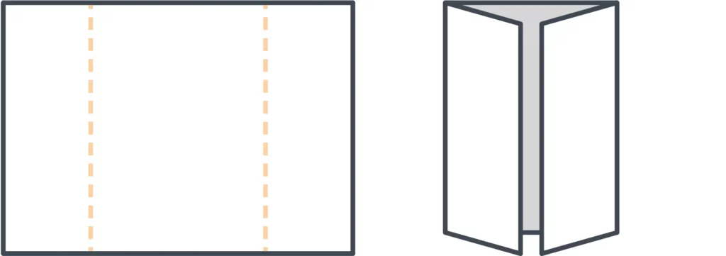
Double gate fold
To make a double gate fold, follow the steps above to create a gate fold brochure. Then fold it in half again, vertically. This creates a central fold down the center panel, resulting in a slender brochure that can fit more easily into envelopes and other narrow spaces.
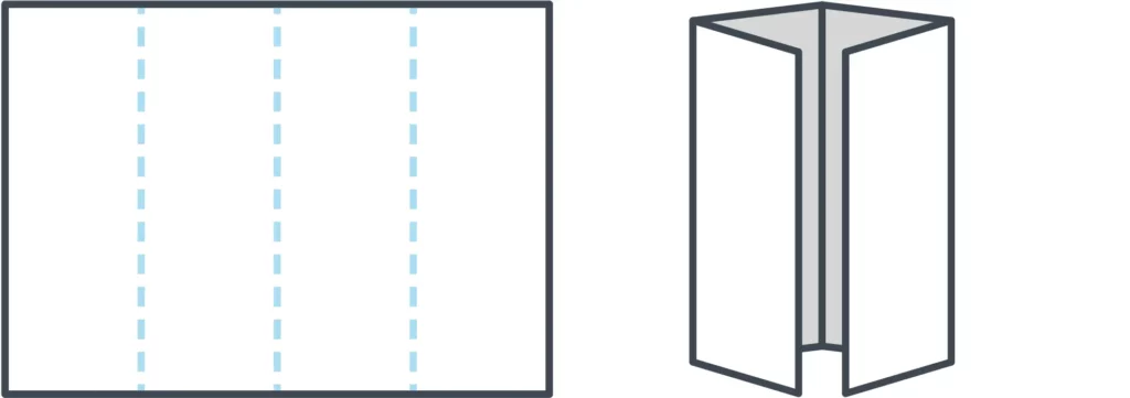
Double parallel fold
A double parallel fold requires two vertical folds. Take a sheet of paper and fold it in half, then fold it in half again. That way, half of the sheet is nested within the other. In the end, you’ll have 8 panels. Depending on the size of the paper, the resulting brochure might be narrower than a typical tri-fold, or it could be roughly similar in size but with the addition of 2 panels.
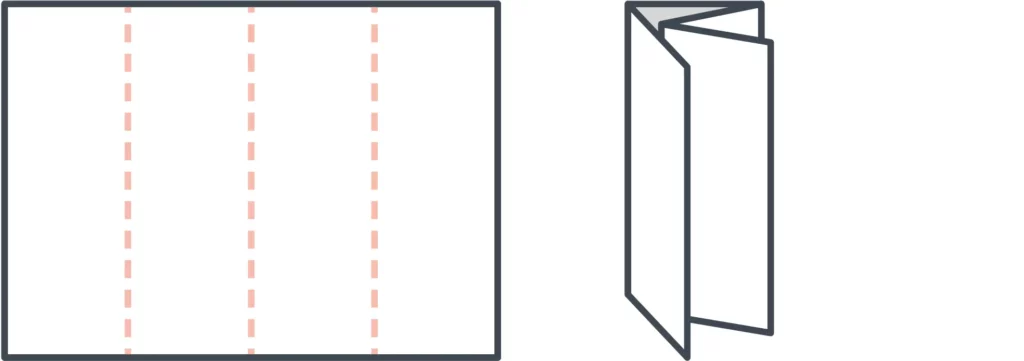
Spiral fold
Lastly, our standard set concludes with the spiral fold. It’s similar to a C-fold, but with more panels—typically 8 in total. The spiral effect is achieved by folding each panel inward so that they nest inside one another. Because of this, the inner panels should be slightly smaller than the outer panels, so that the brochure lays flat when folded.
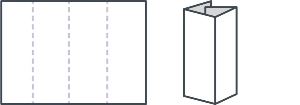
Designing for your fold
If you’ve chosen a layout but are unsure how to design it, try folding a blank sheet of paper and numbering each panel. That will make it easier for you to keep track of where each panel goes while you’re designing onscreen. It’s a handy reference tool!
Templates
Templates are the brochure maker’s best-kept secret. It doesn’t make sense to start from scratch every time you need to create a new brochure, especially when many software tools provide free brochure templates designed by professionals. If you have no idea what you want your brochure to look like, templates can provide inspiration and samples to work with. If you already have a vision, the right template can save you loads of time. For examples, take a look at our gallery of free brochure templates.
Essential brochure elements
Because brochures are most often used in advertising, it’s important to consider what your brochure should inspire the audience to do. Like many marketing materials, a good brochure will be visually interesting, tell an engaging story, and prompt the reader to take a certain action—like purchasing a vacation package, for example.
When you layout your brochure, make sure the following elements are well represented.
1. An alluring cover
This is the first (or only!) chance your brochure has to give a strong impression, so make it count. The cover is a promise, so it should reflect what’s inside. A high quality, relevant image combined with a brief, easily legible headline will provide your reader with a strong understanding of what your brochure is about.
2. A compelling offer
Details aside, what you’re really providing with a brochure is opportunity. It shows the reader a whole new world of possibilities to improve their life. No matter what your product or service is, whether it’s catering plans for a wedding or security alarm systems for an office building, your brochure needs to offer just enough to make readers want to know more.
3. Valuable information
Brochures offer limited space to communicate your message, so prioritizing which information to include is critical. Dedicate space to the features and (more importantly) benefits of your offering, and consider other details like prices, dates and times, if applicable. The best rules of copywriting apply here: be clear, be concise, and tell a good story that makes your reader the hero.
4. A strong call to action
You can build a beautiful, convincing brochure that makes your audience feel exactly the way you want to… but it’s useless if you don’t provide the next step. A strong call to action will prompt the reader to call, visit, or connect with you in some way, so that the relationship can proceed further. Sometimes this means making a purchase, but not always, so think about what you want your audience to do after reading your brochure—and direct them accordingly.
5. Detailed contact information
Goes hand-in-hand with your call to action. Not everyone will make a move right away. In fact, many people hold onto brochures to reference later, when the time is right. Don’t make them search for ways to get in touch with you. Make it easy by putting your name, phone number, email/web address, and physical location on the back. Some companies even put a simplified map to help people find them. That might be a little old-fashioned in the age of GPS, so you could include an interactive QR code or other helpful tidbit instead.
Other ideas to consider
The 5 elements listed up there? Those are the basics. If you really want to knock it out of the park, here are some tried-and-true brochure sections that you might not have considered before.
Answers to FAQ
It’s likely that your readers share similar concerns, resulting in frequently asked questions. Save time and overcome objections early by including a FAQ section in your brochure. Don’t dive too deep; a brochure should be brief and present your brand in its best light. But for concerns that can be quickly and easily resolved, a helpful FAQ section is worth its weight in gold.
How-to guides
Knowledge is power, which is why information is valuable. Sharing helpful information with your audience builds trust, and a how-to guide is a great example. Empower readers to spot or solve a problem on their own by breaking down the process, step by step. It could be instructions on how to test your product, but it doesn’t have to be.
For example, if you’re a pest control company, you could offer tips on how to identify the presence of certain insects or rodents. If you’re a photographer, you could include tips on how to dress for an outdoor photo session. Take a few moments to brainstorm about your brand, and an idea will likely present itself.
Testimonials
No one can speak to how your brand improves lives the way your customers can. They know because they’ve experienced it firsthand in a way you cannot. That’s why we, as consumers, trust friends, family, and online reviews more than any slick sales proposal. Including testimonials in your brochure adds a layer of humanity and credibility that can reassure your readers that they’re making the right choice.
How to make a brochure
Here are the basic steps involved in creating a brochure. If you’re ready to learn more, we have a longer, detailed article that covers each step in depth. Visit our guide on how to make a brochure to learn more.
- Consider your layout / size. Before you can start designing, you have to decide how big or small you want your brochure to be, as well as how it should be folded.
- Write compelling copy. Brochures don’t offer a lot of space, so each word should be purposeful. Make your message consistent, easy to read and easy to understand.
- Provide visual interest. Illustrate your message with visual elements, including high quality photos, that make your brochure more interesting to the reader.
- Choose your colors. Color is closely tied to emotion. Using colors effectively in your brochure will enhance your message and emphasize specific points.
- Test-run the print version. Before you print (or order) hundreds of copies, it’s critical to test-run it first. Verify that the finished product meets your expectations.
Want to design beautiful brochures online? Lucidpress makes it easy. With our intuitive drag-and-drop online brochure maker, you can select a template and customize it with fonts, colors, shapes, images and more. It only takes minutes to create a high quality brochure that you’ll be proud to print and share.
The copy
Words. We throw them around every day, but how often do you carefully consider what you’re saying? When it comes to brochures, word choice is paramount. Remember that your objective is to entertain, persuade, and inform. Here’s how you do it:
1. Check your grammar and spelling
Read your work twice, then have someone else look it over. A misspelling or grammatical mistake can slay your professionalism and doom your brochure to the open jaws of the trash can.
2. Make evergreen content
You don’t want to create a quality brochure only to make a new one next year because the content is out of date. In copywriting, a principal objective is to make sure your content is evergreen. This means that your content will (theoretically) always be relevant. So, you might want to avoid including references to upcoming holidays or this year’s Super Bowl winners.
3. Be international
Your copy will potentially be read by people from many countries and cultures. Every culture has idioms and colloquial expressions that may not transfer well. For example, if you talk about killing two birds with one stone to someone who speaks English as a second language, they might call the animal cruelty hotline.
Of course, using colloquial or idiomatic language can humanize your brand and keep things lighthearted. It becomes a problem when you use so much culture-specific language that your writing is unintelligible to someone who has a different background. Knowing your audience will help you strike the right tone.
4. Know your brand and stick to it
Every line you write should align with the larger brand experience of your organization. This creates a consistent experience for your customers—and helps potential customers know what to expect. Just like we speak differently in different social settings, the copy in your brochure should adjust to your brand.
Yelp’s Eat24, an online food delivery service, has settled nicely into a brand that really works for them. The tone is playful and lighthearted; for an example, check out this messaging from the Eat24 website:

This copy is clever and it also matches the overall feel of Eat24’s site. The humorous, slightly sarcastic branding of Eat24 could work for your brand, but you also might need to take a different approach. Imagine if you saw an ad from your bank that said, “We’ll watch your money for you. Probably.” Customers would be confused and concerned, so again, know what’s acceptable to your audience.
For more examples of standout copy, check out this post from Hubspot’s marketing blog.
The photos
Just like your copy, the photographs in your brochure send a message. You’ll want to make sure that message is professional and interesting. Before we get any further, I think I need to make one thing very clear:
Beware of stock photography.
Millions of Americans struggle with stock photography every year. You know it when you see it—models with unnatural facial expressions, dressed in stereotypical clothing, all bathed in lighting that even a moth wouldn’t fly toward.
Just thinking about it makes me shutter (get it?), and I don’t want you to feel the same pain. Luckily, there are alternatives. What follows is a list of my favorite sites for free images that aren’t awful (in no particular order).
1. Unsplash

I find myself visiting this site most often. I think the images are gorgeous, and they’re always very high quality. All the images are free, and no attribution is necessary. It’s a pretty great deal, and you also don’t have to sign up for anything to download the image.
2. Pixabay
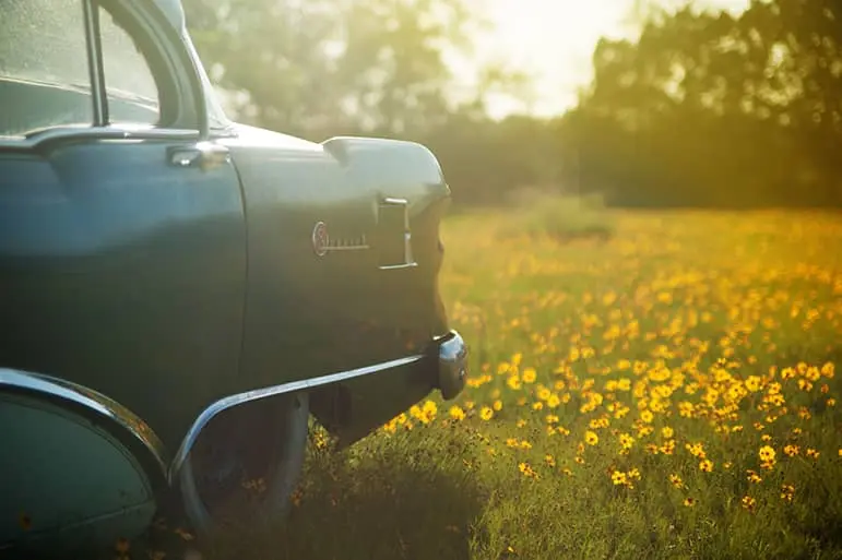
Pixabay has a ton of images on their site, and, like Unsplash, there is no attribution required. There is a pretty diverse range of photos on Pixabay, though the quality does vary. You can find some great stuff though!
3. Stocksnap.io

Again, no attribution required here, and there’s a great selection of high-quality images. Many of the images are comparable to Unsplash, and sometimes the two overlap a bit. Stocksnap.io has definitely come in handy for me.
4. Flickr

Flickr has a lot of great stuff, you just have to be aware that not all of it is free for commercial use. You can filter your searches to only include photos that are open to commercial use and modifications, and you’ll usually have to credit the image to the original creator and link back to the source, just as I did on the photo above.
There are a few more options out there, but those are a good place to start. Fantastic photos will draw your brochure readers in and stay their trash-tossing hand.
