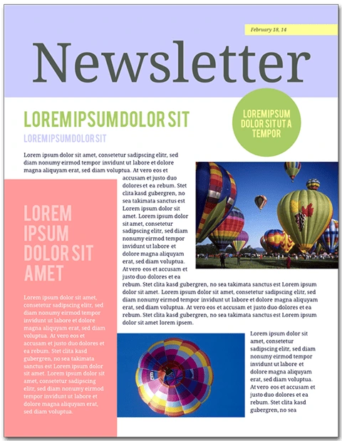
Ever wondered how to improve your school or company newsletter? Follow these steps to take your mailing from “Meh” to “Wow!” To follow along and create a newsletter of your own, open the Citrus Splash employee newsletter template in Lucidpress—you can see the demo features right in the editor.
Newsletters are published on a recurring basis to keep readers in the loop. The details of a newsletter will depend on its audience. Above all, newsletters should be informative and add value for readers. Print newsletters focus on text content and are typically letter size (8 ½” × 11”). Email newsletters can vary in layout and size, but should be viewable from both the email message and in a browser.
Open this template in Lucidpress to follow along!
Related: 13 best newsletter design ideas to inspire you
How to create a newsletter
1. Produce good content
Make sure your content is engaging and useful. Don’t add fluff to your writing for its own sake. Before you use design software like Lucidpress, check to see that your pieces are copyedited, your photos are chosen, and your articles’ lengths are set.
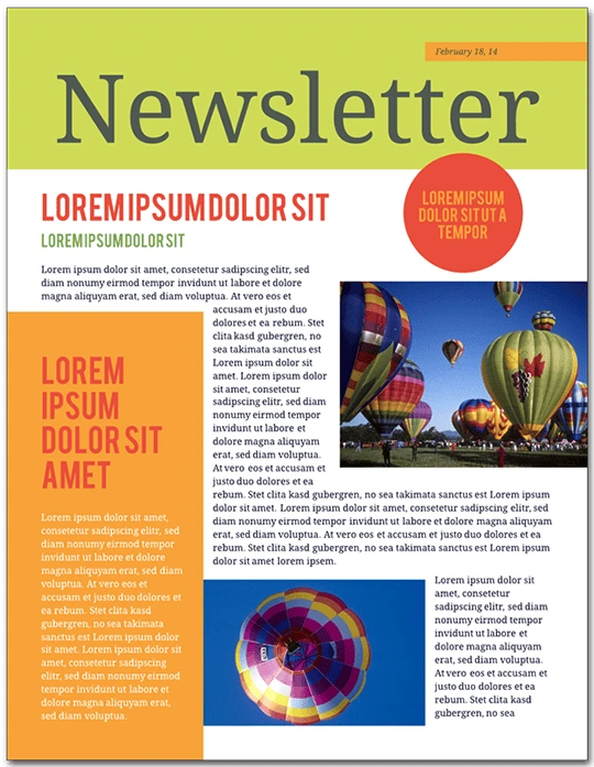
This newsletter template is five pages: long enough to include a solid lineup of articles and photographs, but not so long as to be overwhelming.
2. Establish branding
Think about how you will create a consistent brand. Every aspect of your newsletter will reflect upon your corporate or academic culture and identity. Choose a succinct title, incorporate your business’s font (if you have one), and replicate your brand’s color scheme with Lucidpress’ color picker.
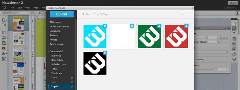
To place your logo onto the canvas in Lucidpress, drag the Image icon from the Content bar. From here, you can upload a .PNG file with your company icon.
3. Brevity is the soul of wit
It’s important to have a strong opening article. This will often be a message from the principal or director, or a highlight of the most exciting feature in a product. Newsletter articles should be a page or less, with carefully placed images that visually break up the text. Splitting your articles into columns gives your content a suitably “newsy” feel.
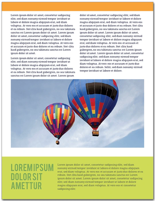
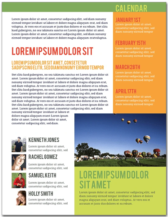
On the bottom of page 3, there is a call-out box with a colored background. There are several ways you could use this section of the template for your own content. It could be a mini-article, a call for donations or a caption for the photo above.
4. Be informative without being too salesy
Newsletters should provide value for their readers. If you used this template for a school, the audience should be able to tell what’s going on for alumni. Avoid too much of the hard sell; consumers are best persuaded with interesting content, not aggressive marketing.
On page 5 of the template, you’ll see an event calendar. To replace the preset dates with your own, double-click the text to edit.
5. Add photos and graphics
This newsletter is tied together by the images of brightly colored hot air balloons. Graphics like these provide visual consistency and make the newsletter fun to look at. A wall of unbroken text is not enjoyable to read, and it will not engage your audience as much as having well-placed images which complement your articles.
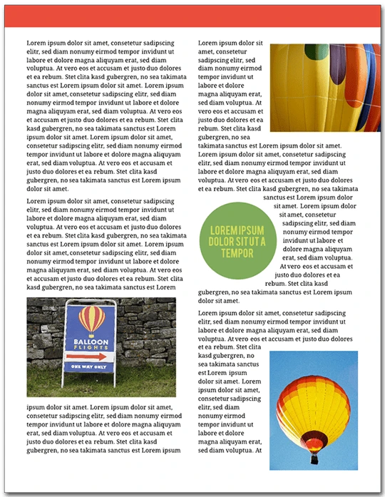
In the template, double-click an image to replace it with your own. This will bring up the Image Manager. From here, you can import images from your computer, Facebook, Dropbox or Google Drive.
6. Optimize your text formatting
Having consistent formatting is essential to your newsletter’s success. Limit the number of colors and fonts—less is more when it comes to readability. In general, use dark text against a light background. Standard usage calls for serif typefaces for the body of your articles, and sans serif typeface for captions, callout boxes and sidebars.
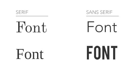
To change the font in Lucidpress, double-click text to select it, then choose a different typeface from the Properties bar. To change the font of every text element at once, press Ctrl+A. The font you choose reflects your brand: aim for consistency over eccentricity. A clean, modern design will earn your audience’s trust more than curlicues and Wingdings.
7. Use interactivity in Lucidpress
Lucidpress makes collaborating on a newsletter simple and straightforward. In Comment mode, your colleagues can weigh in on the content and design of your documents. You can use Lucidpress to invite feedback without the inconvenience of saving multiple drafts—it all happens in the cloud. The following video illustrates how:
8. Proofread your newsletter
Newsletters are text-heavy documents, and a grasp of spelling and grammar conventions will serve you well. Taking a few minutes to proofread your writing will pay big dividends in reader satisfaction.
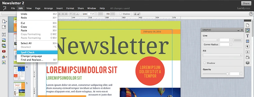
In Lucidpress, select your text, choose Edit from the Menu bar, and choose spell check. You can also conduct a find-and-replace search for those times when you forget “i before e except after c.”
9. Be reliable and consistent
Decide how often you are going to send out your newsletter. This will affect the newsletter’s length, event calendar, and expected features.
Think ahead to the season your audience will receive your newsletter. If you are sending a winter holiday-themed mailing, you have to start designing weeks in advance. The same template can have a very different mood with different color schemes. Try using red and green for December, blue and white for midwinter, pastels for spring, and jewel tones for fall.
Newsletters are both popular and useful. They extend your brand’s presence, inform and entertain readers, and show off your expertise to the world.
