Despite how ubiquitous digital marketing has become, print collateral can still play an incredibly valuable role in your brand marketing stratgy. Businesses large and small can benefit from this versatile medium, from empowering sales teams at trade shows, to generating awareness through direct mail campaigns.
Still, brochures often get a bad rap for being lifeless, boring, and unengaging – a problem that can stem from bad design, ineffective messaging, and low budget. To help you avoid those common pitfalls, we’re going to take a deep dive into the ins-and-outs of effective brochure design. In this guide, you’ll learn how to design a brochure that people will actually want to look at.
When to use a brochure vs. other print marketing
If you can’t decide whether your brand would be best served by a brochure, or other printed material like a flyer or poster, we suggest looking to your buyer journey for some guidance. Flyers are great for attracting attention, building awareness, and sharing a short message. Brochures, on the other hand, tend to be far more effective down the road, when a prospect is in the information-gathering stage. Brochures offer you a chance to share more detailed information about your brand, products, and services.
Here just a few instances where a brochure can be helpful:
Marketing — Brochures can easily be included in direct marketing campaign, or handed out at trade shows or conferences.
Food service — Restaurants can create catering and to-go brochures for patrons to save for later.
PR — Public relations managers can include brochures in press releases and media kits, so the news media can craft better, more accurate stories about a company.
Sales — Salespeople can hand out brochures to business associates, partners, and potential clients after a demo or presentation.
Standard brochure sizes and layouts
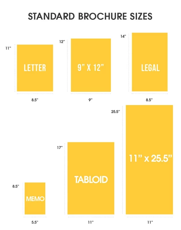
The first step in designing a brochure is choosing the right size. When thinking about brochure size, think about portability, foldability, and how much written or visual information you want to include.
Below are the most common brochure sizes businesses use.
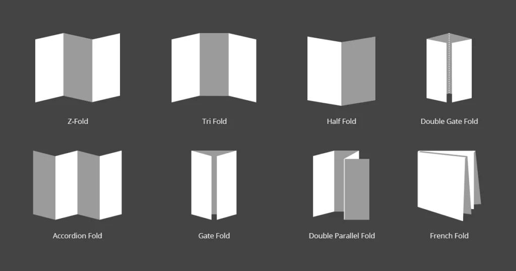
Once you’ve settled on a size, it’s time to think about the layout you’d like to use. From simple bi-folds to creative spiral folds, your choice of layout determines how readers will interact with and move through your brochure.
While there are many different creative brochure layout options to choose from, here are just a few of the most common brochure folds.
Now that you’ve chosen your size and layout, let’s talk about what to put in your brochure.
How to design an effective brochure in 5 steps
Create an outline
Before you start designing anything, you’ll need a detailed plan of attack. While brochures can vary in content and length, most follow a standard format.
- The front panel displays your headline and logo.
- The inner panels make a case for your product/service using
- The final panel contains your contact info and a call-to-action.
Identifying your target audience will help you build out an appropriate outline and flow to your brochure – and will inform your brochure’s tone, language content, and CTA.
Make note of where your target audience is in the buying cycle. Don’t waste space detailing the history of your organization if your readers have done business with you before.
Nail down these essential elements
Now it’s time to dive into the fun stuff. Like we mentioned before, every brochure is different, but all should include these 5 critical elements.
An eye-catching cover and headline – This is the first (or only!) chance your brochure has to give a strong impression, so make it count. A high quality, relevant image combined with a brief, easily legible headline will provide your reader with a strong understanding of what your brochure is about.
A compelling offer – Details aside, what you’re really providing with a brochure is opportunity. No matter what your product or service is, your brochure needs to offer just enough to make readers want to know more.
Valuable information – Brochures offer limited space to communicate your message, so prioritizing which information to include is key. The best rules of copywriting apply here: be clear, be concise, and tell a good story that makes your reader the hero.
A strong call to action – You can build a beautiful, convincing brochure that makes your audience feel exactly the way you want to… but it’s useless if you don’t set them up with a next step. A strong CTA will prompt your readers to call, visit, or connect with you in some way.
Detailed contact information – This goes hand-in-hand with your call to action. Not everyone will make a move right away. In fact, many people hold onto brochures to reference later, when the time is right. Make connecting with you easy by putting your contact info on the back.
Consider adding extra information & resources
Got extra room in your brochure and want to make a bigger impact? Think about adding extra information and resources for your readers. Consider where they might be in the buyer journey, and tailor these extra resources to meet any questions or hesitations they may have.
Some possible extra resources include:
- Answers to FAQ
- How-to guides
- Customer testimonials
- Product specs
- Pricing charts
- Pros and cons
Proofread & check for important details
No matter how much effort you put into your messaging and design, one small error or inconsistency can kill your credibility.
Before you send your brochure off to the printers, proofread everything (and proofread again). We also suggest making sure the tone of your brochure matches the rest of your brand messaging. Unlike informational brochures (which may take the third-person point-of-view), sales brochures usually use the second-person to build rapport with the reader.
Refer to your brand style guide for how to handle things like numerals, dates and titles in the text.
Test run your prints
The last thing you want is to waste time and money printing hundreds of brochures only to realize that the sizing is off, or your imagery is grainy. Do a small test run to verify that the finished product meets your expectations.
5 brochure templates to get you started
Don’t want to have to design a brochure from the ground up? Try customizing a brochure template instead. Here are just a few of our favorites here at Marq.
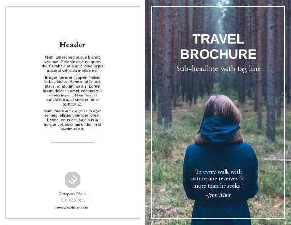
Redwood Coast Travel Brochure Template
This bi-fold brochure template has ample space to showcase immersive photography, with just enough space to introduce readers to your brand.
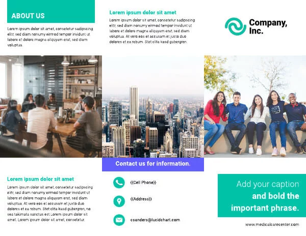
Visual trifold company brochure template
A traditional trifold layout makes it easy to describe your business while creating a compelling cover design.
Health insurance company brochure template
Need to include detailed data and comparisons? This template is perfect. And with Marq’s data automation, you can auto-populate your own data by connecting your template to a Google Sheet.

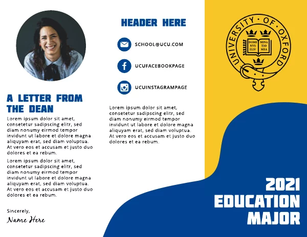
Wavy Shape College Tri-Fold Brochure Template
Update your marketing with a fun, fully customizeable brochure layout. Simply update colors, fonts and images to match your brand.
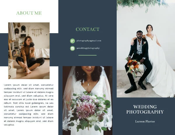
Navy Blue Wedding Photographer Brochure Template
Have a visual-first business? This template offers plenty space to showcase your photography, art, or graphic design.
Want to design your own beautiful brochure online? Marq makes it easy. With our intuitive drag-and-drop online brochure maker, just choose a template and customize it to fit your brand.
