When I was first hired at Lucidpress, I was asked to handle nearly all of our content writing, including the monthly email newsletter. It was a terrifying prospect. Most marketers know that email is a specialized skillset, and it’s easy to screw something up. But not only have we avoided major newsletter snafus, I’ve been able to cut down my time creating a newsletter from one workday… to one hour. That’s a time savings of about 800%, and the newsletters look (and read) better than ever.
Related: How to make a newsletter in 9 steps
So, how did I streamline my process? Here’s how to write a newsletter in three easy steps.
1. Do your homework
I hate starting newsletters from scratch, so I always do research beforehand. If you’re at a larger company, attend important meetings and take notes a few weeks before you start writing. If you’re running a one-man shop, make notes throughout the month. You’ll want to record things like:
- Improvements or updates to your product
- Business initiatives, like a push for more customer feedback
- Random thoughts and ideas like “Are there any upcoming holidays we can capitalize on?” or “Should we start a referral marketing program?”
Always write down a point-of-contact’s name next to your notes so you know who to seek out for more details. As for the third point, you may not use all the random ideas that pop up, but before long, you’ll have a working list of future email campaigns to test.
2. Clarify your goals
Develop a clear goal, and make sure it’s displayed front-and-center in your newsletter. You might be trying to:
- Publicize new features or offerings
- Increase traffic to a store or website
- Boost sales with a newsletter discount or promotion
- Capture customer feedback on your product
- Get subscribers to tell their friends about you
- Remind customers what your product does
- Make an emotional connection with your audience
In all likelihood, you’re trying to do several of these at once. Pick the most important one, and make sure it’s represented at the very start of your newsletter. It should also be presented (in a compelling way) in your subject line. The other major points will fall into place and can often be accomplished without text (think strategically placed links, images and calls-to-action).
3. Make it pretty (and repeatable)
Now that you have notes and a clear goal, you can easily write the text of your newsletter. The most important step here is to format your text for maximum readability. You’ll also want a nice-looking layout that communicates your company’s professionalism. Here are my tips for making it happen in under an hour:
Distribution
Ask yourself where your audience is, then decide on your method of distribution. You can go old-school with a printed newsletter or distribute your content digitally; the latter is more common nowadays. Lucidpress’s company newsletter templates allow you to quickly build a professional-looking newsletter, then print or share with a URL. All of our templates can be customized to make school newsletter templates, Christmas newsletter templates and more.
You can push out the link via social media or a website, but remember that you’ll still want to use a dedicated email service to email it. That way, you don’t have to handle subscribes/unsubscribes, CAN-SPAM compliance, and other time-sucking aspects of email management. I’ve had good experiences with MailChimp and Hubspot, but there are many others to choose from.
Here’s how a Lucidpress newsletter looks when you embed it in MailChimp. Pretty snazzy, right? We generate the code for you—just copy and paste it in.
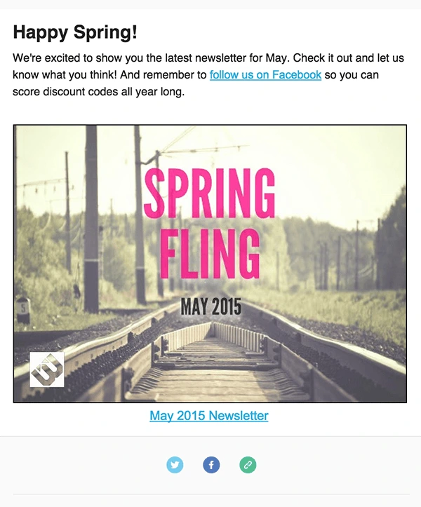
If you’d rather build a newsletter with HTML than embed a Lucidpress newsletter, pick an email service that offers prebuilt layouts. If you can’t do that, enlist the help of a professional web developer to create a few plug-and-play templates.
Text formatting
Lead with items that have the broadest appeal to your audience.
Keep it short, unless you have a good reason to do otherwise. My newsletters rarely exceed 400 words and are usually closer to 200.
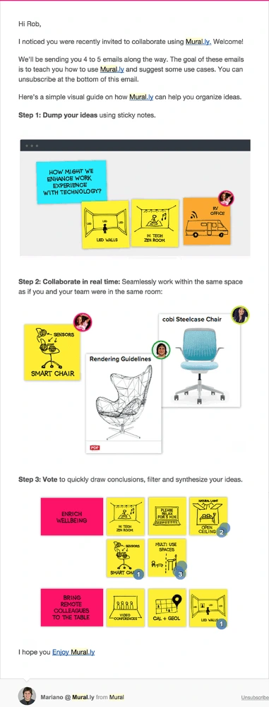
This email from MURAL is a great example of how to use text sparingly to get your point across. The copy is brief and easy to read, while the images are carefully positioned to support the text. It all adds up to a highly consumable newsletter.
Design
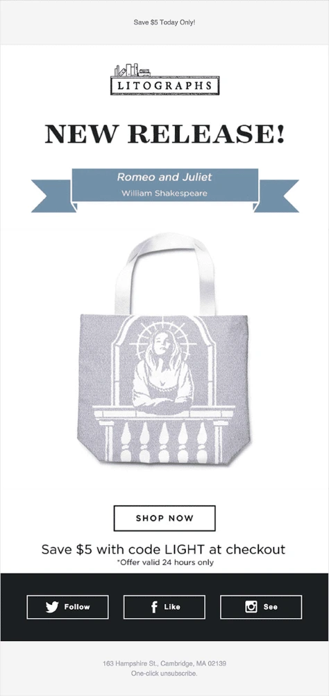
Break up the text with relevant images, buttons and links. Use enough negative space to let all of your design elements breathe. This example from Litographs shows how striking a clean, roomy design can be.
And that’s all, folks: how to write a newsletter in less time than ever before. We’d love to hear your own tips for maximizing effectiveness in marketing—just leave them in the comments.
