As designers, we know how important it is to deliver creative and compelling designs. Designs that catch the eye and gets the viewer thinking “That must be one hell of a product!” And over time, ads have gotten so creative and innovative that our expectations only get higher every time we see a head-turning advertisement.
Even in the age of digital marketing, print media advertising still plays a decisive role in the effectiveness of a marketing strategy. And as today’s world gets increasingly digitized, it might be easy to dismiss the idea of traditional print advertising, from cheap business cards to print flyers and product brochures.
Related: 5 elements of the perfect print job
If you want to increase your brand’s favorability and improve purchase intent, you must learn to adapt to the latest design trends and adopt new ways of doing print ads. Here are a few ways you can play with print layouts to achieve print perfection.
Experiment with your layouts
When designing print ads, you attempt to piece together the elements of the ad into a visually pleasing arrangement. The number of patterns you can use are endless, and it’s your duty to fit them into print advertisement mediums. You can do so by structuring them according to different layouts.
The frame-up
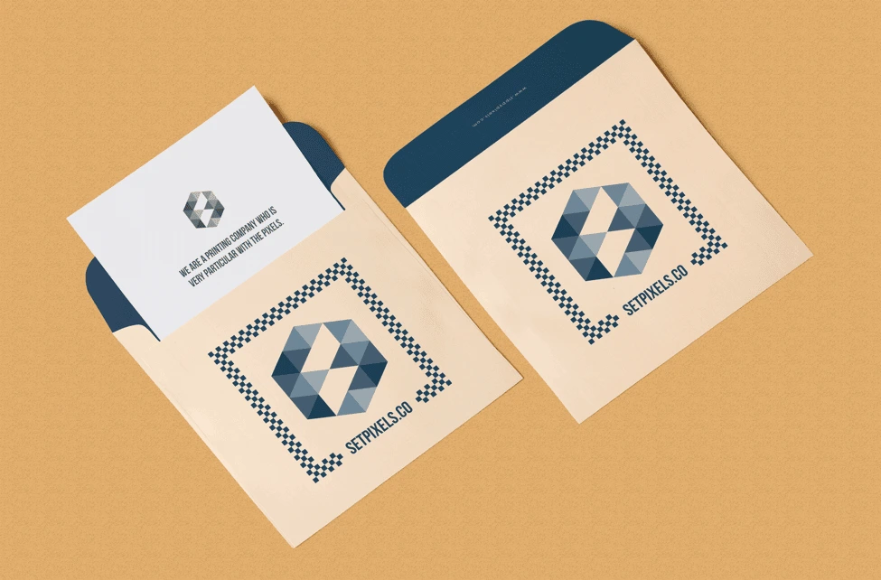
Easily frame a layout with the help of borders. This keeps the elements within bounds and sets them apart from other aspects of the page. The composition emphasizes a central component which surrounds the entirety of the ad, be it partially or wholly, focusing the attention on its center.
The big type
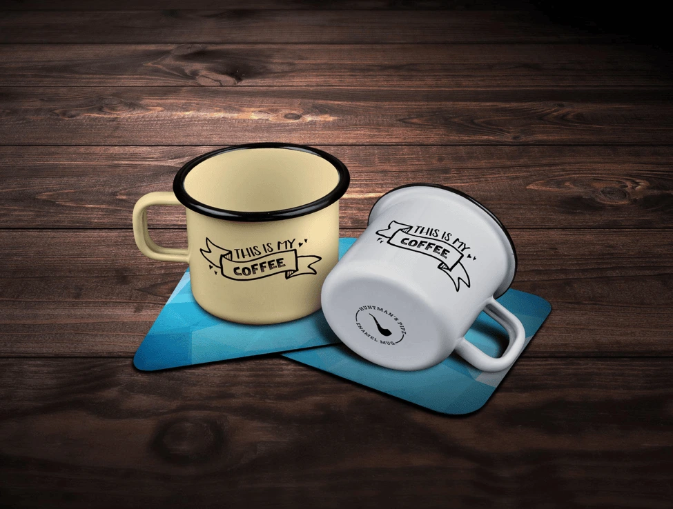
Types, especially in their larger forms, hold a particular appeal for viewers and even for artists themselves. Big types command greater attention due to their curves and stroke orders. They work seamlessly without the need for additional artwork or images, and designers can play with the typeface’s readability to convey different moods, from professional to playful.
The multi-panel layout
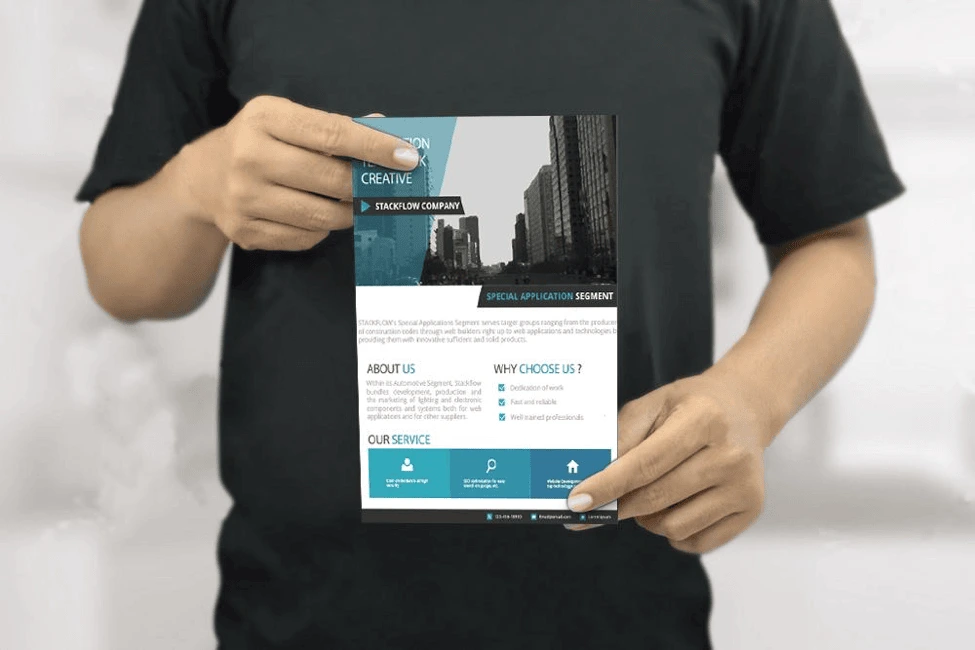
You can use panels for an variety of functions. They can be used to tell a story, or to display a set of information, or in our case, show off the products we want to advertise. This layout uses several frames to compare different perspectives or different features.
Designers often keep a proportional variation between every panel block to set the headline apart from the body and the signature. One of the most common examples is when you order business cards or promotional flyers online. You may notice that many designers opt for the clean, paneled look to help readers glide through the content.
Look at the bigger picture
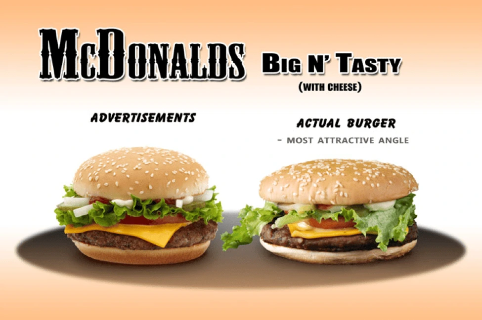
“Big Picture” layouts, also known as the picture-window layout, highlight the main visual—usually a single, large illustration that dominates the canvas. This type of layout shows the importance of the main visual without any further accents, other than the brand logo and a line of text. The image should speak for itself.
The Mondrian-esque
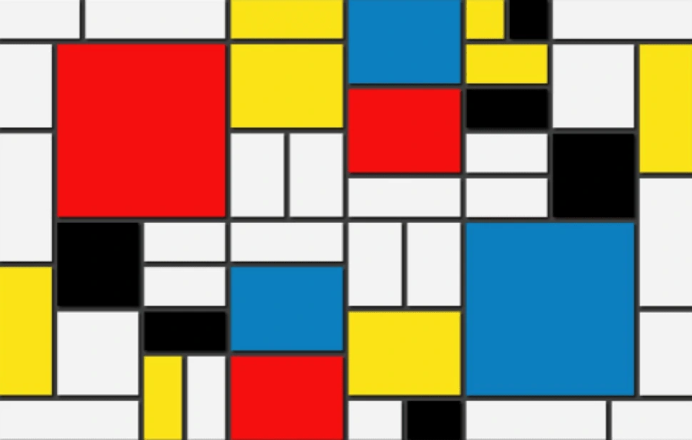
Inspired by Dutch painter Piet Mondrian, the Mondrian layout consists of black bars and solid areas of primary color, divided across the canvas into squares and rectangles. A Mondrian layout focuses on the proportion as the main design principle that proves to be an easily workable and logical way to showcase art and typefaces.
Incorporate different strategies
You have your product and design concepts with you, but the industry remains competitive, and consumers have higher expectations for your ads. To meet these expectations, here are four techniques to try out.
Show, don’t tell

“Show, don’t tell” is a well-known technique across many creative fields. It states that you should always take the chance to show something rather than explain it. Use your print designs to help consumers conceptualize the product with their five senses.
This Curtis tea poster is a great example. Instead of telling you how the tea would taste, they visually appeal to our senses of smell and taste to convey what the teas are like.
Play with the medium
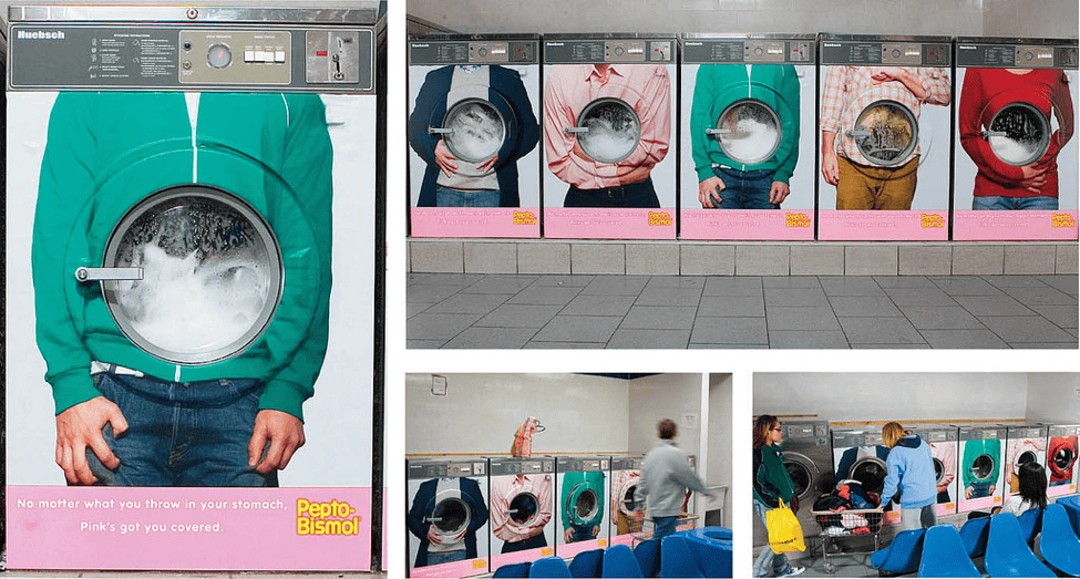
Make your design interactive using the physical parts of your print. You can make your centerfolds show motion every time you flip through the pages. Use your pages as transitional devices if you want to tell a story. For instance, you can print business cards with thin sliding panels that contain more information about your company.
Food for thought
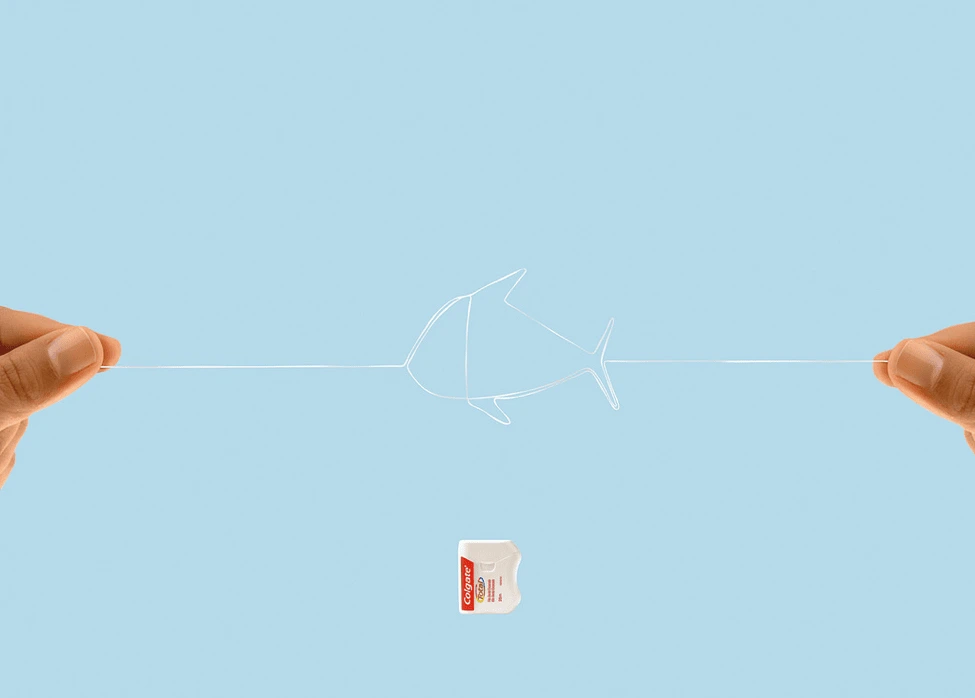
Print media is all about imagery and visualization. Use a series of images to draw the viewer into your message and show them what’s hidden underneath your clever design. Keep this famous mantra in mind: “If you have to explain it, then it probably isn’t that good.”
Invoke an emotional response
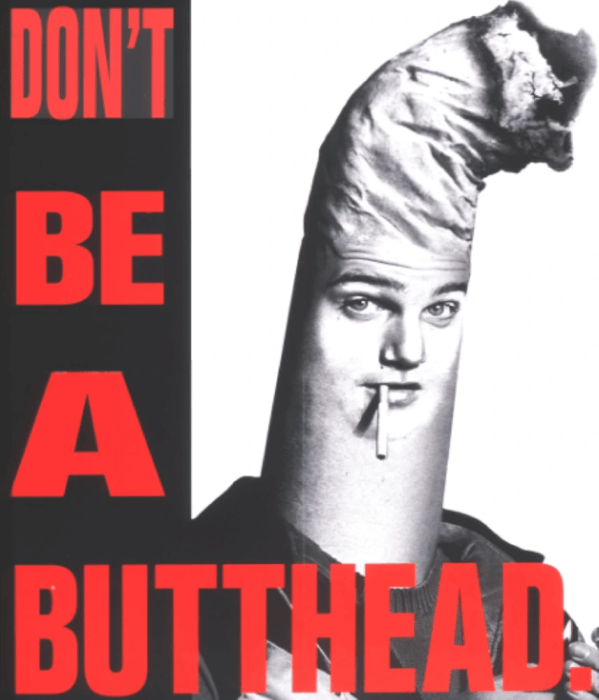
Be it via humor or deep subject matter, engage your audience through emotion. Designers can use emotional appeal to evoke sentiment and nostalgia from viewers. Consider your topic and tweak your design to enhance the emotional effect of your ads.
Key takeaway
As Pablo Picasso said: “Learn the rules like a pro so that you can break them like an artist.” To be a good designer, you need to know how to look at your product from the viewer’s perspective. You need to know how to apply different rules and techniques to create a compelling print ad. It’s up to you to decide: play by the rules, or dare to be different.
