Like many things worth learning about these days, brand identity is a topic that sometimes gets so misconstrued and complex that the whole thing turns into a big meaningless fugazi.
For some reason, a lot of designers seem to think that making their ideas about brand identity sound more complicated will in turn make them sound like they know their stuff.
In my opinion, that couldn’t be further from the truth.
Related: Branding? Follow this template for creating a brand platform
In the famous words of Albert Einstein: “If you can’t explain it simply, you don’t understand it well enough.”
Sadly, because many businesses have a preconception that brand identity has to be a complex affair, they make it so. But in the ever-changing, fast-paced business world of today, who’s got time for complicated?
Simplicity is key to making good decisions, fast.
So, if we were to sheer away all of the confusing fluff surrounding brand identity, what sort of beast would we be left with underneath?
Welcome to the minimalist guide to brand identity, where all of the confusing and pretentious stuff is thrown out the window and we focus solely on the stuff that really matters.
Let’s dig in.
Rule #1: If it ain’t broke, don’t fix it.
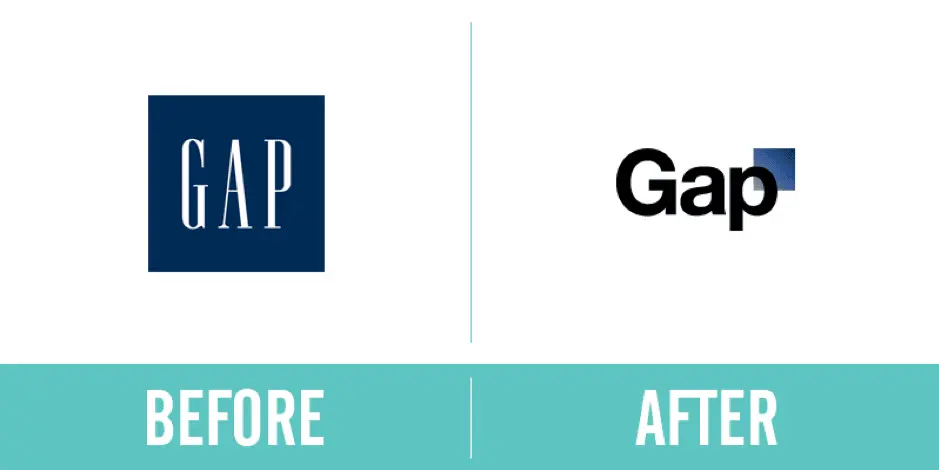
Just take a look at Gap’s rebrand from 2010.

LOOK AT IT!
That change cost them 100 million dollars.
And, they changed it back.
The lesson? If you already have a brand that works, and no compelling reason to change it, leave it as is.
Branding (your brand’s identity) only needs to be changed when the perception of you in the market doesn’t match what you actually do and represent as a business… which leads us into the next rule.
Rule #2: Put your values first.
So, you’ve thought about the point above and decided, “Yes, we actually do need to fix our brand because it doesn’t match who we are.” Fair enough.
But, before you even start to talk about the visual stuff—fonts, colors, imagery and so on—you need to do a little soul-searching to get down on paper the values of your business.
This, in essence, is what a brand’s identity is: the values that the visuals represent. [ ]
Everything about the brand therefore needs to make sense and represent you in some way, so start by answering a few simple questions like:
- What are your business’ values?
- What values do your competitors have that you don’t want to be associated with?
- How do you want people to describe your business, product and service?
Answering those sorts of questions will help direct you in making choices about the visual aspects of the brand.
If you want your brand to be considered tough and macho, for example, you wouldn’t go for a curly, wavy font.
If you want your service to be perceived as simple and to-the-point, you wouldn’t want to go overboard with the imagery.
Once you’ve got those values nailed down, it’s much easier to say whether a visual idea is a good fit for your business.
Rule #3: Simplicity is key.
Sure, you could take a course on branding & design. You could read Pearce’s Theory of Semiotics. You could hire a team of brand consultants to come in with their chihuahuas, fedoras and turmeric lattes to give your brand “pizzazz” and make it pop.
But, why bother when you can keep the process simple?
You’d be amazed at how many companies waste weeks or months—even years in some cases—obsessing over minuscule brand details.
While it’s true that the devil is in the details, it’s also true that branding, just like any other form of art, is incredibly subjective.
Remember that, while you might get into disputes over the finer details internally, as long as the new brand looks good and represents your values, people won’t notice that your font is slightly lighter, slightly bolder, or that you’ve chosen Pool Party Valspar over Filoli Morning Valspar (yes, those are genuine Pantone colors).
In other words, don’t let your own personal ideas of perfection get in the way of progress.
Keep your decision-making system simple, while understanding that people on your team are bound to have a few ideas you don’t, and the process will be both quick and fruitful.
Rule #4: Look at your competitors.
If you want to save time while building a brand identity (and the elements to match), it’s crucial to put together a board of your competitors’ brands, including their logos and value propositions.
Why? Because a lot of businesses rush in, creating a brand they love, only to realize that it looks disappointingly similar to the competition.
Consider zagging where everyone else has zigged. If every brand in your industry is blue, pick another color that will make you more memorable and own that hue instead.
It’s far more powerful to stand out than fit in, so don’t assume that just because everyone else has done something for a reason, you should follow suit.
Looking at competitors early in the process is an easy way to guide your identity and the resulting elements. Other companies will give you insight into exactly which routes to pass by and which ones to explore.
Rule #5: Listen.
I’d strongly recommend using this exercise to build trust with your customers.
Ask them what they think your brand values are to get a picture of the way they see you.
Not only will they love that you got in touch, they’ll feel valued and potentially even become brand advocates.
This is the best and most accurate source of data when revising your brand identity.
Rule #6: Test, tweak and test again.
Once you’ve made your decisions and pushed your new brand identity out there, the key is to test and make sure the changes you hoped would be evident are the ones you actually get.
A soft launch to the same customers you spoke with can be a great way to gauge whether the decisions you’ve made are wise ones.
More often than not, some unexpected reactions and results are likely to occur. A/B testing new messaging & branding on your website and in your communications is a great way to measure whether certain tweaks are working.
When you do launch—especially with changes to messaging—it’s advisable to make incremental changes so you can track exactly what’s worked and what hasn’t. If you push ahead and change everything in one go, you’ll never know which elements are responsible for positive or negative reactions.
Key takeaway
Branding is a huge differentiator. No matter how you approach the subject internally, it’s important to keep a commercial head on your shoulders and realize that the more time & resources you sink into your new brand, the less cost-effective it becomes.
I know that’s a pretty boring thing to say when talking about something as exciting as branding, but many businesses fall into the trap of sinking so much time into brand identity work that the whole project becomes a false economy, costing you way more than it could possibly generate in revenue.
To avoid that pitfall, keep your decision-making process swift, honest, and void of too many personal preferences—and your identity project will be a flying success.


