Studies show that the average consumer is exposed to up to 10,000 brand messages a day.
To break through the noise, your brand image should be powerful and to the point, like an elevator pitch—an quick and accurate expression of your key values, unique benefits and mission. Delivering it successfully has never been easy, especially if you work with tech brands, which can often be hard to describe succinctly.
Does this sound scary? Probably. Should that be motivating? Surely!
So what does a tech company brand consist of? What are the steps tech companies take to create a brand that reflects their values and appeals to their target audience?
We talked to 5 experts—startup founders, marketers and designers—about the answers to these questions and about their own brand-building experiences.
Here are the questions we asked:
- How did you come up with the idea of the logo?
- Why did you choose the colors you’re using now?
- What is the key message you wanted this design to convey?
- What are the general impressions and associations you think users get from the brand?
- What advice would you give to a startup working on their own branding?
- How do the current logo, design and tagline reflect the core values of your company?
Here are the insights they shared.
Markus Pirker, co-founder of Userbrain
Userbrain is a subscription-based tool that helps website owners, designers and developers improve their products by providing first-hand feedback from real users.
Before starting work on our logo, we made sure the whole team was aligned with our core values and beliefs, a crucial first step in brand building that helped us avoid common branding mistakes later on. I don’t think you can create something as important as your brand image starting with the details like color choice—you have to work from inside out to create something authentic. These are exactly the kind of rebranding questions teams should ask themselves before making visual changes.
In the process of fine-tuning our core values, mission and vision, we decided to lead with the promise of effortless, ongoing user testing. This inspired the design and served as a baseline to assess the quality of different logo suggestions.
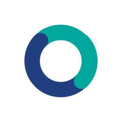
We went through a couple iterations before we decided to go with the current logo. Past suggestions used additional elements, and we tried to narrow everything down to a very simple logo which could be used across different platforms without substantial alterations.
User testing is often regarded as a tool for experts only, which it really isn’t. If you get the basics right, testing your own product with other people will always deliver valuable insights.
There are already several user testing services out there using subtle colors and an enterprise-like look in their branding. As a startup, you always have to fight for attention, so we wanted to stand out by using bright colors – a simple but effective choice within our broader brand engagement strategies.
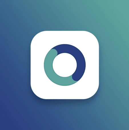
The Userbrain iOS app icon
We used two different color palettes and paired the main colors of our logo with shiny, vibrant colors like orange and violet.
The vision of Userbrain is to help people build better products by bringing them closer to their users. This is something we wanted to reflect in our logo, with the two circles depicting users and customers blending together.
As in sports, continuity in testing your products is the secret ingredient of user testing. We really wanted to embed the idea of ongoing user testing in our branding.
We ran a couple of user tests on our marketing site to learn more about how people reacted to our branding and service in general.
We had several people mention that it was fun navigating around our site, and they captured the basic idea of our service within a couple of seconds, so I guess we got the basics right here.
However, our branding is always adapting to the new needs, I think that perfect branding is something that evolves over time. In modern digital brand management, avoiding rigid decisions early on helps teams correct branding mistakes before they scale.
Maybe this sounds a little counterproductive, but I’d advise startups not to worry too much too early about their own branding. Startups should focus their early efforts on getting something really minimal yet valuable out in front of people.
This is not meant as an excuse for bad design, but if your product provides value to people and is a clever solution to a real problem they face every day, they will overlook your crappy logo.

The old, quite simple, Userbrain logo
The Userbrain logo has been the word “Userbrain” written in Open sans and uppercase for the first year and a half, and we’ve had customers sign up with no branding at all.
The promise of our service is effortless and ongoing user testing. I think that our team did a great job communicating this idea in a simple yet effective logo.
Tim Sae Koo, CEO at TINT
TINT is a content marketing platform that allows brands to source authentic community content from social media, new and review sites, then integrate it dynamically into any digital channel.

TINT’s logo is a powerful symbol that was designed back in 2012. It represents the connections between brands and their audiences. The intersecting lines resemble customer touchpoints and the circle that surrounds these connections represents our product, implying that these connections are the center of our product.
Warm red is our primary color. It’s meant to signify clearness and power—our brand essence.
The key message is meant to signify that we speak less and say more with design. We use simple and clear design that allows us to speak from the heart. We are direct, consistent, compelling and inviting. We are grateful. We are compassionate.
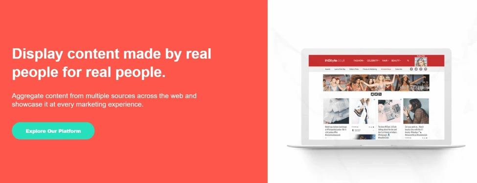
Start with why you started the company, and translate it into a physical manifestation via logo and branding. The logo reflects our personalities, which stood as the baseline for creating our core company values.
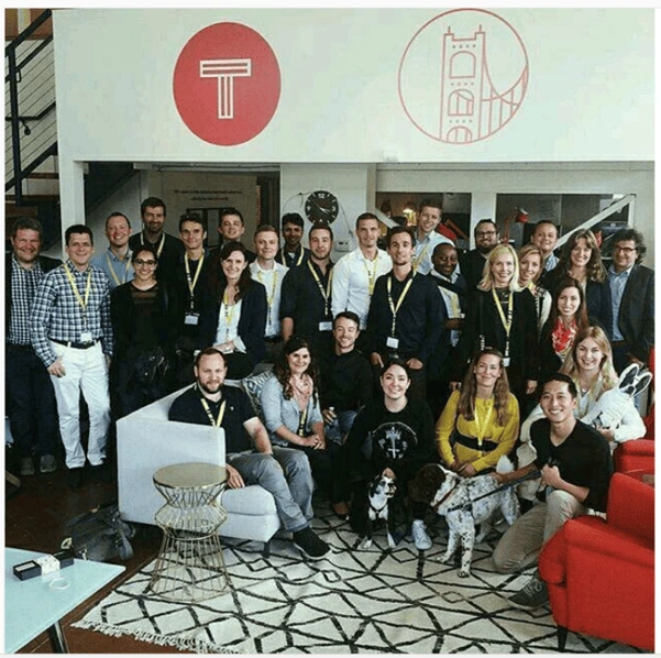
Hayley Snow, Marketing Project Manager at ContentCal
ContentCal is a simple tool to create, plan and publish compelling social media content.
Our logo was born from one of ContentCal’s core components: the approval flow UI. This UI consists of multiple dots on an axis, one for each step of the approval flow.
We started playing around with the concept of dots in a line in all different ways, then started to realize the potential in the idea. With some tweaks to its form, the graphic could morph into a line chart, process circle or share icon.
The flexibility of its form won over our team in an internal design critique. We developed the logo further to give it the form of a system, and after multiple iterations, the new ContentCal logo was born.
There are four brand colors used in our logo. The original UI colors in the ContentCal product were blue and “zing blue” (a very bright cyan), so these became two of the four colors used. We then added green and red, which are the ‘approve’ and ‘deny’ action colors within the product.
So the logo looks like a system, and the colors are the ones used in that system, reinforcing consistency across the product and our broader brand content management efforts.
Our logo doesn’t have a strong key message other than for it to represent our core values and to feel at home in the tech startup world.
General feedback has been that the logo works well in its environment, it feels associated with digital technology, which is definitely what we wanted to achieve. We also have great feedback about our logo being used at a large scale—for example, in exhibition spaces.
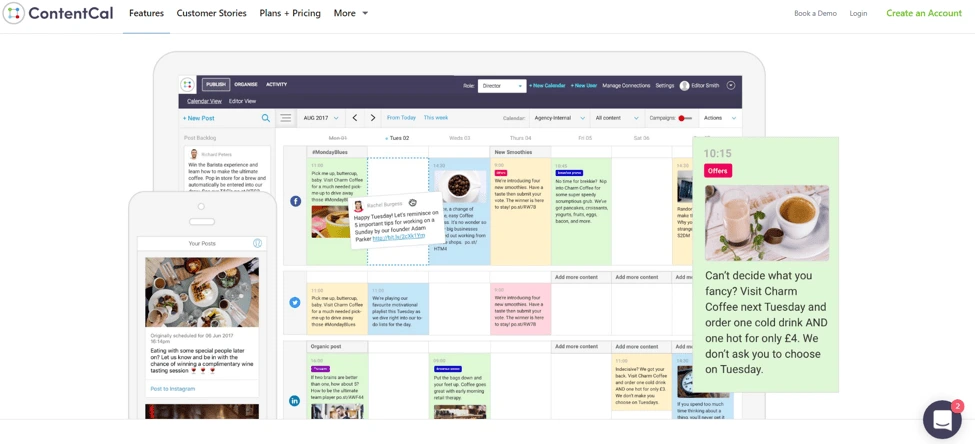
My advice to a young startup would be to stay agile with your branding. Branding in tech startups is predominantly used online now, so there are more opportunities to tweak and adapt over time. I also would suggest not worrying too much about brand guidelines at an early stage. Your company should constantly be adapting and growing, and so should your branding.
We’ve made many incremental improvements to the branding both on our website and in printed documents. It’s always adapting, and I think this is the best approach.
Our core values are Flexible, Dynamic, Together and Consistent. Our whole brand is built around these values. As we grow, staying true to this will become more and more important.
Nick Kamyshan, CEO at Chanty
Chanty is a fast and simple AI-powered business messenger designed to increase team productivity.

The idea was to make a dead simple symbol which clearly shows the letter “C” for Chanty and a dot in the middle to emphasize a human being in the center of information flow.
We decided to go for a high-quality logo and hired top-ten Dribble logo designers. After several months of their work and multiple iterations, our tests showed that none of the logo designs satisfied our target audience. Our founder and product owner was extremely frustrated with the low-quality results and came up with our current logo while on a plane.
We’ve tested a lot of color schemes, and it turned out that the color combination we chose is the most attractive to our target audience. It also has the highest conversion rate. I should highlight, however, that this color scheme is mostly used for marketing resources at Chanty, not for the software product.
Laconic is the exact word to describe the look and feel we’ve worked so hard to achieve. We believe that things should be simple. On top of that, laconic crystal clear designs are easy to remember.
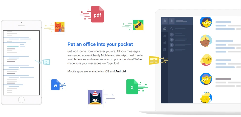
Experiment until you die or succeed. Find out which colors really work for your target audience by constantly testing different color schemes via various marketing channels — an experimental approach that strengthens long-term brand engagement strategies.
Listen a lot. But don’t listen even more. Make discovery a part of your workflow. The more informed you are, the more confident you become.
Be unique, develop your own style, and go in a different direction than your competitors when it comes to branding.
Ksenia Levoshko, UI/UX Designer at Daxx
Daxx is a nearshore staffing company that helps companies hire talented developers.
Tech company branding is more than just the logo or color scheme on a website. The product or service a company sells is the foundational element upon which all branding is built. As your company’s offerings evolve, so should your branding.
The product I worked on consisted of several parts: a wearable device (bracelet or ring), an app, and a web portal. The wearable collected data on vital signs then transferred it to the app, which sent notifications motivating people to take action and pay attention to their health.
The primary objective of the project was quite ambitious: We needed to inspire users to change their behavior. As it turned out, the strongest motivator was the user’s desire for tangible, positive change and the use of personalized data.
That’s why we made a U-turn from a fear-based approach to a new, engaging one. We made it into a game, where at the beginning, you see your current health state and set custom goals.
We used points to track users’ success and implemented badges and stickers as gamification elements. Each badge or sticker marked a small achievement that greatly motivated users and helped maintain their enthusiasm.
If you want to ask your audience about something, you have to give them something first. Early on, we asked our users for personal medical data and gave nothing in return. Now, we clearly explain why it’s necessary and how it’s going to change their lives for the better.
Understanding a user’s motivation is crucial. Once you realize what your users need, you can help change their behavior.
Key takeaways
Tech branding is not limited to logo design and a color scheme. Branding also includes the way a company communicates its values and mission, internal company culture, and customer relationships.
In an age of information overload, companies do their best to communicate brand messages as clearly as possible. This includes visual representation: as we saw, most experts prioritize simplicity—minimizing clutter and leaving only the key, nuclear elements that convey their message. Then, they make sure it’s 100% authentic and reflects their ideas and goals.
The experts also agree that designing brand elements is just the beginning of a long path—finalizing and polishing them requires a lot of experimenting and user testing. The branding process is never really complete. As a business evolves over time, the brand image should stay aligned by adapting to changing market requirements and business needs.


