The 9 Types of Infographics

Infographic design doesn’t need to be overwhelming. Like other types of content, infographics follow typical structures and layouts as a starting point for arranging your copy and visuals. Instead of jumping right into your infographic design, start by determining which layout works best with the type of information you want to convey.
We’ll walk you through nine different styles of infographics and what information they’re best for.
Related: What is an infographic? A comprehensive guide
Timeline infographic
A timeline infographic is the best layout to use when you’re showing the history of something, placing events in chronological order or showing the steps of a project plan. A timeline can be arranged along a vertical axis as shown in this example.

Or it can be displayed horizontally like in this example.

Tips for creating a timeline infographic:
- Choose a consistent cadence for your dates. Either show a timeframe over days, weeks, months, years or decades.
- Use visual cues to move the reader through the infographic. An icon representing each development in the timeline or a change in color can help distinguish each section.
Comparison infographic
Coke vs. Pepsi, pancakes vs. waffles — sometimes a direct comparison is the best way to help your audience make a decision. A comparison infographic has a symmetrical layout that compares two different options on the same data point. Comparison infographics can be used to compare your product to a competitor’s or to help a customer understand the differences between two products you offer and decide which option is right for them.
A comparison can include small sections of text on specific topics or if you have data, use charts and graphs like in the following template.

Tips on creating a comparison infographic:
- Be sure you’re able to make a direct comparison by choosing attributes both options have such as price, color or relative popularity.
- Avoid creating a list of random facts with no relation to each other.
- Use a centered section of text for any general commentary or context to help distinguish it from the two-columned comparisons.
Roadmap infographic
A roadmap infographic layout works best for anything with a start and end point, such as the steps of a process or project milestones. You can use a large icon to represent each step in the road map like shown here:

Or combine icons with a numbered list as shown in this roadmap infographic example:
Use this infographic template
Tips on creating a roadmap infographic:
- Focus on a series of stages rather than an exact timeline.
- Create a visual start and end point.
List infographic
A list infographic layout has a broad range of use cases from creating a checklist of things to do, to explaining how a process works, to creating a list of the top 10 reasons to create an infographic. A list can be arranged vertically like a traditional checklist.

Or you can alternate the copy and image for each section like in this template:

Tips on creating a list infographic:
- Use visual cues that represent each element of the list.
- Use a larger color palette of harmonious covers to differentiate each part of the list.
Geographic infographic
A geographic infographic works for any comparison or dataset specific to location. The infographic uses a map of the continents, countries or states you’re describing as the main data visualization element. Use lighter and darker shadings within the map to visualize differences.
Small callout boxes or reference points can be used to provide additional context and information.

Tips for creating a geographic infographic:
- Use darker and lighter shades of the same color to indicate a greater or lesser amount like population density.
- Use different colors to show different categories like red and blue states on an election map.
Numbers-heavy infographic
A numbers-heavy layout combines multiple types of graphs and charts to tell a story with data. This layout works best for summarizing a research report, synthesizing data to support an argument or sharing data that’s entertaining or insightful.
Charts can be relatively simple such as a scorecard or bar chart.

Or you can get creative and use visuals specific to the data set, such as a graph made up of a person icon to show population density.

Tips for creating a numbers-heavy infographic
- Be selective about which data you include. Every point should work together to tell a holistic story.
- Keep your graphs simple and stick to your color palette.
- Use subheads and labels to help the reader understand what the graph is about.
Article summary infographic
The article summary layout works best for providing a brief overview of a blog post or other in-depth article. The layout provides plenty of space for copy while incorporating imagery to create some visual interest. Each section can cover a different topic discussed in the longer article. This type of infographic is great for repurposing content to post on social media or send in a sales email.
An alternating layout can work best for disparate points that don’t necessarily build off each other in a particular order.

A linear layout works for summarizing a series of points or sequential steps like in this explanation of the taxation process:

Tips for creating an article-summary infographic:
- While this type of infographic will have more copy than other layouts, keep content as succinct and scannable as possible.
- Focus on the key points in the infographic and point the reader to the full article for additional anecdotes and examples.
Resume infographic
A resume infographic tells the story of a person’s work experience and professional skills in a visual way. Common uses include adding icons to represent each section, using charts to show relative experience with certain tools or incorporating a timeline. Job seekers in creative fields will frequently use this layout to stand out in the pile of resumes.

Tips for creating a resume infographic:
- Be sure to still include all of the necessary information for a recruiter to evaluate you. Keep graphics and illustrations simple.
- A less-is-more mentality works best when creating a resume.
Visual backbone infographic
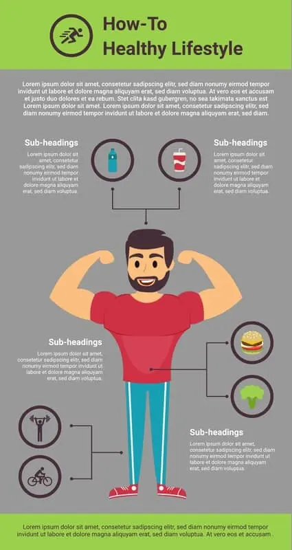
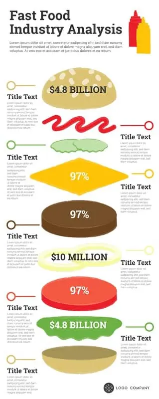
This type of infographic uses a single large image as the center backbone of the piece with each point or data set breaking down one component of the visual. This style is best to use when visualizing parts of a whole, like interesting facts about a building or the layers of a sandwich.
For example, this infographic uses an illustration of the body as the center backbone and then uses symmetrical callouts to describe points relevant to different parts of the body.

This layout example uses layers of a hamburger to discuss interesting stats about the fast food industry.

Tips for creating a visual-backbone infographic
- Choose visual that can be broken down into multiple relevant parts
- Place the visual in the center with sections of explanatory text placed evenly on each side of the image
In summary
Feeling empowered … overwhelmed? While creating infographics does require some extra lift, remember that eye-tracking studies show internet readers pay close attention to information-carrying images. In fact, when the images are relevant, readers spend more time looking at the images than they do reading text on the page. So get your audience engaged!
Sign up for our free infographic maker for an easy design tool and free templates to get you started.


