The internet is teeming with sites vying for attention, and a poor first impression could very well be your last. It’s a fine line one walks when it comes to nailing that website design. Some get it right; many don’t. From the layout and navigation to the colors and fonts, everything has something to say about the brand behind the scenes.
Related: 8 best practices of high-converting websites
Some studies suggest that it only takes 50 milliseconds for a user to decide whether your website is appealing enough. With such a short amount of time, your website needs to wow them fast and leave a strong impression.
Let’s delve deeper into three areas—design, user experience and content—that can make an impact on your viewer, to give you insight into what your website says about your brand.
Driven by design
With dwindling attention spans and fast-changing loyalties, the design of your website plays a huge role in holding the attention of fast-moving visitors and encouraging interaction.
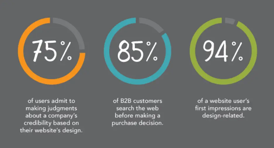
Source: Kinesis
Organizations spend top dollar to help their websites stand out amongst the noise. With special emphasis on digital marketing strategy, a great website design will help you grab your consumer’s attention.
Traits of a well-designed website
Visual appeal, but for the right audience
Looks matter.
In fact, 38% of users will stop browsing your website if they don’t find it attractive enough. So, a visually appealing website is half the job done. But remember—you are not trying to appeal to everybody.
Good design addresses the target audience with a brand personality users want to engage with. Check out this website, Crypton. It’s designed ideally for a tech-savvy audience.

Source: Crypton
Parallax scrolling heightens the user engagement here, but you don’t have to include parallax functionality on every website. Research your buyer personas and use design elements, functions and colors that make your target audience feel right at home.
Your above-the-fold section should do the job
A Nielsen study says the majority of your website visitors will spend 80% of their time above the fold. That’s the section you see without scrolling—call it the opening screen.
The best websites explain what they do in this opening screen. A general practice is to use a headline (think your company’s tagline or mission statement), followed with a brief subtitle text describing your services or products. Top it off with a CTA button to direct visitors toward the next stage in your conversion funnel.
Airbnb does this brilliantly; the headline is the CTA. While there’s no subtitle text, their call-to-action is strengthened by a slideshow of awesome travel photos. Just beneath the headline, a search bar is intuitively placed. The example text in the search bar encourages interaction.
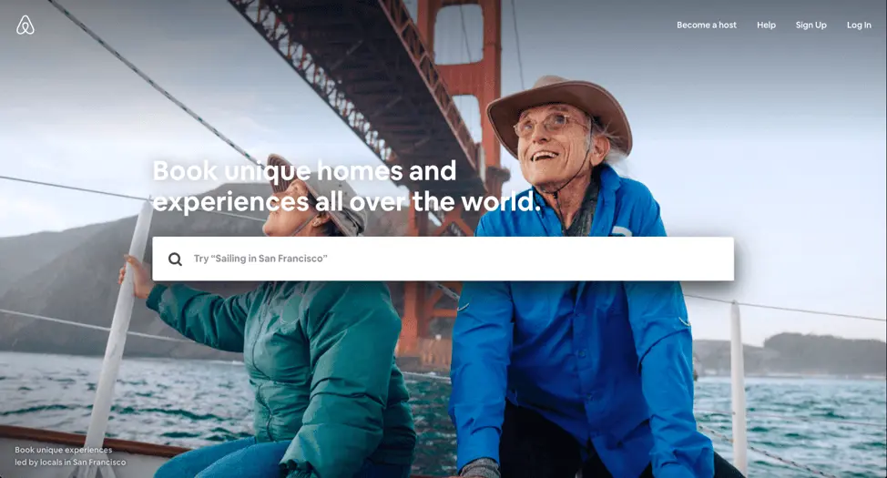
Source: Airbnb
Your design might be ineffective if:
- Your colors are wrong. For example, you’re targeting B2B consumers with a color theme that appeals more to B2C consumers.
* Your site has no visual hierarchy. This confuses the visitor, resulting in missed opportunities and eventual sales.
The design approach you take depends on many factors. Location, age brackets, and target groups will certainly affect how your website should look. Having said that, these factors should be the starting points for your design. A well-designed website that considers all these factors will set you apart from the crowd.
User experience counts
Today, it’s all about experiences. You could have a brilliant product or service, but if your website fails to deliver an enjoyable user experience, all that will be for nothing. It all comes down to how you make your customers feel.
The kind of experience users have, good or bad, will stay with them for a long time, even after the browser window is closed. A well-thought-out homepage or landing page with content that resonates will go a long way towards creating a great user experience.
Let’s see what your website’s UX has to say about you.
Good user experience:
- With good UX, your website tells the world that you think clearly about the end user. See Crunchbase’s website; its UI is done beautifully. There’s the search bar on top if you want to explore specific results, or you can click the menu on the left side to browse sections that interest you.
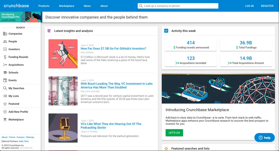
Source: Crunchbase
- Clean, intuitive user interface shows that you have a clear purpose.
* Got a 404 page built? Small things like this send out signals that you don’t skimp on your efforts to deliver an optimized experience.
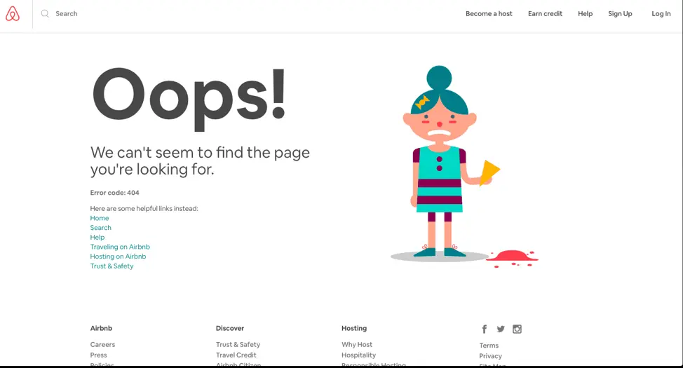
Source: Airbnb
Poor user experience:
- Your website doesn’t respond well to mobile or other screen sizes. This will send a bad message about the lack of strategy and planning behind its setup.
* Too many calls-to-action on one page show a lack of purpose for what your website aims to achieve.
User experience can make or break your website. To stay ahead of the game, it’s important to take feedback from your visitors. Incorporating that feedback will give your users a sense of gratification and improve future visitors’ experience.
Content will make it all work
Content might be the most important aspect of any website. Well-written content will bring you new traffic and repeat visits.
These days, content isn’t limited to the stuff you read. There’s now an increased demand for visual content. Animations, infographics and GIFs tell stories and illustrate data like never before. Compelling content with clear calls-to-action will eventually drive your users toward conversion.
Take a look at how the quality of your content reflects your brand’s personality.
Characteristics of good content:
- Great headlines and a call-to-action above the fold—nice. Videos on the landing page to engage fast-moving visitors—even better. This shows that you want users to get the best, most relevant material quickly without wasting their time.We especially love HubSpot for its content. The blog is fabulous, and there are explainer videos on all their landing pages, plus a video testimonial section. In short, almost every aspect of content necessary to build trust and conversion is present.
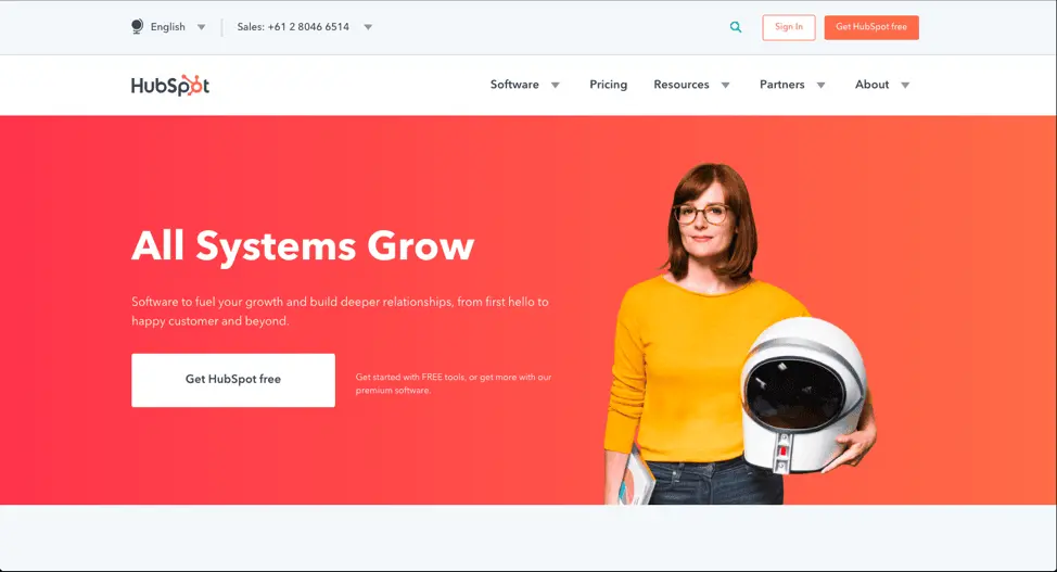
Source: HubSpot
- Use the language and verbal style your target audience speaks in. This shows that you’ve spent time thinking about and curating the content your target audience would appreciate.
* A blog should offer well-researched pieces that add value to your consumer’s decision journey. It will drive home the point that your content strategy cares more about the readers than ranking. This helps build trust and thought leadership.
Characteristics of poor content:
- Grammatical errors or typos on your site. Careless content informs your users that quality doesn’t matter to you. If you can’t pay attention to your content, who’s to say your product, services or customer support will be any better?
* Articles published just for the sake of traffic. If your content doesn’t target your audience or speak to a niche, it will be difficult for audiences to determine who your site is really for.
* Generic content that doesn’t offer anything valuable or new. This demonstrates a lack of research and understanding. The users goes away thinking you don’t really care about their needs.
Key takeaway
With so many sites competing for dollars and attention, it’s more important than ever to offer the user an exceptional experience. By breaking down your website into these three areas of design, user experience and content, you can evaluate how well each one contributes to your brand’s success. Conversely, you can also isolate areas that aren’t working and try new ways to engage your audience. When all of these areas represent your brand authentically and consistently, you will enjoy higher traffic, conversions and customer satisfaction.


