Visual communication and storytelling are critical for any business in this day and age of social media and short attention spans. Infographics are a popular way to visually share information, but creating an effective one isn’t easy. This guide will walk you through what you need to know to understand what an infographic is and provide tips to create a great one.
Related: Infographic stats that prove infographics aren’t dead
What is an infographic?
In the simplest terms, an infographic is a visualization of data or information. Infographics can take on many different layouts but ultimately include visuals, charts, icons and brief sections of text to convey an idea.
Like any piece of content, every element used should help contribute to the reader’s overall understanding of the topic rather than simply being an addition to the content already there.
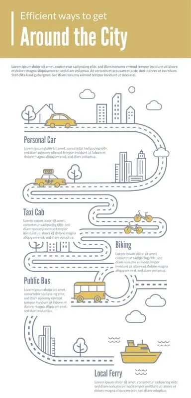
Take this infographic as an example. The design uses a road to direct the reader to each piece of information, but it also does more than serve as a visual cue. A quick glance immediately tells the reader that the infographic is about movement and transportation. The visuals of the car and bus quickly help the reader know where to find information about a specific type of transportation. The copy is brief and to the point building off of the message the visual has already created.
Why use infographics?
Creating an infographic should never be an end unto itself. Instead, carefully consider which medium makes the most sense for the content you are trying to create.
Creating an infographic makes sense when you have:
- A set of data to visualize
- An idea you need to summarize quickly
- A complex idea you want to explain through visual representation
- Two topics to compare and contrast
- A timeline or roadmap
- A checklist or process to follow
Infographics can be used across a wide variety of use cases and contribute to many goals.
Infographic examples
Marketers seeking to drive awareness of a brand or drive backlinks to their website can create infographics with unique stats and data. By presenting this data in a visual form, it not only makes the research more compelling but also makes it easy for other blogs or publications to share your infographic and link back to your website as a source. For example, this infographic provides interesting comparisons and stats from Marvel movies that only a fan willing to watch all of the movies and count the stats could create making it a unique piece of content to reference.

Marketers can also use infographics to create useful educational content for potential customers. For example, a company that sells cookware could create an infographic showing how to create a specific recipe. The graphic is then easy to promote on social media or in a blog to help drive brand awareness and loyalty.

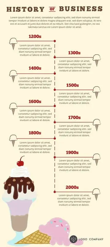
Business owners can also use infographics to tell their stories to investors or provide a product comparison to potential buyers. Here you can see an example of a simple timeline infographic showing how a company has grown over the years.
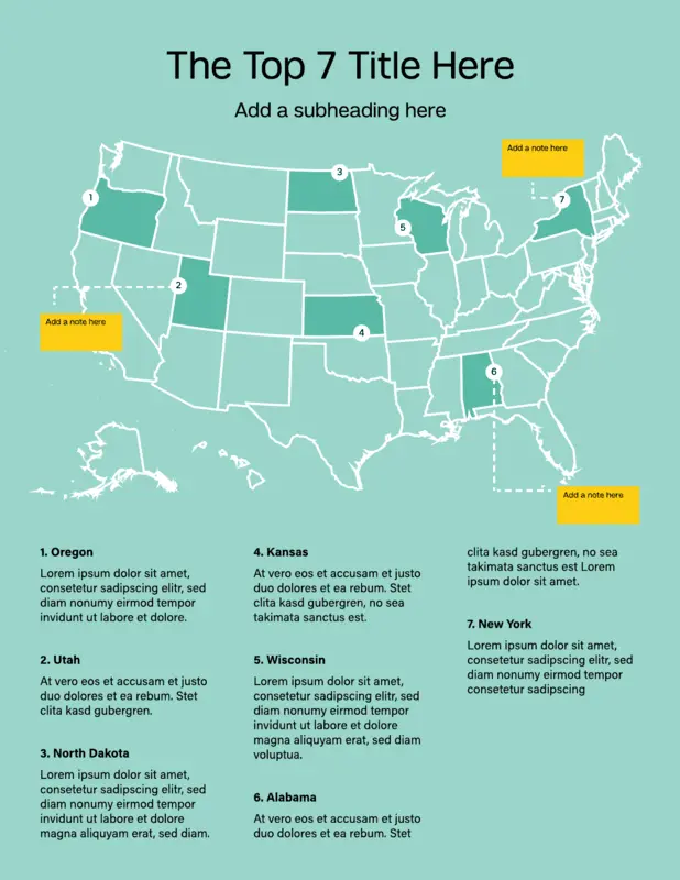
A geographic infographic like the example below can show how many customers a business has or how many countries it’s located in.
How to create infographics
Once you’ve decided that creating an infographic is the right medium for your marketing content, how do you go about creating a high-quality infographic?
Lucidpress offers a video tutorial with our professional designer that can walk you through the process in our drag-and-drop infographic maker. We also offer a variety of free infographic templates to get you started and outline best practices for designing infographics below.
Infographic outline
Start by creating an outline to help you focus your topic and stay concise.
Create an outline with the following
- Objective: what do you want to achieve with the infographic?
- Audience: who is the content being written for?
- Bullet points of the content or data you want to include
- Selected fonts and color palette
- A couple examples of infographics for inspiration
- Promotion channels: where will the infographic be published and promoted?
Once your outline is completed, you’re ready to start putting the infographic together. In general, an infographic should include the following elements.
Elements of an infographic
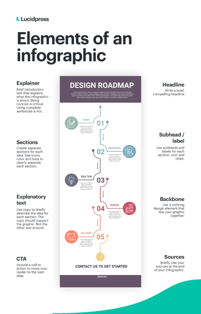
Explainer: Brief introductory text that explains what the infographic is about. Being concise is critical. Using complete sentences is not.
Sections: Create separate sections for each idea. Use icons, color and lines to clearly separate each section.
Explanatory Text: Use copy to briefly describe the idea for each section. The copy should support the graphic not the other way around.
CTA: Include a call to action at the end of the infographic to move your reader to the next step.
Headline: Write a brief, compelling headline
Subhead/Labels: Use subheads and labels for each section, icon and chart.
Backbone: Use a unifying design element that ties your infographic together.
Sources: Briefly cite your sources at the end of your infographic.
Types of infographic designs
While there are no hard and fast rules of how an infographic must look, infographics tend to fall into specific categories and layouts that can serve as a starting point for creating your infographic’s backbone and defined sections.
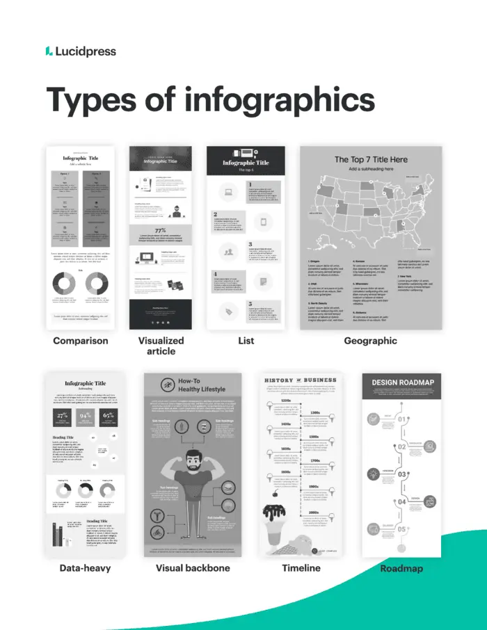
A timeline or roadmap layout uses a single, visible line either straight down the middle or on a meandering path to guide the reader from one point to another. A checklist or visualized article style infographic, uses a series of icons or visuals to organize information. Typically, a comparison-style infographic will use a symmetrical layout forming a natural line down the center of the graphic. To learn more about different types of infographics, visit our in-depth guide.
Infographic design best practices
Follow these design best practices to create a professional-looking graphic that is easy to read.
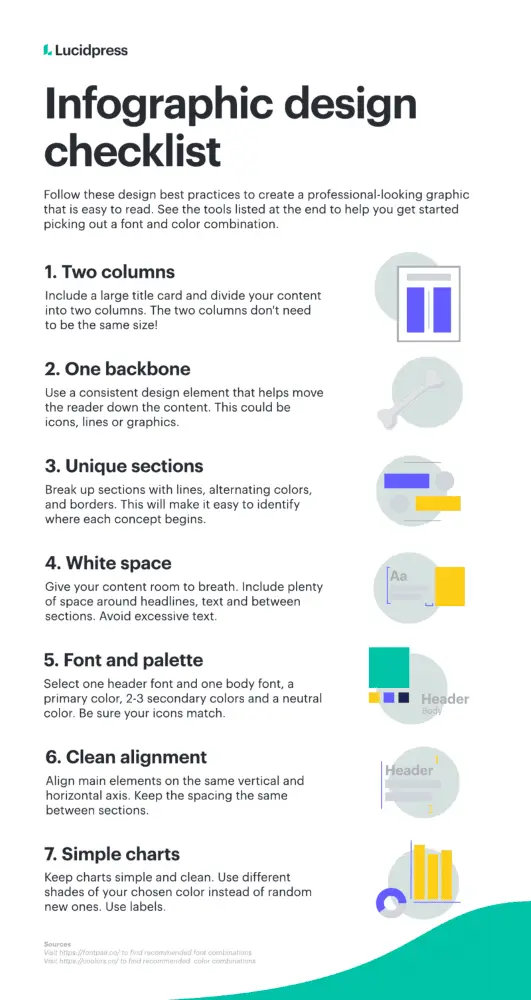
Two columns & a backbone
For beginning designers, divide your infographic into two columns with a large title card on top. Remember, the two columns don’t need to be symmetrical. Next, form a background with a single design element that helps the reader move through the content. A backbone can be made of a line, icons or visuals.
Clearly-defined sections
Just like a paragraph in a blog post, divide your infographic into specific sections based on topic. Distinguish each section by breaking them up with lines, alternating colors or borders. Each section should have a main subtitle or label and accompanying icon or image.
White space
White space is any area that is left free of any text or design element. White space gives your content room to breathe making it easier to consume and more visually appealing. Include plenty of space around headlines, between sections and avoid extensive text.
Font and color palettes
To start, keep your font selection and color palette simple. Use one font for the headline and one for the body. Your color palette should include one primary color, 2-3 secondary colors and a neutral color. Neutrals are typically white, black or gray. Be sure to use icons that match your color palette and have a similar style to each other.
Clean alignment
Once you have a draft of your design done, go back and make sure all main elements align on the same horizontal and vertical axis and that spacing is the same between each section. A perfect alignment will make the final design more professional.
Simple charts
Keep any charts or data you add to the infographic simple and clean. Be sure to stick to your color palette by using different shades of your chosen color rather than adding in a random assortment of colors. Always include labels with the chart, so the reader can understand the topic of the data.
Data visualization strategies
Using an infographic to visualize data is a common use case, but creating data visualizations that are useful and easy to read is its own art form. Selecting the correct chart for the data you are displaying will go a long way in making your infographic effective.
Types of data visualizations
Line chart:
Use to compare data over time.
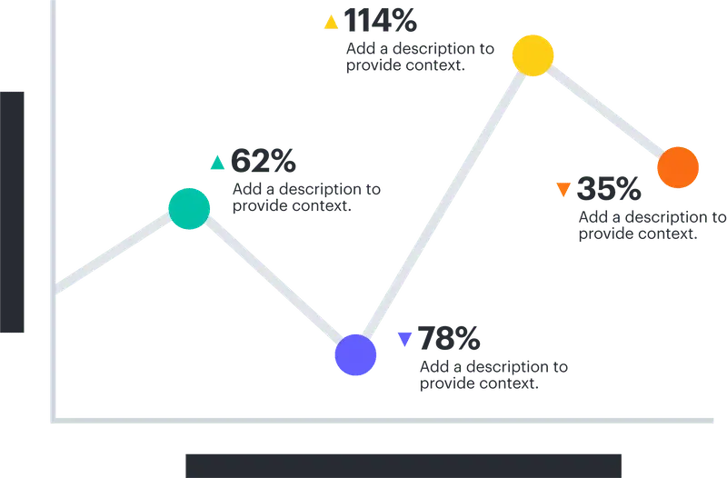
Bar chart:
Use to compare quantitative data from several categories.

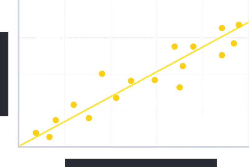
Scatter plots:
Use to show relationships between two data sets.
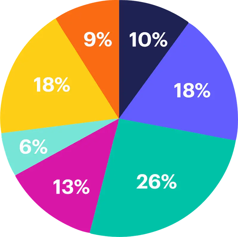
Pie charts:
Use to show parts of a whole. These should not be used for comparisons or changes over time.
Additional data visualization tips:
- Only include the data that’s necessary
- Avoid complicated visuals with multiple lines and charts
- Create the chart to have one specific takeaway that’s immediately obvious
- Avoid the overuse of data labels and keep the background simple
Infographic publishing & promotion strategies
Once your infographic is designed, it’s time to publish and promote.
When publishing your infographic, remember the following:
- Size the infographic to fit the width of the page
- Link the infographic to a full-resolution version of the image
- Use an embed code generator to allow others to easily share and link back
- Add a “pin it” button if relevant
- Include crawl-able copy for search engines
Your infographic promotion strategy should ultimately be defined by your objectives. A few to consider:
- Share the infographic image on a relevant social media channel
- Split the infographic up into smaller sections to promote on social channels
- Reach out to blogs/publications with similar content and offer the infographic as part of a guest post
Ready to start
Ready to get started creating your infographic? Lucidpress offers a free infographic creator with free infographic templates to choose from to help you level up your infographic design.


