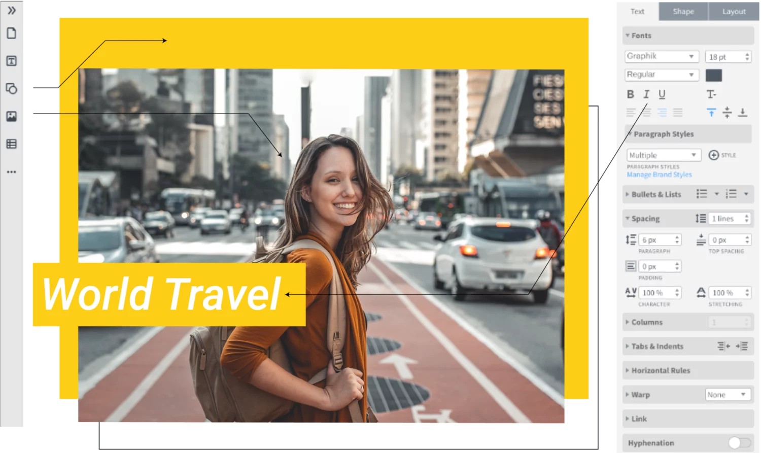
Need inspiration? Our free poster maker has a wide selection of complementary and premium poster templates to help you get started.
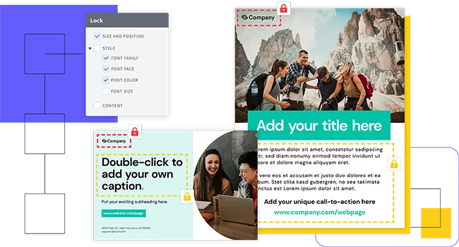
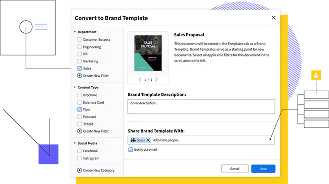
Our template collection is sure to meet whatever needs you have. Want a business poster that looks clean and professional? We have you covered. Looking to have some fun at a party by creating a wanted poster from the Old West? We have that too. With so much to choose from, you’ll quickly turn into a skilled poster creator! Customize the template by hand or upload your branding to access a collection of Smart Templates automatically customized to fit your brand.
An online poster maker for everyone
Marq is a professional poster maker anyone can use. With our intuitive, drag-and-drop editor creating beautiful, on-brand posters is easy for everyone.


Haven't signed up yet?
Give us a try.
 Sign up with Google
By signing up you agree to our Terms of Service and Privacy Policy
Get started fast with smart poster templates
Why choose our poster maker?
Brand assets

Web-based platform

Data automation

Easy Import
How to make a poster
Step 1: Get the right size
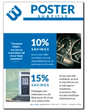
Posters are large print documents designed to grab attention. A few standard poster sizes are 11” × 17”, 16” × 20”, 18” × 24”, and 24” × 36”. You have flexibility in choosing the size of your poster, depending on whether it will be on a corner lightpost, the break room, or a school bulletin board. All of the poster templates in Marq are set to 18” × 24”.
Step 2: Design your poster layout
Your audience needs to take in the message of your poster at a glance. Choose your alignment—left, centered, right, or justified—and apply it to your headers, photos, text, and shapes. Unify the elements of your poster by aligning objects and text. This will make the poster feel coherent. Text is often centered, creating a sense of symmetry.
Step 3: Choose your graphics
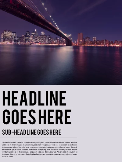
Photographs and other graphics can visually communicate a message in ways that words can’t. Have a balance between text and images that complement and relate to each other. With larger posters you will want to make sure you have the highest-resolution version of the photo possible. Don’t upload low resolution files of photos, otherwise your printed poster won’t look its best. Use photos which have been saved at a minimum of 300 pixels per inch at poster size for printing.
Step 4: Use color in your poster
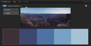
Posters are designed to grab attention. A good eye for color can direct your audience to the core parts of your message. Choose colors that complement your photographs and your message. For example, if you are advertising a farmers’ market, the color green can evoke freshness and nature. A poster can make a big impact even with a limited color palette—too many colors can distract from your message. Black and white posters provide good legibility for simple posters. There are several tools online to help you choose a color scheme, including Adobe’s Kuler. This tool lets you upload a photograph and select complementary colors to use in your background or text.
Step 5: Include text into your poster
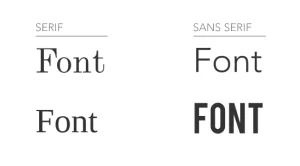
Keep your headers and titles simple. Use a larger font size for headers, which helps you determine the first thing your audience sees. Grab your audience’s attention with contrasts in font sizes, style, and color. If using multiple font faces, choose ones that are different enough to look deliberate. As a rule of thumb, don’t use more than two font faces in a document. Use font weight (bold) to differentiate sections of text. The use of ALL CAPS and italics also draw attention to particular points of a message. Keep text limited to your core message so your audience knows What, Where, and When.
Ready to make your poster?
Posters aren’t simply advertising tools: the best poster designs become works of art. Whether you’re creating a poster for a movie, a party, or to decorate your home or office, Marq has the templates you need. The Marq editor is intuitive enough for a beginner but customizable enough for advanced poster creators.
