Not a professional designer? No problem. Choose from one of our hundreds of templates to get you started creating a professional brochure. Customize by hand or unlock the power of Smart Brand Assets. Upload your brand’s colors, font and logo to access a collection of templates customized to your brand
How to make a brochure
Brochures present and organize a larger amount of information than flyers or posters. A good cover can pique your audience’s interest and encourage them to read on. The back cover often includes contact information and a call to action. Marq has custom brochure templates that not only look professional, but are easy to use. Spend less time worrying about learning complex layout tools, and more time growing your business.


Haven't signed up yet?
Give us a try.
 Sign up with Google
By signing up you agree to our Terms of Service and Privacy Policy
Brochure design and layout
A standard print brochure (tri-fold brochure) is on 8 ½" × 11" paper, folded into thirds. You have the inside flap, the back cover, and the front cover on one side of the paper, from left to right. The core content of the brochure is on the inside. Grid systems are a simple way to line up your content and organize it. The grid lines help you align your brochure's various elements (headers, text, and photos). When the alignment in each brochure section is consistent, it helps your readers.
How to create a brochure
Step 1: Customize your layout
Brochures should appeal to casual browsers and serious customers alike. Choosing the right layout is essential for catching your reader’s eye. With a web-based design program like Marq, you can use a template or design your brochure from scratch. The advantage of using a pre-made template is that you can focus on crafting your message while saving time. Marq offers a library of attractive, flexible templates to fit your needs.
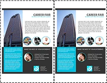
To get started, create a new document in Marq. Under Templates, choose For Print, then choose the Brochures category. Select a brochure template. This will give you a template divided into thirds. To add a new page, choose Add Page (the top icon) from the left-hand Content bar. The Blank Brochure option will give you custom brochure guides. You can align your text and images with these guides and with each other. When you drag any element of your brochure, an auto-alignment guide will appear.
Step 2: Add compelling photos and graphics
All good brochure design includes visual elements. The images you choose should complement the text. A compelling cover photo can be the key to getting your audience to pick up your brochure and act on your message. And don’t forget to include your company’s logo where it makes sense to.
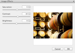
High-quality photos and illustrations show a commitment to quality that you want your brand to reflect. Choose software that includes options for cropping or masking, changing the saturation and contrast, and image alignment.
Step 3: Add your text
Decide what you want to say in the front cover, back cover, and body of the brochure. Make sure that your message is consistent and easy to understand. Front covers sell your product or service, back covers provide contact information, and the inside page usually tells a story or provides pricing options (different types of drinks served at a cafe or spa packages, for example).
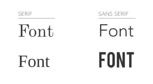
When it comes to fonts, less is more. Choose one font for the body of the text, with a complementary font for titles or headers. Complementary fonts are two fonts that are different enough to look deliberate — often a serifed font and a san-serif font.
Use simple, easy-to-read typefaces without an excess of flourishes to better communicate with your readers. Choose a font color that is easily legible against your background color. Dark fonts stand out against light backgrounds, and vice versa.
Step 4: Incorporate color
Using color well in your brochure design enhances your message visually and emphasizes specific points. Color is closely tied to emotion. Using a color scheme that is consistent and pleasing provides a better experience for your reader than one which is too loud, busy, or difficult to read.
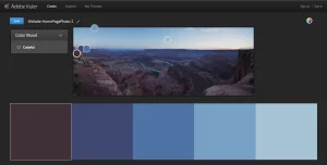
There are several resources online to help you find colors that work well together. The color wheel on Adobe Color has several color palettes to help you choose a balanced scheme, including monochromatic, complementary, and compound colors. You can save your color swatches, then refer to them to choose colors for your brochure.
Step 5: Use full bleed
Most printers are not able to print right up to the edge of paper. This can result in a white border around your content. In order to achieve a design that extends all the way to the edge, use a printing technique called full bleed. This allows the printed document to be trimmed to give you the desired visual layout with no obtrusive white space.
If you’re printing at home, test one print brochure to make sure the bleed is what you predict. If you’re using a professional printer or copy shop, contact them to make sure your brochure will look as predicted.
Ready to make your brochure?
A good brochure is informative, memorable, and tells a story. When you use Marq for your brochure design needs, you’ll be pleased with the results. Start making professional-quality brochures with these templates.


