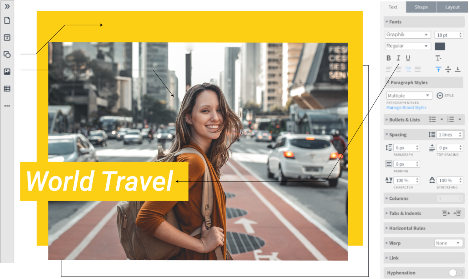
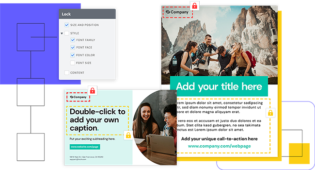
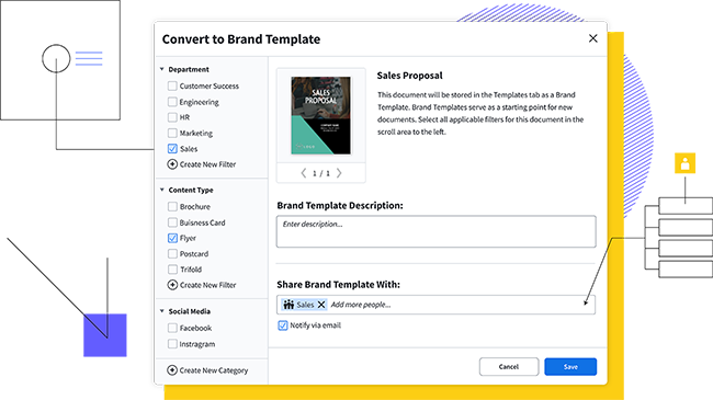
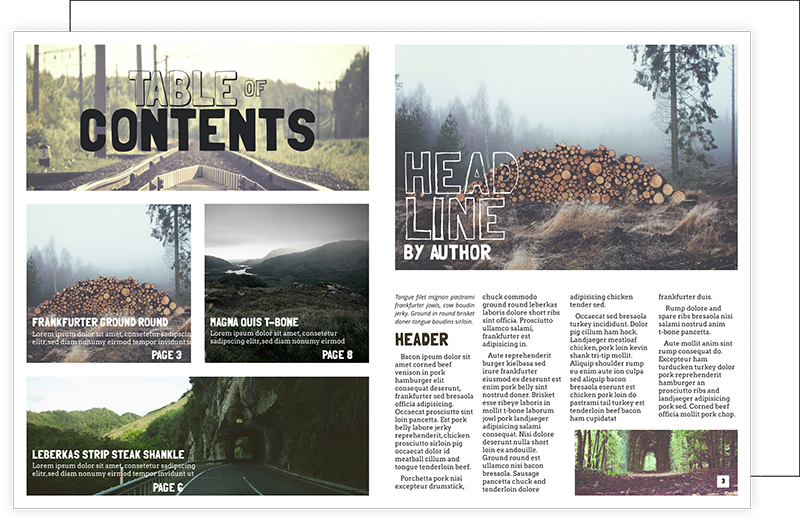
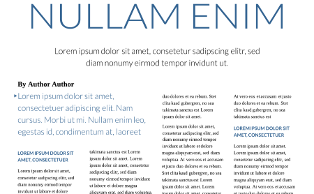
There are several ways to lay out a multipage document. Having a consistent header unites the pages of the document and makes your newsletter look professional. Another feature unique to newsletters is the inclusion of an issue number, volume number, and the year. Aim to strike a balance between text and images in your newsletter. Images should contribute to your message, not just clutter the page. Breaking up your text into columns can make it more legible. For a letter-size newsletter, three columns is a good choice.
How to make a newsletter
Newsletters are published on a recurring basis to keep readers in the loop. The details of a newsletter will depend on its audience. Above all, newsletters should be informative and add value for readers. In Marq, you can create high-quality newsletters without expensive design software that slows down your system. It’s simple to create sleek, readable designs in the cloud.

Haven't signed up yet?
Give us a try.
 Sign up with Google
By signing up you agree to our Terms of Service and Privacy Policy
Purpose of your newsletter
Newsletters are about keeping your audience up to date with the latest developments in your company, school, or club. They are sent on a predictable schedule to inform readers of sales, promotions, new features, reunions, and events. Print newsletters focus on text content and are typically letter size (8 ½” × 11”). Email newsletters can vary in layout and size, but should be viewable from both the email message and in a browser. They should also contain links to relevant content, and should be formatted consistently.
Some newsletters—for instance, those aimed at an alumni group—list personal updates, highlight school events, and showcase new buildings or donations. Others, such as business email newsletters, might contain links to company videos, promo codes, and new features. Marq offers several newsletter templates to get you started. Drag and drop your content to create a customized look to match your branding.
How to create a newsletter
Step 1: Choose your layout
Step 2: Incorporate graphics and design
Creating a newsletter presents a good opportunity to cement your brand. By incorporating your company’s or school’s colors, logo, and typeface, you can increase brand recognition and improve the likelihood that your newsletter gets read. On this page, shades of green and orange are used to create an enjoyable color palette. Only two typefaces are used—a serif font for the paragraphs, and a strong-looking sans serif font in all caps for headers, captions, dates, and names. By visually signaling these key points, the designer of the newsletter is giving the audience takeaways that are easy to remember. Using dark text against a light background ensures that the page is easily readable and not too busy.
Step 3: Craft your message
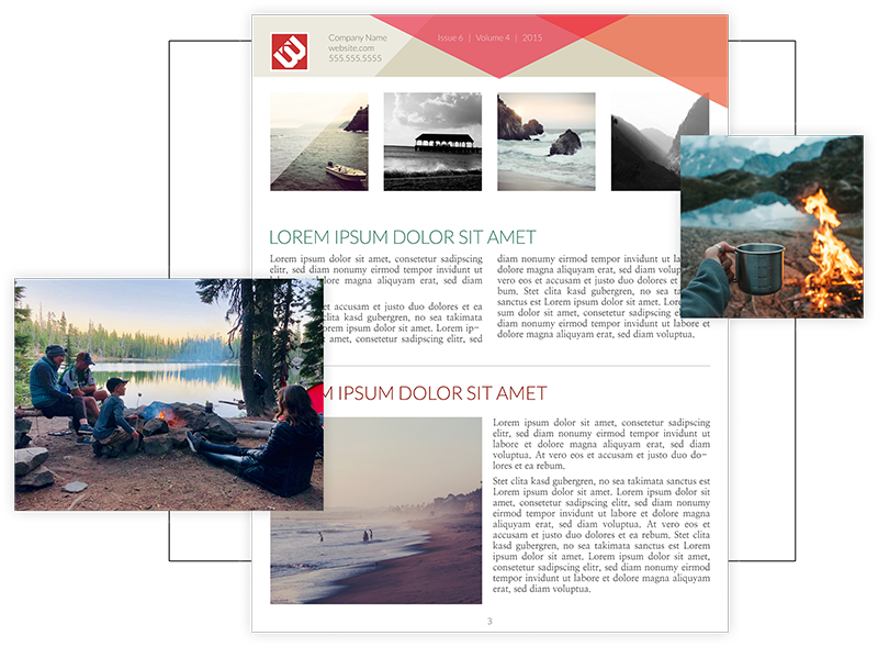
Your newsletter should be instructive without being heavy-handed. Don’t treat the content as an afterthought: if your newsletter doesn’t inform your audience or provide useful updates, you will generate more bad feelings than good. Make sure your text is copyedited and that your articles are succinct and easy to read. Event calendars and new product features are expected components of a newsletter. For print newsletters, the page count should be limited so your audience does not feel overwhelmed. For e-newsletters, the unsubscribe process should be straightforward for your readers. Articles on a given page of a newsletter should have a unified theme. This page is tied together by the photos of a banquet. That way, readers can tell at a glance if it will interest them.
Ready to make your newsletter?
Quality newsletters entertain as they educate, and clue in consumers, alumni, and hobbyists to the latest ideas in their fields. If you’ve wondered how to make professional-quality newsletters, check out the customizable templates in Marq.
